A landing page serves one purpose and one purpose only; to convert visitors into customers/clients/leads. Of course, there are a lot of different goals when it comes to landing pages but the principal is the same; you need to convert as many of the visitors as possible into carrying out a particular action.
You might want to get people to sign up for your email list, enquire about your services or perhaps even buy a product from your online store; whatever you’re looking to obtain, it’s important that your landing page is designed to ensure that you get the best results possible.
Landing page design is not a simple task. In fact, it’s one of the hardest things you can possibly do as quite literally, your work will never be done. There will always be possible improvements to be made and it will be an ongoing process of A/B split testing in order to constantly improve.
However, there are a few things you can do to ensure that your landing page has the best chance of being a huge success, and here’s a few of them.
#1 – Headline (IMPORTANT!)
You hear a lot about landing page headlines as for most people, this is the first rule of landing page design. However, a lot of people still get this wrong. It’s important that your headline doesn’t tell the visitor much about your product/service but instead, captures their attention and makes them want to read more.
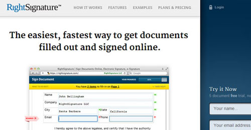
For example, take a look at the screenshot above from Right Signature. You can clearly see the headline “The easiest, fastest way to get documents filled out and signed online”. Obviously, this doesn’t tell you that much about the product/service or about how it works, but it makes you want to read on and find out more.
It creates a hook by claiming to offer the “easiest” and “fastest” way to get your documents filled out, therefore portraying an image of providing the best solution.
It’s important that you get your headline right and truthfully, this is one of the things that you should be constantly split testing.
#2 – Call To Action
Another hugely important aspect of any landing page is the call to action. If you don’t actually tell the visitor to take a particular course of action, chances are that they won’t and therefore, you won’t convert many visitors.
Now, I hear the words “call to action” a lot when it comes to landing page design and it can often be something that gets overcomplicated by a lot of guides but basically, it’s just telling the visitor to do something.
Usually, a call to action will stand out from the page and be quite prominent. It might tell the visitor to fill in their email address to get a free download or even just the words “buy now”. Clearly, these are all call-to-actions as they tell the visitor to do something.
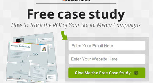
Take a look at the image above of a pop-up that occurs on the Kissmetrics landing page. As you can see, it provides a clear call to action. It says “Give me the free case study” on the button. Not only is this extremely prominent in the design, but it also includes words such as “Free” which helps to convert visitors. Everyone loves a free download if it offers something useful!
#3 – Build Trust
With any landing page design, it’s important that the page actually builds trust with the visitor. If you think about it, a lot of the visitors that will arrive at your landing page will probably never have come across your company before and therefore, this will be their first visit.
Because of this, they have no clue who you are, what your company is all about and whether or not you’re trustworthy. If people don’t think you’re trustworthy, they’re going to think twice about filling in their email address to obtain a free download and if you want them to actually make a purchase, you’re really going to have to get them to trust you.
Luckily, there are a lot of ways to build trust and one way is to let visitors know about big, well-known brands that have used your products/services before.
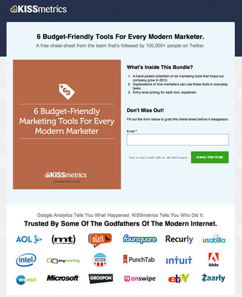
For example, take a look at the image above of another KissMetrics landing page. As you can see, this landing page features the logos of some well known brands near the bottom of the page. It also features the subheading “Trusted by some of the godfathers of the modern internet”. This helps to establish trust between the website and the visitor and will no doubt help conversions.
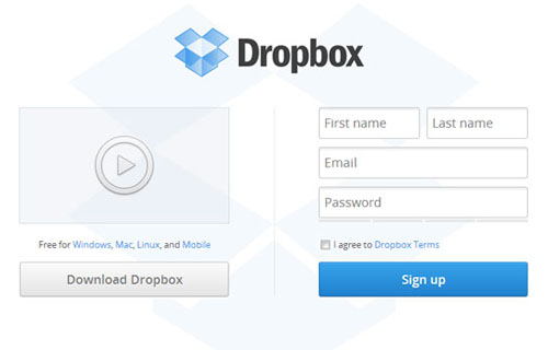
You can also use testimonials and videos to generate trust and help conversions. Take a look at the image above from Dropbox. You can clearly see that there is a video icon which when clicked, plays a video introducing the Dropbox concept, thus generating more trust.
#4 – Clear Design
A hugely important aspect of a successful landing page design is to ensure that the visitor doesn’t have many options. By this, I mean that the design should be clear and uncluttered.
If you have a tonne of links to other pages of your site or external sites, chances are that you’re going to lose your visitor. Once they leave your landing page, they’re going to be a lot harder to convert.
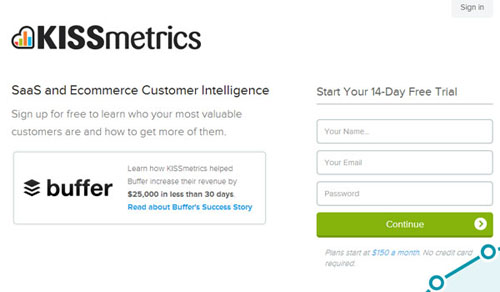
Take a look at the landing page design above (again from Kissmetrics), you can see that the design is very clean and straightforward. There are virtually no links on the page and therefore, the visitor has very few options. Because of this, they’re more likely to sign up for the free trial (which is the point of the landing page) and convert.
Conclusion
There’s no exact science to effective landing page design and truthfully, it’s going to take a bit of testing. However, by following the design steps laid out in this post, you’ll be sure to start your landing page design off on a good foot.
Another thing to remember is that your landing page should ooze your brands personality. Just because it’s a landing page doesn’t mean that it should use a different colour scheme than the rest of your website/branding, it should stay consistent and reflect your brand.

")


[…] made and it will be an ongoing process of A/B split testing in order to constantly improve. Continue Reading Advertisements Author: Team Member Being a member of team, I really enjoying my […]
[…] A landing page serves one purpose and one purpose only; to convert visitors into customers/clients/leads. Of course, there are a lot of different goals when it […]
[…] The Ultimate Landing Page Design Guide […]