
Are you thinking about building a web page? Graphic design is a great skill to learn, but when you’re just starting out it can be a little bit intimidating. Though graphic design software is much more widely available and intuitive, even with WYSIWYG interfaces there’s still a steep learning curve from “Let’s build a website!” to taking the finished product live. You may not need to code by hand every step of the way if you’re working with a pre-made template, but there are choices you’re going to need to make. Here’s a few basic tips to get you going:
1. White space is your friend. The term ‘negative space’ has been used to describe space where there’s no color or graphics, but in terms of what someone landing on your website is going to see, there’s a lot going on! White-space gives the reader room to see the information whether it’s text or a graphic without any distractions. The star of the show is not the design, not all the latest design trends, but letting your customer be able to find what they’re looking for. White-space can even increase comprehension by 20 percent, according to a study reported by Smashing magazine.
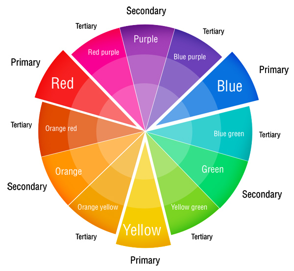
2. Learn your color families. Reds, oranges, and yellows are called warm colors, while blues, greens, and purples are called cool colors. Neutrals are black, white, grays, browns, and beige tones. Sites with predominantly warm tones can evoke excitement, energy, and passion, while sites that use cool tones can be seen as reliable, logical, and tranquil. Sites using neutrals also have connotations of luxury, cleanliness, and traditionalism. It’s possible to warm up or cool down a neutral by going slightly into the warm spectrum, such as leaning to the warm spectrum colors to a reddish-brown or to the cooler side with a bluish-grey.
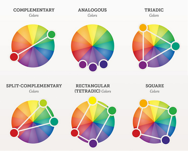
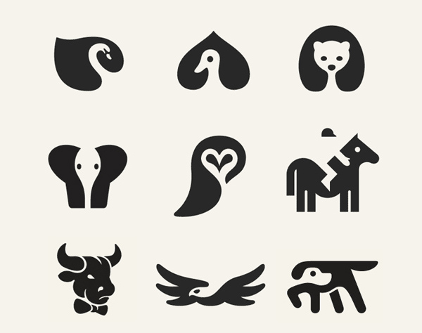
3. Learn about how to combine colors for maximum viewer impact. Analogous color schemes use two more colors from the same family; warm colors with other warm colors, cool colors with cool colors, and neutrals with neutrals. The colors don’t compete with each other, and if done correctly should not appear either to bright, too somber, or too uninteresting. Contrasting color schemes use colors from different groups, but it can be a retina bending experience at if not done very precisely. Monochromatic color schemes use different shades of the same color that is easy to look at and doesn’t overwhelm the message or the merchandise.
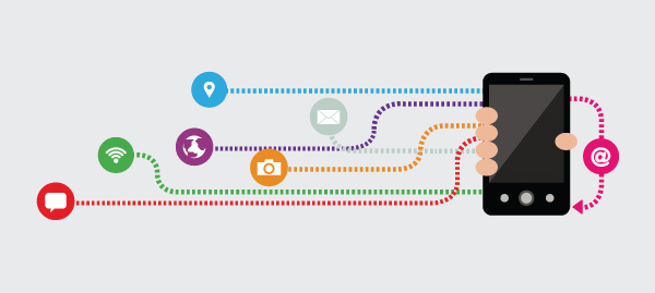
4. Design needs to get past the desktop/laptop dichotomy. With Pew Internet reporting that 58 percent of Americans own and use a smartphone and 42 percent use tablet computers like iPads, design has had to change and adapt. Mobile device users are like anyone else, they have an eight second average attention span, according to Statista, thanks to the overwhelming use of social media. They want their information to load quickly, be presented in a form that lends itself to quick comprehension, and then be able to navigate further. If your design is still Web 2.0 with patterns, textures, spinning logos, and busy tiled backgrounds, someone’s going to roll their eyes, hit the back arrow, and go onto the next listing.

5. Nobody scrolls. Nope, not any more. Instead, present the most important information at the top of the page and offer a way to read more if that information is intriguing enough for the customer to click on a fold. Think of a product page as a brochure. Most people are going to look at the front of the brochure and move on. Some are going to look at what’s on that first page. Catching their attention and then getting them to the first page is the aim of your site. Presenting them with something that tells them what they need to know in the first few seconds of landing will get that click.

6. Trends and gimmicks can be fun, but just ask a frequent internet user what they think of having multiple tabs open and an auto-run Flash module trying to load on every page. They’re going to talk to you about their ad blocking, pop-up blocking, and antimalware browser extensions and add-ons. Let the design and the product or service do the talking for you, instead of trying to grab attention with noise and motion. Nothing makes people more irritable than being slowed down whether it’s on their commute or in their browser window.
These are not the authoritative hard and fast rules, not by a long shot, but they’re a good place to start whether you’re going DIY or using a service like graphic design by GraphicDesignJunction.com. Making your page the best it can be, readable, loadable, and memorable will create a positive and memorable experience for your customers and clients.


")


Awesome tips. Thanks
[…] Basic Graphic Design Tips You Should Know […]
[…] you’re not a graphic designer and you’re not about to take a course in web design, Web.com is exactly what you need to get your […]
Thanks for the great tips
Nice sharing information. if you looking for graphics design company like social media marketing, logo design company and packaging design company then visit my site show my portfolio. i hope like my portfolio design.