Product labelling is one of the most important aspects of product retail; in fact, most big brands spend hundreds of thousands (if not millions) of dollars on product labelling and branding.
The reason for this is simple: most consumers make their purchasing decisions in store, which means that standing out on the shelf is perhaps even more important than all other forms of marketing combined.
This is especially true when retailing products in supermarkets and other chain stores, as typically, many other competing products will surround your product; this gives the consumer an abundance of choice when it comes to purchasing a product.
In such a competitive and somewhat cluttered world, it’s often the simpler, more minimalistic product labels that stand out.
Below, I’ve rounded up some minimalistic – yet visually stunning – product labels with the aim of providing some inspiration.
1 – Mighty Rice
Source: https://www.mousegraphics.gr/
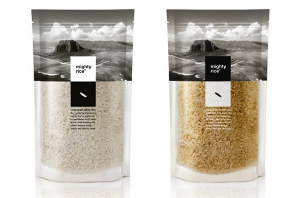
Mighty Rice has opted for a simple yet elegant approach to their product labelling/packaging, which – aside from being minimalistic – also does something extremely important: it let’s the natural beauty of the product shine through.
For Mighty Rice, it’s all about the product, so when they were designing their labels, it was clear that the product itself should be front and centre.
By utilising a minimalistic design featuring some stunning landscape photography (of the location where the rice was actually grown), Mighty Rice has managed to communicate the sheer level of quality to the consumer.
The simple illustration of the single grain of rice places further emphasis on the quality of the product, too.
2 – Eesti And
Source: https://www.tbwa.ee/
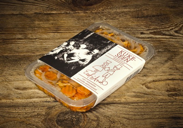
Eesti And is a brand with a somewhat similar approach product labelling as Mighty Rice, as they also utilise stunning black and white photography on the label itself, along with a relatively minimalistic design.
The idea behind Eesti And is that the product should be given as a gift, which is why the label shows a rather minimalistic illustration of the giving process.
The photograph (i.e. the image of the family) further illustrates the concept of family and giving.
3 – Pams Budget Range
Source: https://www.behance.net/gallery/Pams-Budget-Range-Packaging/2616321
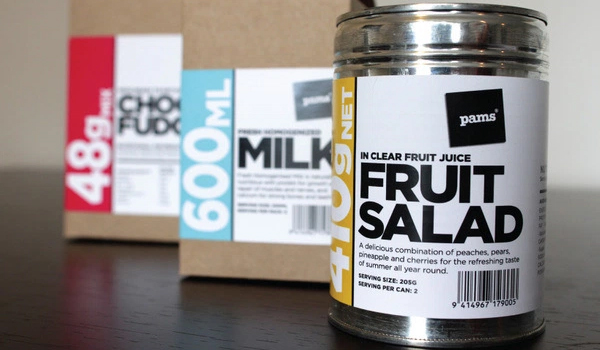
Pams Budget Range may not be the most upmarket brand, but their product labelling is a triumph in minimalistic product packaging.
As you can see, the idea behind the labels is to provide a simple yet clear explanation of the product. The label features the name of the product in big, bold sans-serif typography, along with vital information (e.g. quantities/weights, etc).
It’s definitely a great example of how “budget” product ranges should look.
4 – Simply Oil
Source: https://www.gendall.co.uk/
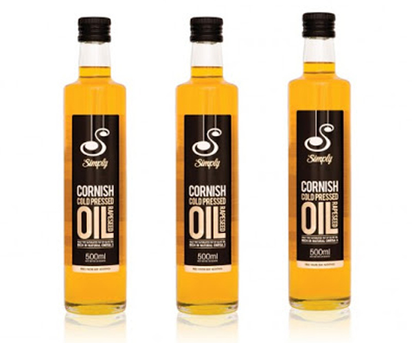
Simply Oil is a UK-based producer of cooking oils, which is a unique selling point in itself.
Their rapeseed oil features a simple yet elegant product label, which shows only the information the consumer needs. The big bold lettering clearly states exactly what the bottle contains (i.e. Cornish cold pressed rapeseed oil) and aside from that, the label features only a couple of other pieces of vital information.
What’s more, the simple black background of the label – set against the bright yellow/golden colour of the oil – further helps the product to stand out on the shelf.
5 – Rare Earth
Source: https://www.behance.net/Gallery/Rare-Earth-Wines/148592
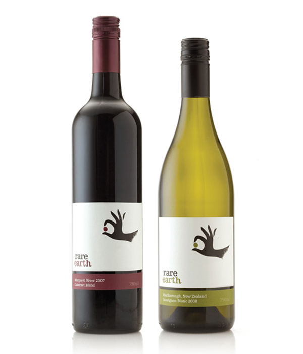
If you’ve ever perused the various wines on offer at your local supermarket, you’ll likely have noticed that most wines feature similar labelling; they usually feature a sketched vineyard or some other overly elaborate illustration combined with over-the-top typography.
Rare Wines has not gone for the norm, though; instead, they’ve opted for minimalistic label featuring more white space than anything else.
The illustration of the hand delicately holding the planet Earth illustrates the fragile nature of the product, and the care that’s most likely been put into producing it.
6 – Kispiac
Source: https://www.behance.net/lakieszti
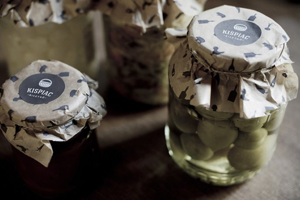
Kispiac is a Hungarian bistro situated in the countries capital city, Budapest, and as you can see, they’ve opted for some seriously minimalistic – yet exceptionally beautiful – product labelling.
After adding their branded paper to the top of their jars, they simply attach a small circular product label (you can get product labels like this from FastLabels) on the top, which features nothing but their logo.
This gives the product a handmade feel, which in turns gives the product a premium look and feel.
7 – Jacqueline Evans Skincare
Source: https://lovelypackage.com/jacqueline-evans-naturopathic-skincare/
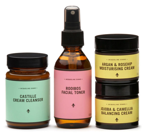
Jacqueline Evans skincare products are well known for their sheer quality, and these extremely minimalistic product labels are the perfect fit for such a product.
Featuring nothing but the brand name (i.e. Jacqueline Evans), a small logo and the name of the product itself, these labels are almost entirely blank.
Despite this, the labels say everything they need to say, and the colourful backgrounds certainly help the products stand out from the crowd.
8 – Mama Brown
Source: https://www.marnich.com/
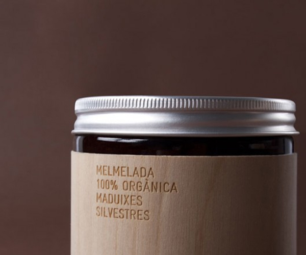
Mama Brown products are not only extremely luxurious, but also 100% organic (as the product label clearly states); it’s a combination that calls for a somewhat out-of-the-ordinary product label design.
Rather than using standard paper/plastic labels, Mama Brown has opted for a thin wooden label, which wraps around the product beautifully.
The wooden label is laser engraved with only vital product information; it looks absolutely stunning.
9 – Froosh
Source: https://www.packagingoftheworld.com/2010/07/froosh.html
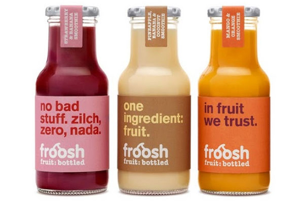
Froosh is a juice brand with a clear unique selling point: their products contain nothing but fruit (i.e. no additives, preservatives, or in the words of Froosh: no “bad stuff”).
With the simplicity of the product being the primary selling point, it makes perfect sense that Froosh decided to represent this USP with a super-simple label.
Each label features nothing but the name of the brand, their slogan (i.e. “fruit: bottled”), and a short one-liner about how their product contains nothing but fruit.
It’s a great design; it looks great and portrays the brand perfectly.
10 – E/M Jam
Source: https://www.behance.net/lakieszti
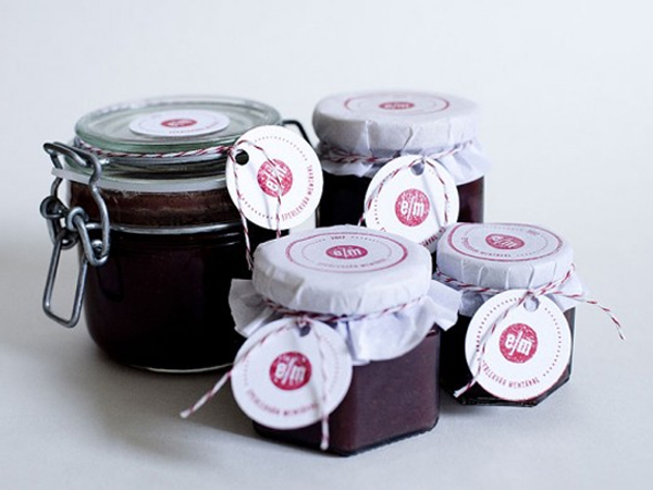
E/M are producers of delicious strawberry jam, all of which is made by hand from local produce in Budapest, Hungary.
The simplicity of the product is reflected in the minimalistic product labelling, which features nothing but the brand logo (i.e. the red circle with the letters “E/M” in it) printed on a plain white circular piece of card.
Combined with the simple product packaging (i.e. a clear glass jar), this labelling showcases the handmade nature of the product beautifully.
