Shapes have to mean. A jagged line is going to be interpreted differently from a smooth curve. Similarly, squares are different from circles. And as shapes for an integral part of any web page, you’re going to design, it’s important that you know what those shapes communicate. Otherwise, your audience might pick up things subconsciously from your web page design that you never intended.
For that reason, it is important that before you just grab a set of free icons, you know what they mean. And so today we’re going to look at the differences between different shapes so that you can consciously choose what you’re going to say. So that your sites, rather than sending conflicting messages to mesh together smoothly, so that your users have a smooth UX and walk away with exactly the message you want.
Shape grammar
There are three basic shape types. These are Geometric, Natural/organic and Abstract shapes.
- Geometric shapes don’t need that much explanation. These are the circles, the squares, the arrows and such. These are the most basic of the shapes and what most people will think of when they are asked to ‘imagine a shape’. Using these kinds of shapes in your web pages suggests structure, organization, and efficiency. On their own they can be slightly uninspiring, however.
- Natural and organic shapes aren’t regularly shaped. They do not have symmetry (at least not immediately obviously symmetry) and often have uneven shapes as well as curves. They can often be calming in that they’re symbolic of shapes we find in nature (flowers, rocks, leaves, trees, etc.) They are often introduced through the use of pictures and can give a very spontaneous feeling. Note that if there are too many of these shapes it can give a cluttered feeling.
- Abstract shapes are human made. These include the wheelchair figure, the man and the women used in many bathrooms, as well as many traffic signs. They also include typographic glyphs and other figures. They have been given meaning through our use of them.
Note that shapes can either be positive or negative, as in they can be foreground and background. Pay especial attention to what shapes you use in your negative space. Though your user might not actually be consciously aware of them, that doesn’t make them less important. In fact, in many ways, it makes them more so as they can come in under the radar.
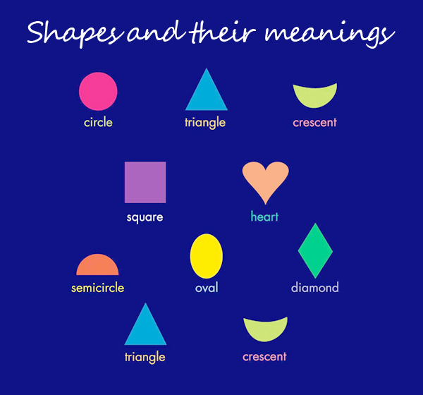
Shapes and their meanings
The first important thing to note is that many shapes have different meanings in different parts of the world. For example, the thumbs up sign might be positive in the rest of the world, but means you intent to jam your thumb up somebody’s anus in the Middle East.
And so, before you use any sign or symbol, make certain that it is not going to offend anybody in some corner of the world that you want to do business with!
That said, some ideas do appear to be quite universal, simply down to the way a shape flows.
Circles – as it has no endings – is often interpreted in many cultures as a sign for endlessness. Similarly, because it has no corners (or an infinite number of corners according to mathematicians) is also associated with smoothness and gentleness. It also has freedom of movement, in that it can roll, which is something that you can enhance through the right shading or use of lines.
For those reasons, it is often associated with community, perfection and completeness.
Rectangles and squares – are more stable. They can’t be moved easily. This means they’re often associated with sturdiness, security but might also be associated with being boring (you’re such a square!).
For that reason, to really make them work, consider adding a tilt. This turns a boring shape into something with far more energy.
Note that rectangles are very common online. They are everywhere, forming the borders around areas, the shapes of buttons and even the dimensions of the screen.
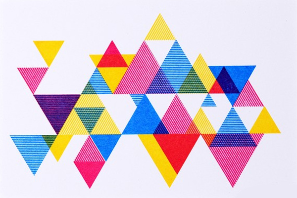
Triangles – can represent stability (that’s when they’re sitting on their base) or instability (When they’re not). They can also imply directions as they are arrows at their most basic, and therefore can also indicate movement.
They can give feelings of conflict or steadiness, depending on how they are used. What’s more, as we like the number three in western societies, they’re often associated with religion, mysticism, and other spiritual concepts.
Spirals – this is a shape that often signals creativity, progress, and nature (spirals are very common in natural phenomenon). They’re also often associated with transformation and are therefore often linked to birth, day, growth, fertility and so on.
The spiral is quite a busy shape and can be distracting to the eye – particularly if there are several of them. They are also strongly linked to mysticism and so if that’s not what you’re trying to go for (for example if you’re trying to build a tech website) this you’d probably be better staying away from them.
Crosses – can be associated with the sciences and mathematics. In an overlying pattern, they once again become rectangles and squares. Obviously, the cross with a longer leg than the other directions has very strong significance in western shapes and shouldn’t be used unless you want to signify religious intent.
On its side, the cross becomes the ‘x’ shape, which is more stable, but also associated with ‘no’ in the subconscious of many people (it’s a hangover from school). It is therefore probably better avoided, particularly if you’re also using the color red.
Background
Remember that in recent years that has been a strong movement away from an over-busy background. For that reason, it’s better not to use too many shapes. Some shapes repeating (provided you choose the right ones) are possible, though that can still be frustrating for the eye and thereby reduce the UX.
Therefore, if you’re trying to organize the working process so that users are more likely to engage with them, it might be best to use shapes sparingly to draw the eye towards the right spaces rather than to distract them.
In that way, you can imbue certain aspects of your page with a strength or significance that the user isn’t even aware of consciously, but that will still influence how they perceive that element as they consume it.


")


