Creating a website for your company, firm or organization is a very useful way to advertise and inform the users and people what your product or agency is about. But more important than that is making the people actually stay on your website to read up about it. You need to make your website’s homepage “stand out” and appeal to the user because as they say, the first impression is the last impression. People generally tend to presume thoughts just as they see the page when they open your website’s link. Here
You may be interested in the following related articles as well.
- 25 Best Vintage Fonts
- Awe-Inspiring Badge & Emblem Logo Designs
- New Web & Graphic Design Freebies : 28 Resources
- Fresh multipurpose Responsive HTML5 Templates & Themes
What Should be on Your Website Homepage
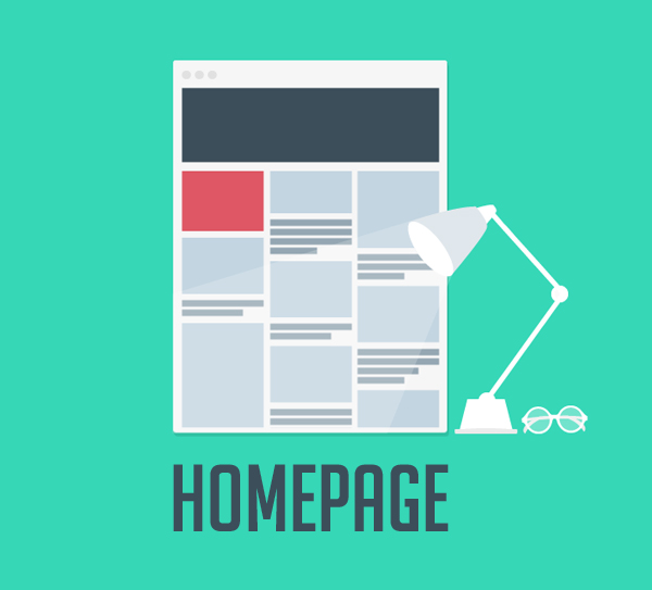
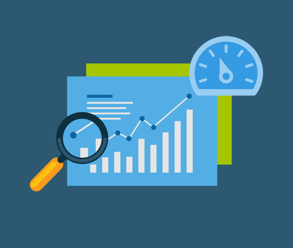
Your website’s homepage must contain information that is clear and to the point. Most important homepage should follow the new trends. There shouldn’t be unnecessary information that bores the user or information that is irrelevant to the purpose of the website. All the data must be organized neatly, preferably in paragraphs to make it easier and comfortable for the user to read and process the information. In case of advertising a product or service, use pictures and videos that give the user a better idea of what your product or service is about and what it offers.
Designing an Ideal Navigation Menu
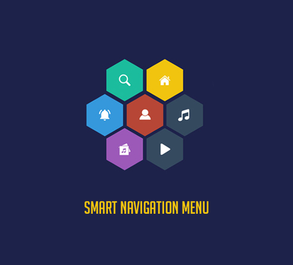
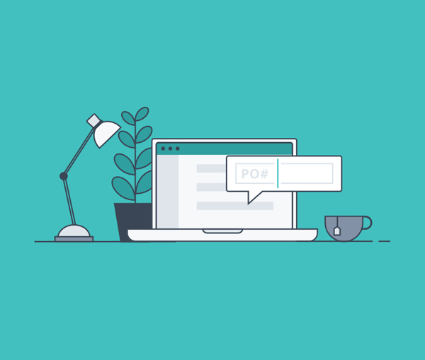
Use an easy navigational homepage that helps the user to easily access all other pages related to your website. Don’t clutter all the tabs and links that confuse the user. Links for the next and previous page should be at the beginning of your page so as to help the user navigate through the whole website easily. Add in common links that link the current page to important pages such as the home page or the contact page. Make the links in words rather than icons that help the user have a better idea of what page he/she is opening.
Principles Of Good Homepage Design
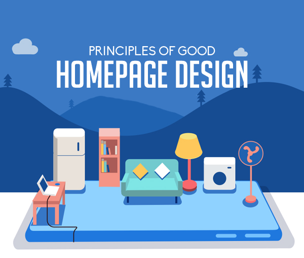
Make your data attractive and appealing. Use colors, themes, and fonts in your homepage and all other pages. Use different fonts for different sets of information, not every time you change a paragraph or sentence. You can even use different text sizes, but just like using the font, don’t get carried away. And don’t use too much large text that has the user scrolling your webpage most of the time. Use common colors for text and similar background theme that adds in an attractive look to the whole page. The most preferable combination is black and white because it is easier for the user to read. Don’t use too many colors; it would only make the homepage unappealing.
Assemble all the information that is easily and accessible and don’t get carried away in making your homepage “too fancy”. Make it simple and clear. People are easily distracted, let them concentrate on one thing at a time and process all the relevant information properly rather than just throwing away in all the information.
Make Your Homepage Load Faster
Remember that users are always in a hurry and want the information quickly. Don’t make your website’s homepage too “heavily” filled with graphics, pictures and videos etc. that make the homepage take longer to load. To make your site’s homepage load faster use more text and less graphic material such as pictures, animations and videos. If graphic material is really necessary on your homepage, use graphical software that can adjust or optimize the resolution or size of you graphic material and help your website load faster. Although many people have fast internet connections but not all of them and maybe not the ones your website is trying to attract. So it’s preferable to make your site fast loading in any case.
Popup Ads Should Avoid at Homepage

Don’t use pop up ads on your homepage and don’t go trying to “over sell” your product using them through other websites and pages. Pop up ads are links and windows that open automatically when you click on a link or tab that may not have been meant for that pop up. Though these pop up ads are used as ways to increase a product’s advertising and in some cases are effective, but they are being used more than necessary and have made many internet users irritated and annoyed. An irritated user is very unlikely to come to your website if he’s been dealing with pop up ads of your product more than required. And if you put more and more pop up ads on your homepage, it would just distract and annoy your users and perhaps even resist them for going through your own website.
Manage Links and Forms at Homepage
In the case of advertising and selling a product of your company through your website, it’s a good idea to include links like purchase, sell, shipping, ordering options, and customer feedback, and any other information that may help the user to be fully aware of what he’s buying. Don’t jumble up all the information on your homepage, rather set up links where the user can comfortably navigate through all the information.
Conclusion
In the end, keep the purpose of your website in mind. Do you want to advertise your product? Do you want to provide online shopping service? Do you want your audience to simply read and discuss about your blogs and articles? Keeping your objectives in mind will help you work more effectively and will help you create a better homepage for your website.
")


This is clearly and the best tips to design homepage layout. Thank you!