Do you want to deliver important, yet overly complex information to your audience in an easy-to-understand way? Or are you finding hacks to engage your readers in the boring statistics? ![]()
Whichever is your case, infographics might be exactly what you need!
Infographics are popular choices when it comes to presenting information in a visually engaging way. They’re designed to break down information and make it easily processed and remembered.
After all, visual content is far more engaging and easily remembered than long textual matter. They are, even, shared and liked more than anything else on social media.
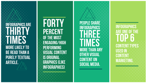
You might have seen infographics highlighting important statistics, here are some important stats about the infographics:

- Infographics are 30 times more likely to be read than a purely textual article. Source: Co-schedule
- 40% of the most engaging and high performing visual content is Original graphics (like infographics). Source: Social Media Today
- People share Infographics three times more than any other visual content on social platforms. Source: Hubspot’s research
- Infographics are one of the top six content types used in Content Marketing. Source: Content Marketing Institute
Famous and popular brands, such as news magazines like Time and Newsweek and web giants like Google, are turning to infographics for communicating information to their audience.
Besides these large enterprises, small companies can also use these visuals. Even when there is a plenitude of free infographics templates and resource available on the internet, not using one is clearly unacceptable.
However, while creating an infographic visual you have to get the best out of it. Here are ten things to remember as you are putting together your own infographic.
#1: Curate Content
An infographic is made up of well-balanced visuals and content; therefore, you have to invest some time and effort in curating powerful and interesting content for your design. Below are some tips to consider:
- Always check your sources
Infographics are famous for distilling a lot of information into a small space and rendering it clear to the audience. However, it is vital that the information delivered is both, accurate and relevant.
Even if it requires a lot of research and double-checking, infographic content should be backed by authentic sources that you can cross-refer for further verification. Misleading data or incorrect statistics not just tarnish your brand’s reputation but they also hurt the readers’ trust.
So, do cite your sources properly at the bottom of the infographics to solidify your credibility. And don’t forget to revise your already-published infographics to edit the statistics that might change over time.
But do not pile up stats in your infographics.
Strip down the less important information and let the facts breathe.
Here’s a good example:

Image: Infobrandz
- Stay relevant and focused
Keep your focus on the main point you want to explain with the infographic. Don’t bury the lead or get bogged down in superfluous information. Make sure that the information you are using supports the main purpose of the infographic and does not stray too far off the main topic.
- Get Powerful Ending
In the end, be more influential. Whether you are ending with a statement or a question, make sure it is interesting and thought-provoking. You can also use a compelling call to action, directing your readers to something you want them to do.
#2: Direct The Eye
Infographics don’t generally take up too much time when they’re being read, but that doesn’t mean that they’re simply brief bursts of facts. The information can still be arranged in a “narrative”.
Once you’ve cherry-picked your information, arrange it in a logical format in which each point seamlessly leads readers to the next. Just like an article or a how-to guide, but with shorter pointers and lesser text.
End each point in a way that the reader gets motivated to read the next points in order to learn more.
#3: Create A Wireframe
Behind every good design, there are backbreaking efforts, thorough research, and lots of time invested.
This could mean a lot of scribbling on scrap paper, or it could mean constructing a wireframe version of your design, allowing you to see how it will look before you actually put it together.
Try your creative ideas! Play around different sizes, spaces, and shapes on your layout that may help you come up with a final design. Doing this may take a while, and the end result will surely worth it.

GIF: DesignMantic
You may try out different form tables and graphs, such as pie charts or Venn diagrams, to present your stats and then go for the type that best suits your content, theme, and topic.
#4: Choose A Minimalist Color Scheme
Infographics are heavy on the graphics, rather than the text, but it’s still important not to distract too much from the information you need to convey. It’s easy to overstimulate the viewer or divert them by choosing colors that are either too bright or don’t really play well with the overall theme.
It’s safe to limit colors in your palette and use contrast to spark the interest. But, you have to be sure your design stays easy on the eyes.
#5: Choose Functional Fonts
Choose the right font, your message will be more powerful. Select the inappropriate one and your message will become ineffective. Sometimes the effects are subliminal but they do exist.
Good fonts make an incredible impact on the legibility and visual appeal of your design.
The main purpose of a font in Infographics (describing content like research findings, reports, and case studies) is to ensure legibility and readability, which is why it should less fancy. However, if your infographics are related to entertainment, you can try playful fonts.
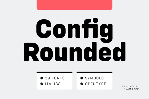
Check out these free fonts to try in 2019.
To put it short, choose a font that is reader-friendly, legible, and powerful enough to draw the interest. For example, check out this infographic on JustCreative blog:

Don’t opt for a font too complicated; remember, the graphics are still telling the larger part of the story in your infographic design.
#6: Opt For Vector Images
This is a deceptively simple reminder, but an important one.
Infographics, especially the more complex and information heavy ones, are often shown in thumbnail format, allowing the viewer to click on them to see the full size. Scalability is thus indispensable in a well-designed infographic.
Choosing raster images will severely affect the ability of your infographic to be scaled to size, and thus damage the legibility and effectiveness of your design.
#7: Trade Text For Visuals
Now that we’ve covered the importance of both choosing a legible font and choosing appropriate types of images, get a sneak peek into your wireframe again.
Is it possible to choose a visual way to convey information rather than text?
Limiting text in favor of visuals is a smart way to make your infographic both memorable and accessible to the viewer. For example, rather than describing statistics in long sentences, you can use visuals, such as pie charts or graphs.
#8: Isolate Your Content
This guideline boils down to using space wisely.
Negative space is being amazingly used in graphic designs. Even if it isn’t immediately noticeable, it plays a huge role in making a design memorable, information legible, and message understandable.
Isolating the elements of your design with plenty of space around them will make it easier for your viewer to process the information within the infographic.
This may require several run-throughs and revisions to make sure everything flows smoothly and usefully across the design.
#9: Edit and Then Edit Again
Right information matters! Infographics are all about delivering accurate information. Even if you have double-checked your sources, typos may occur. Therefore, proofread the content multiple times, as a wrongly placed zero or decimal can completely change the facts. Give it your best shot and make sure it’s as close to perfect as it can get.
It’s also a good idea to have someone else take a look at it, for a fresh perspective.
#10: Pay Attention To The Feedback
Once your infographics hit the internet, you have to be ready for the feedback, both positive and negative. Even if you left no stone unturned to make it a masterpiece, you might get negative feedback. You need to take the criticism constructively.
If any fact is incorrect, even after proofreading, change it. If the text is not legible or font is overly kerned, changing the font would probably be a wise idea.
Final Verdict
The whole purpose behind an infographic is to convey information in an engaging manner. By remembering and implementing these ten things while designing an infographic, you have a great chance of succeeding in your goal!


