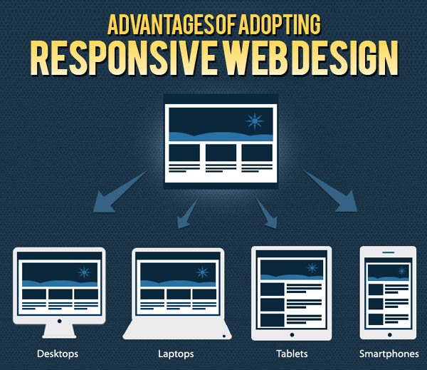
These days, people access the Internet from their mobile phones, computers, tablets, Smartphones, and suchlike gadgets. This trend has led to changes in the concept of Web development. Web developers are focusing more and more on responsive Web design.
The concept of responsive development lies on the principle of change of layout of a website according to the resolution of the screen that a user is using. Thus there is a visible change in the video or image size and the amount of text that can be viewed. Thus, the layout of the website is done to prioritize the elements in a page. Even if you browse a particular page of a website from your Smartphone, you will be able to easily check out all the important elements of the site on your screen.
You may be interested in the following modern trends related articles as well.
- Bloggers should know how to write Good Quality Posts
- 26 Fresh Responsive WordPress Themes
- 25 Useful Responsive Frameworks For Front-End Design
- Responsive Web Design Solutions and Enhance Web Presence
Unlimited Downloads
Over 1,500,000+ Fonts, Mockups, Freebies & Design Assets

There are certain principles on which the responsive web design is based. Given below is a short discussion on the key principles of effective responsive web design:
- Content displayed on multiple platforms: The most important principle on which the responsive web design is based is the display of a website’s content on multiple platforms. The three most important elements of such web design are –
- Flexible Images – Images form an important part of website content. There are images on almost all sites. However, there are times when web designers need to deal with the development of image-heavy websites. Images in a mobile-compatible website need to be scaled down using height and width HTML attributes. Images cannot take up all the space in a webpage, so developers often crop those with CSS.
- Media Queries – It is one of the most important elements of responsive web design. It allows the designers to use the same HTML documents for creating multiple layouts.
- Fluid Layouts – A responsive site should always have flexible layout of content. Parameters like spacing, columns, and containers should be flexible. Now, the web developers do not focus much on pixels for designing. Instead, they use web layouts that need some calculations.
- Interface for optimal usability of the Internet for devices of all resolutions – Did you know that according to the researchers, about 95% of Internet users use their mobile phones and tablets to find local businesses? Thus, there are lot of advantages of making highly compatible sites that can be browsed using tablets, Smartphones, computers, and even mobile phones.
There are loads of advantages of adopting responsive web design – both for the users and the clients.
The major benefit for the users is that they can receive same quality web content for any type of device they use. Thus, they can get the flexibility to use different platforms for accessing the Internet. The users can get all the information they need without zooming or clicking too much.
Responsive web design is an economical option for the clients. It increases the accessibility to clients through various platforms, and they do not have to spend a lot of money in developing websites for each of the platforms. Moreover, the design allows comprehensive and crisp content, which facilitates sale.


")


[…] Key Principles of Effective Responsive Web Design | Web Design …By Muhammad FaisalThese days, people access the Internet from their mobile phones, computers, tablets, Smartphones, and suchlike gadgets. This trend has led to changes in the concept of Web development. Web developers are focusing more and more on …Graphic Design Junction […]
[…] Key Principles of Effective Responsive Web Design […]
[…] Key Principles of Effective Responsive Web Design […]
That hits the target perfectly. Thanks!
[…] Key Principles of Effective Responsive Web Design […]