There are more applications and uses for a business logo in today’s world than ever before. When you design for the digital world, it can include websites, social media, mobile apps and more. That means a wide variety of sizes and a wide variety of backgrounds to mesh with.
There is a wide array of uses in a wide variety of environments. There is a lot to keep in mind as you begin the process of designing your logo for the web. While you consider all that needs to be done for your digital web presence, you’ll also want to make sure that your logo’s transition from the web into print is as seamless as possible.
You may be interested in the following modern trends related articles as well.
- 25 Amazing Digital Illustrations by Professional Designers
- 13 Fresh High Quality Free Fonts
- Useful HTML5, JavaScript Tools and jQuery Plugins
- 26 High Quality Modern Business Cards Design
Here are Eight Easy Tips To Keep In Mind As You Design Your Logo For The Web:
8. Resist the temptation to overreach
Your logo has a very simple job. It’s one of the first visual associations that people will make with your company, so it needs to look inviting and draw your audience in to your larger message. This can be accomplished through simplicity. It doesn’t need to tell the whole story of your brand on its own.
7. Know your color limitations
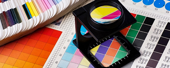
Some colors may work online, but not in the print world. Make sure that you understand how your digital marketing efforts will transfer into the offline world.
6. Grab attention quickly
People make their decision whether to stick around on your website in a few seconds flat. The logo is one of the first visual elements they’ll see. It needs to be warm and inviting, and work to draw people in to consume your whole message.
5. Make sure your logo works everywhere
In short, size matters in the world of logo design. Your logo will need to work as a large element on the page, and a small thumbnail in the corner of the banner. Make sure multiple sizes are considered as you’re in the process of designing.
4. Stand apart from the competition
Keep this in mind as you’re in the process of designing. If you own a coffee shop, a dark green logo with a mermaid on the front could be a really bad idea (think Starbucks). You don’t want to be constantly confused with your competitors.
3. Keep is simple
Some of the most successful logos consist of a simple design element that on the surface does nothing to actually convey what the business does. Think about the McDonald’s logo. There’ s no burger or fries, but the image is easily connectable to the restaurant. You don’t want to overload your web audience. A simple image is really all it takes to draw people in.
2. Sketch it first
The temptation is to go immediately to your design software and see what you can work up. A simple sketch pad can still be the best place to nail down your visual thoughts on how your brand should be represented.
1. Know the brand
The logo needs to be a true reflection of the brand. The web is a crowded place, and the logo needs to quickly give people an idea of what kind of business you are.









[…] sure that your logo’s transition from the web into print is as seamless as possible. Continue Reading Advertisements Author: Team Member Being a member of team, I really enjoying my […]
Good tips! I´ll keep it all in mind.
[…] and the artistic value of the image that represents the brand as well as the organizations. When designing a new logo, it should be done in such a way that the customer is able to recollect and recognize the logo […]
[…] and the artistic value of the image that represents the brand as well as the organizations. When designing a new logo, it should be done in such a way that the customer is able to recollect and recognize the logo […]
[…] channels one can use to reach customers. There are numerous tools that are available including the print, mobile and online media. In as far as user experience is concerned, the digital marketer is supposed to identify the […]
[…] and the artistic value of the image that represents the brand as well as the organizations. When designing a new logo, it should be done in such a way that the customer is able to recollect and recognize the logo […]
[…] is all about. The common theme is then linked to your company name as well as your company’s logo in the minds of the consumer. Once this happens, you will have achieved great success in […]