A creative packaging design concept can make a big impact to increase awareness and sales in modern world. Modern packaging is the technology of enclosing or protecting products for distribution, storage, sale, and use. Technology was involved in a long term packaging strategy project developing the visual identity in any category. When you need to get a lot of attention for little money, make eye-catching, attractive, modern packaging design of your product.
In this post we are gathered a showcase 26 modern packaging ideas, packaging concepts and packaging design examples for your inspiration. So enjoy the inspiring designs and let us know by commenting below:
You may be interested in the following modern trends related articles as well.
- 30 Remarkable Examples Of Typography Design
- Professional Brochure Designs (Premium Collection)
- Creative Advertising Posters: 36 Fresh Examples
- 25 Outstanding Examples Of Branding, Visual Identity and Logo Designs
Creative Packaging Design Examples
Excellent product research is key to any packaging design. Sussing out your competitors, their income, their resources spent and finding out the consumer opinion on these packaging design is essential. Only once you have all of this information at the tips of your fingers, can you let yourself design to your hearts content.
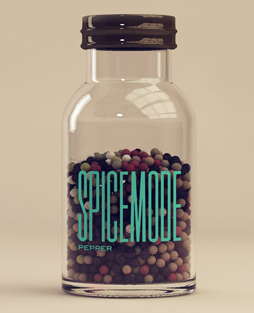
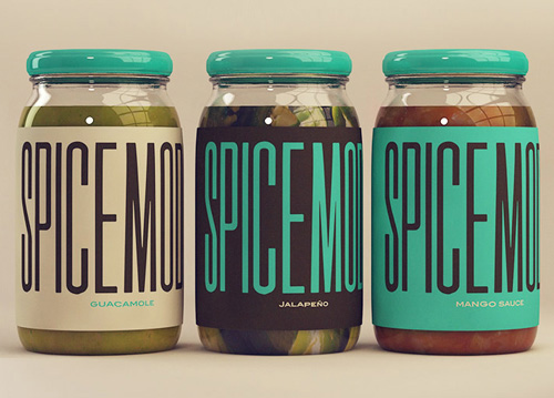
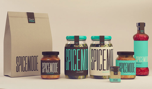
Spicemode by Isabela Rodrigues
Spicemode is a s line of international specialty food products is focused on showcasing all-natural, handcrafted and healthy versions of the flavor-forward and vibrantly-spiced curries from India.
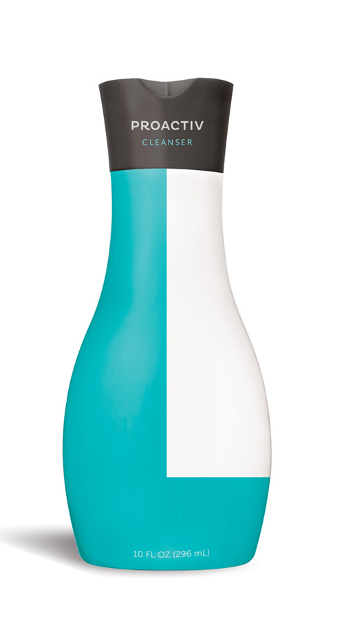
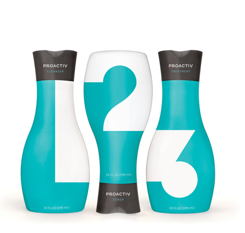
Proactiv Packaging by Kate Carmack
A gender-neutral packaging redesign for Proactiv Solution, an acne treatment system. The new bottles were designed to appeal to teenagers-Proactiv’s target market—by utilizing the more sophisticated look of a beauty product in place of its current “medical” appearance. The minimalist design highlights Proactiv’s very simple 3-step process, and the geometric, interlocking numbers suggest that each step is akin to a puzzle piece; integral to the completion and efficacy of the system.
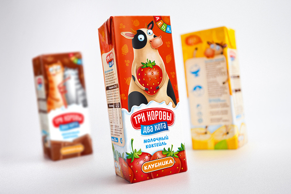
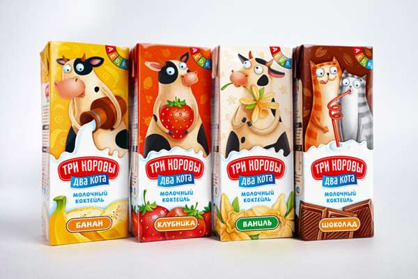
3 cows 2 cats by Olga Mosina
The cocktail line includes 4 of the kid’s favourite flavours: banana, strawberry, vanilla and chocolate.
Due to limited package space we decided to create a separate hero for every flavor and two heros for chocolate flavor (two cats) – he appears on the face of the package.
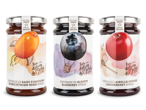
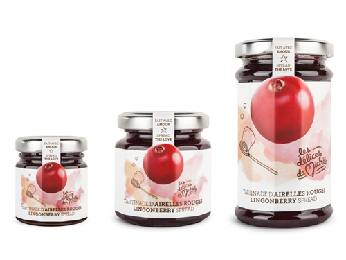
Delices de Michele – Brand Identity & Packagings by Chez Valois
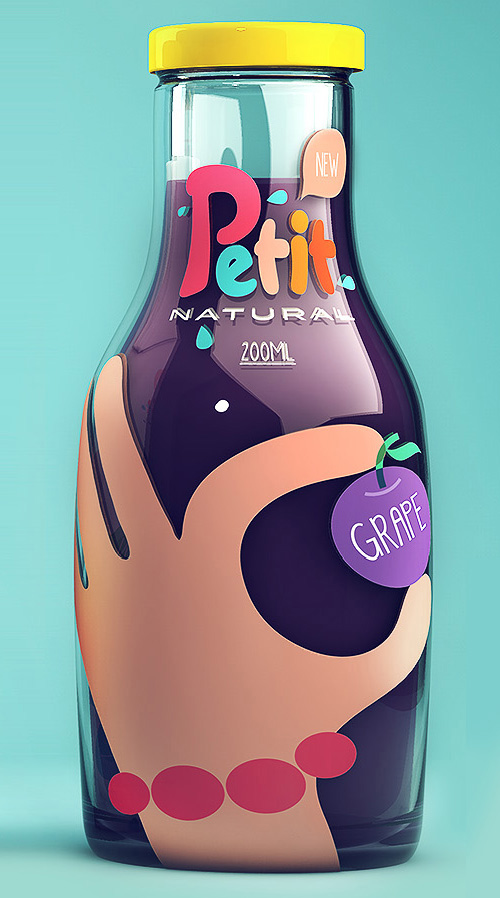
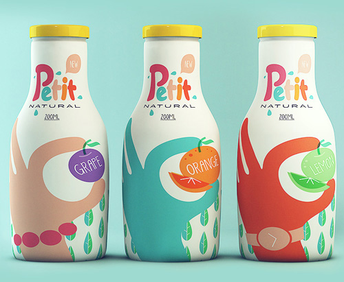
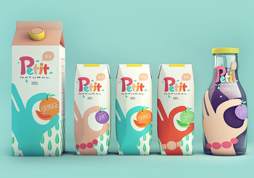
Petit Natural Juice by Isabela Rodrigues
These funny collectible juice packaging were developed with all our affection for children, “les petits”. With tetra pack packaging that retain more natural juices, all packages have been designed in a sustainable use, with papers and returnable bottles.
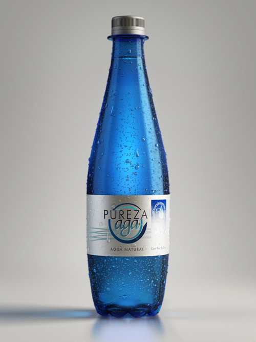
Pureza Aga by Antonio Luna
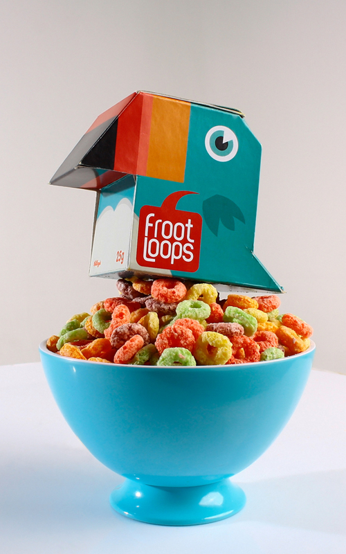
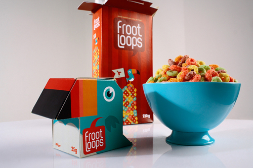
Froot Loops Packaging Design Concept by Diego
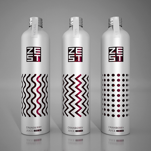
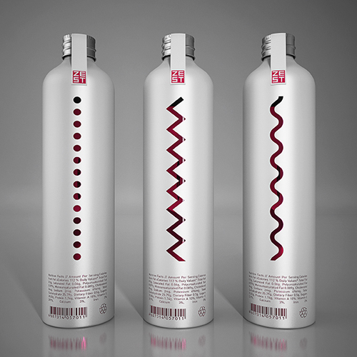
ZEST by Derrick Lin
Zest is a low calorie superfruit juice sweetened with Stevia that was developed to satisfy the most health-conscious consumers. It is made of all-natural ingredients and contains no preservatives, aromas or colorings. The beverage is packed with fruits that are high in antioxidants and that offer strong health benefits for a healthy and tasty refreshing experience.
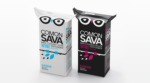
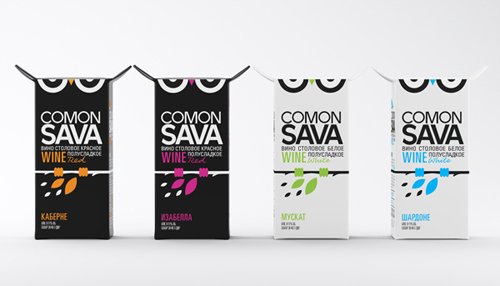
COMON SAVA by Maxim Kadashov
Beautiful package design concept of COMON SAVA. It comes from French greeting “Comment ca va” which sounds very similar to Russian word “sova” (owl) and altogether with “comon” it sounds like «come on sova” (which is literarily is come on owl!). These phonetic synonyms are perfect match because the main hero of this pack is owl by itself.
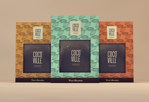
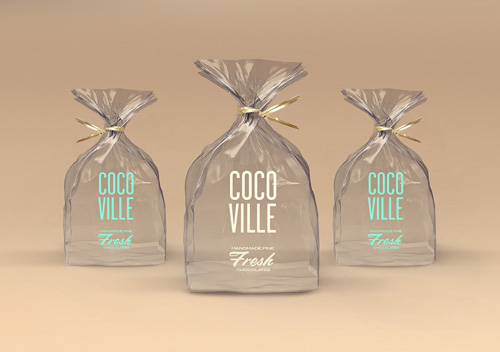
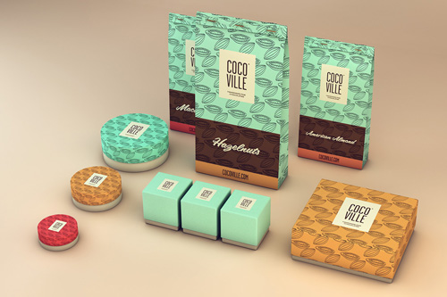
Cocoville – Handmade fine chocolates by Isabela Rodrigues
The Isabela Rodrigues Sweety Branding Studio also loves chocolate and loves amazing brands.
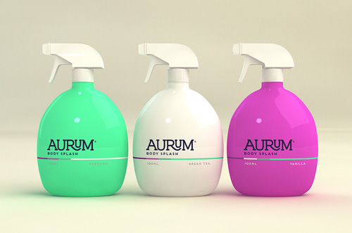
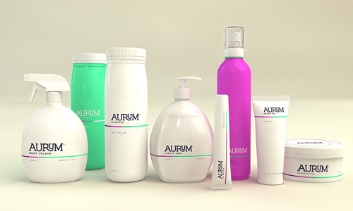
Aurum by Isabela Rodrigues
Aurum is a brand of natural cosmetics focused on organic products.
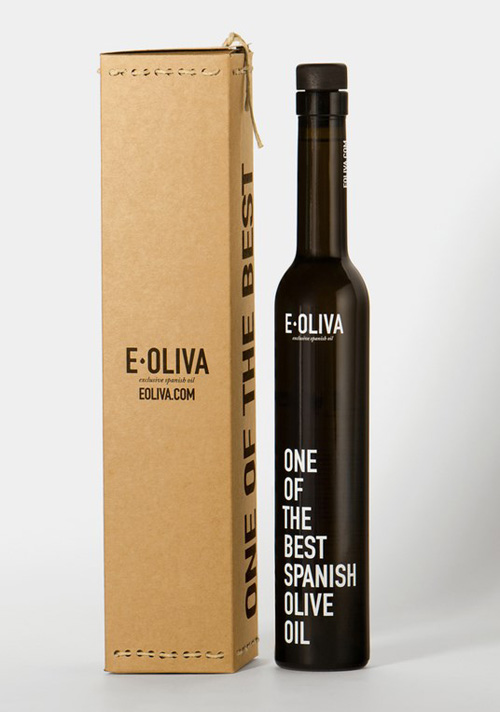
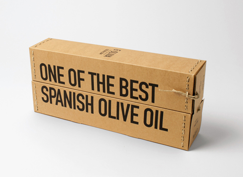
Eoliva Packaging Design by
In the packaging, the handmade tradition is translated in the utilization of noble materials, formal and conceptual related to its origin, to the tools and the processes where the product is born. The paper gives our product a natural language. It is accompanied by a manual sewing, where quality rules over complexity. It has been conceived since the beginning as green thinking product. That is the reason why the pack does not use any kind of adhesive and is produced exclusively of biodegradable materials.
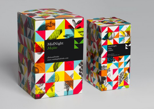
MidNight Drinks by Mucho
MidNight drinks is proposing a unique idea for cocktail consumption. Using a simple system involving a backing box with cocktail mixes and a box shaker, their intention is to revolutionize the way people create cocktails both in bars and at home. The cocktail mixes maintain the essence of classic cocktails but this new method results in surprisingly excellent quality cocktails.
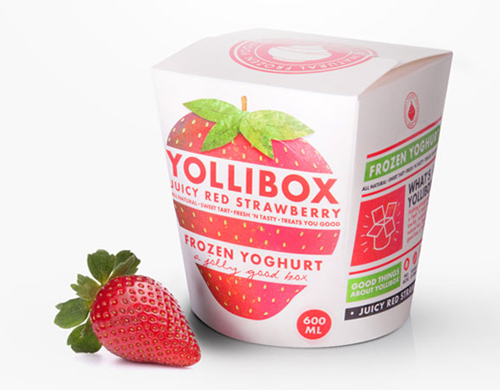
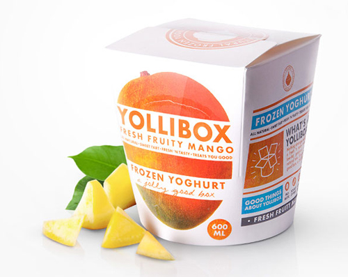
Yollibox Frozen Yogurt by Erenstrahle & Wagnert
“Yollibox is introducing frozen yoghurt for the Swedish market. Made on only natural ingredients it’ a healthy choice instead of the swedish ice cream and sorbet.” As an alternative choice from Ice Cream and Sorbet, Yollibox comes in a unique package, half way between a box and a traditional pint (if you ask me, it also resemblance a chinese ‘take out’ box).
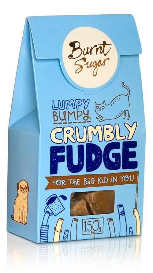
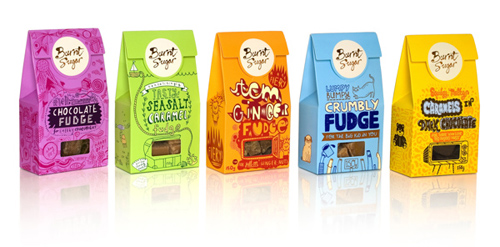
Burnt Sugar packaging by d.studio
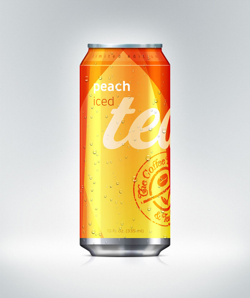
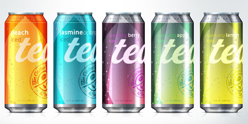
Coffee Bean and Tea Leaf by Daneille Duran
“Our concept was to be bright, refreshing and innovative. The biggest challenge was to visually communicate carbonated to non-carbonated, the fruit flavor and that it is, iced tea in a can. We wanted to stand out with a bold design, but still maintain a classic and clean look.
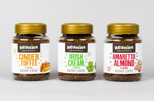
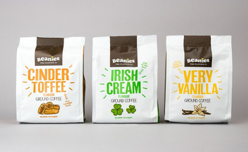
Beanies The Flavour Co by Robot Food
Beanies The Flavour Co. has launched a range of flavour coffee exclusively for Sainsbury’s, with a new design created by specialist branding partner Robot Food. The creative team worked in close collaboration with Sainsbury’s to deliver exactly what it felt was missing from the shelves. Beanies’ commitment to satisfy the retailer was rewarded in volume orders, which are hitting the shelves by mid July.
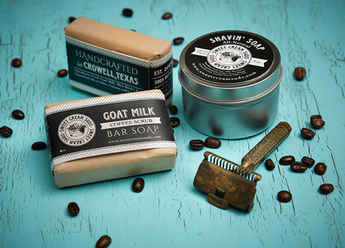
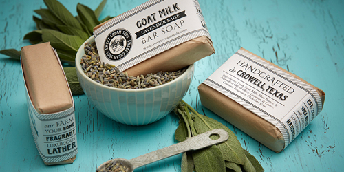
Sweet Cream Suds by Maeve Rogers
The concept was to capture an old-town general store feel using a mixture of delicate and playful fonts with subtle decorative elements. The one-color design not only allows an economical solution for a start-up business, but also emphasizes the company’s commitment to using pure ingredients in their products.”
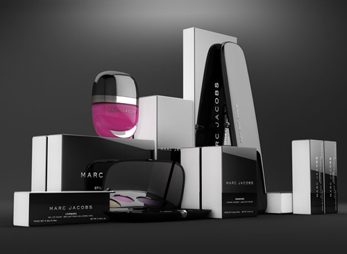
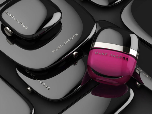
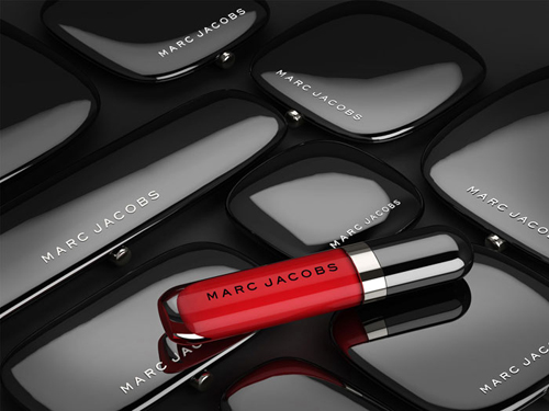
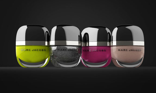
Marc Jacobs Cosmetics by Established
Design studio Established was specially selected by Marc Jacobs and Sephora, the world’s best-known specialty beauty retailer, to partner on the design of Marc Jacobs Beauty. The highly anticipated makeup line will be sold exclusively in Sephora stores across North America and available on August 9th.
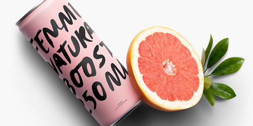
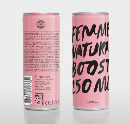
Femme Natural Boost by Ehrenstrahle & Wagnert
Femininity and independence were the key words in the creation of Femme’s brand, which included a complete graphic profile and packaging design. In terms of branding we wanted to express attitude and self-confidence with the female at the heart of it, which sets Femme apart from other competitors in the energy drink market. By working with a saturated yet distinctive color along with hand-drawn typeface, the can got an expression that was feminine without being perceived as cliché-like.
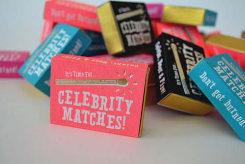
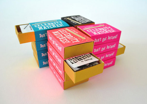
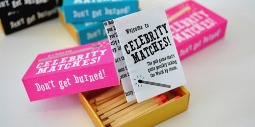
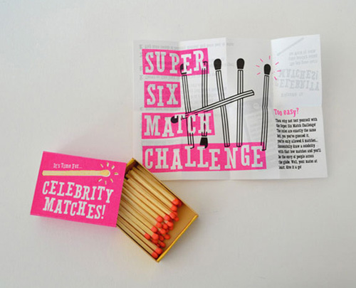
Celebrity Matches by Nick Yates
Celebrity Matches is Pictionary with a greater risk of third degree burns. UK based designer, Nick Yates was inspired by a game his tutors and her friends would play whilst at a pub – simply from playing around with matches. As an excuse to play around with print techniques and packaging, he decided to make it a reality.
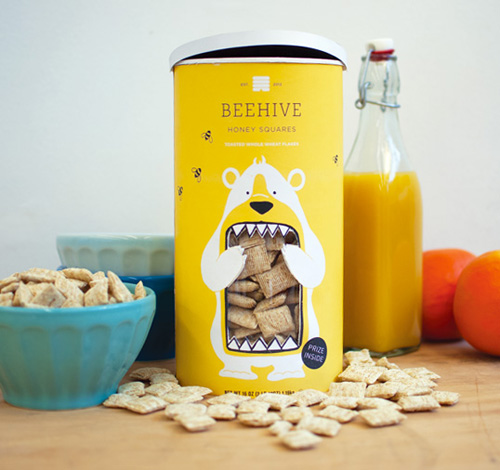
Beehive by Lacy Kuhn
The Heartland line of breakfast cereals is a newly conceived experiment by the National Cereal Corporation. The marketing strategy is based on the celebration of breakfast cereal’s all-American roots. Each flavor will be named after a state’s nickname; the pilot being Beehive Honey Squares. The packaging seeks to stand out from the competition, a blatant contrast to the standard cereal box approach.
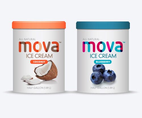
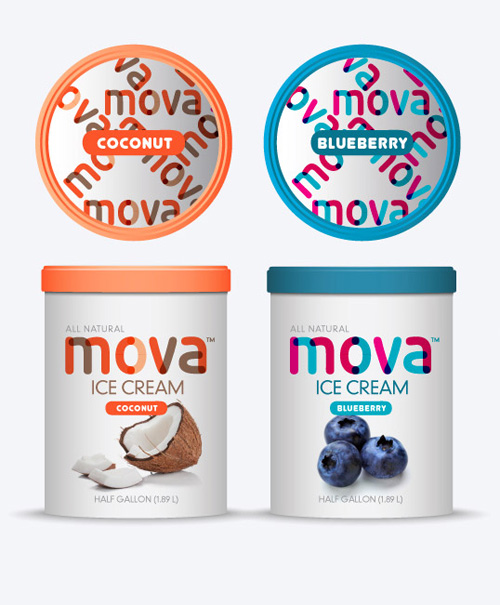
Mova Ice Cream by Luko Designs
Mova Ice Cream is an English brand ice cream and is now being introduced to the American market. Based in the heart of England’s beautiful Camden District, the business is run and owned by husband and wife team Matthew and Isabel Mova. Mova Ice Cream is full of the finest ingredients skillfully blended into an exciting feast of flavours that are purely indulgent.
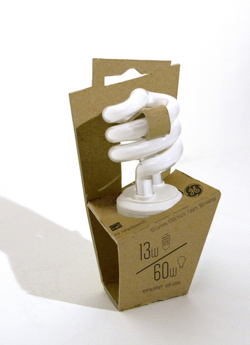
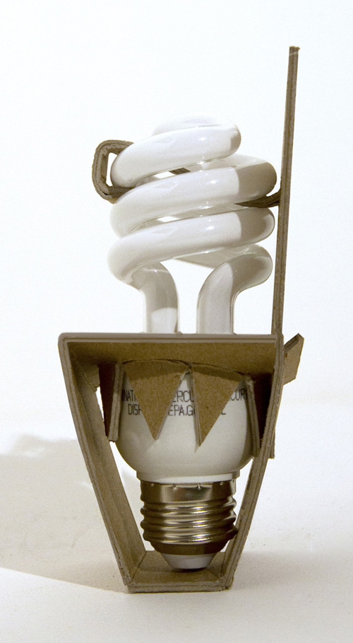
Green Packaging by Kate Allaire
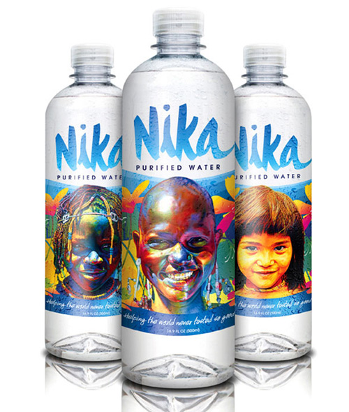
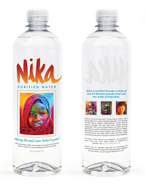
Nika Bottles by Stephen Bennett
Nika Water is social cause-driven, eco-responsible, premium bottled water, currently sold in thousands of nationwide retailers. This includes major natural food stores, in addition to cafes, coffee shops, delis, nightclubs, hotels, schools, fitness and beauty locations and more.
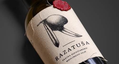
Razatusa Olive Oil by Sesnic & Turkovic
The Croatian olive-producing region of Razatuša gave this extra virgin olive oil its name. The logo consists of the majuscule “R”, composed of olives and leaves. The application of the label is kept simple, since the family business does the labelling on its own. Accordingly, the label was designed so that it can easily be slipped onto the bottle and then fixed by a wax stamp. The harvest year can be written on the label by hand, while its fabric also prevents drops of oil from dripping onto the table.





[…] 26 Modern Packaging Design Examples For Inspiration […]
[…] 26 Modern Packaging Design Examples For Inspiration […]
[…] A crip looking package. Via Graphic Design Junction. […]
Good … thinking… good concept.
Thanks for such informative article. i am seeking this tropic for one month.
I would like a nice logo/brand for my products. I much would you charge.
Hi Tamara,
Kindly send your details or queries at info@graphicdesignjunction.com
Thanks
Hello
well while surfing the net , came across your art work , we were looking for lable designs. product branding art work. We understand that you have a cutting edge on the filed of designing .