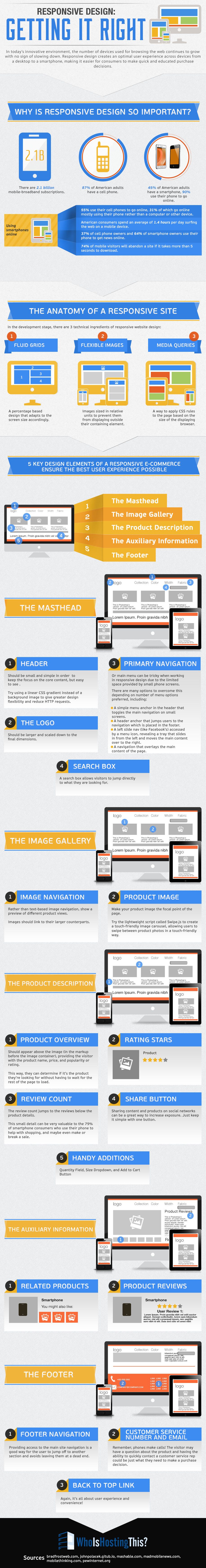
Technology is becoming more and more ubiquitous in today’s consumer market. Browsing and shopping occurs on computer, tablets, and smart phones. With over 2 billion mobile-broadband subscriptions, responsive design that works well across multiple devices is crucial to help consumers become customers.
When developing a responsive site, grids of information must adapt to different screen sizes, images must be flexible to fit into the appropriate space for each device, and CSS rules must apply suitably to varying browser displays. These set the foundation for a functional and attractive site.
You may be interested in the following modern trends related articles as well.
- Free Flat Icons Set for Websites, Apps and Infographics
- Some Useful Points about HTML5
- High Quality Retina-Ready and Responsive WordPress Themes
- 18 Fresh Free Fonts for Designers
Unlimited Downloads
Over 1,500,000+ Fonts, Mockups, Freebies & Design Assets

The five elements of the site must also adapt to being viewed on various devices. The masthead generally includes the header, logo, primary navigation, and search box. Each part should be sized and organized to give proper focus to the content. Remember that mobile devices are great places to integrate contact through phone or email, so that consumers can easily ask questions.
The user experience is crucial to any website. By designing responsive sites to suit the screen sizes and browsing capabilities of multiple devices, consumers can shop enjoyably and productively.
Source: whoishostingthis.com
")


[…] to varying browser displays. These set the foundation for a functional and attractive site. Continue Reading Advertisements Author: Team Member Being a member of team, I really enjoying my […]
[…] See on graphicdesignjunction.com […]
[…] See on graphicdesignjunction.com […]
[…] Responsive Design: Getting It Right [Infographic] […]
Responsive designs also affect website SEO according to Matt cuts