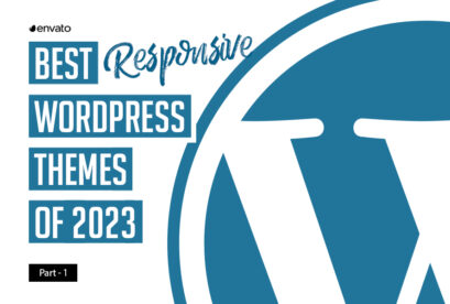
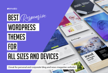
High quality, retina-ready responsive design WordPress themes are always better than the free ones, premium themes have many options like parallax, ultimate fonts, slider plugins and more. There is a huge variety and choice available online in responsive WordPress themes. These WordPress themes are available according to the type of WordPress page that the customer wants the themes for. Premium WordPress themes for Magazine, Responsive web design and blogs are popular with the WordPress users.
This is a collection of perfectly responsive and beautiful WordPress theme with a unique designs. All themes are come up with massive admin including a template customization, drag & drop page builder, unlimited fonts, colors, backgrounds and sidebars which makes your work easier to run your powerful website. All these are fully responsive and tested on latest WordPress version.
You may be interested in the following modern trends related articles as well.
- 18 Fresh Free Fonts for Designers
- 22 High Quality Modern Flyer Templates
- 20 High Quality Responsive WordPress Themes
- Responsive WordPress Themes: 10 Fresh & Free Themes
Unlimited Downloads
Over 1,500,000+ Fonts, Mockups, Freebies & Design Assets

Responsive WordPress News, Magazine Themes
If you want a better response to their web page a great idea is to invest in a quality premium WordPress theme rather than opt for the standard free themes on WordPress.
Today i would share 10 retina-ready responsive WordPress themes for you, which are best to use your next site.
Manshet – Retina Responsive WordPress News, Magazine Theme
Manshet Word press Theme Is Perfect For Personal Blogs Magazine Sites, Modern and fully responsive (try resizing your browser) , And Portfolio. Manshet Looks Fun And Sophisticated You Can Have Fun On The Run By Posting Videos, Photos, Links and more ..

Aziza – Responsive Multipurpose WordPress Theme
This professional and most flexible and responsive WP theme is the real thing, and useful for all business purposes. Do you want to build a corporate site, a shopping site, a multilingual site, or maybe a forum site

Pandora Box: Onepage WordPress Template
Pandora Box – creative and minimal onepage WordPress Template for mobile developers.

Pandora – Responsive WordPress Magazine Theme
Pandora is a powerful theme with fresh and crisp design and responsive layout built especially for the news, magazine and blog sites. Theme offers lots of features as unlimited color schemes, sidebars, Google Fonts, reviews, rich formats, post banners, secure contatc forms with reCAPTCHA and a lot more. You can create as many feature pages as you want.

Rudermann – Responsive Retina Ready Theme

TheOne – Responsive WP One Page Parallax
TheOne is the most awesome one page WordPress theme. Your visitors no longer have to spend time clicking through navigation menus searching for the piece of information they’re after. TheOne is easy to customize with our SmoothThemes Framework that include a Drag & Drop Page Builder, shortcodes, custom widget, fonts selector to help you easily customize your theme without any coding.

FLIP – A Unique & Colorful WordPress Theme
A unique and colorful (or not, if you don’t want it to be) portfolio-style blog theme. WordPress 3.6+ Ready, Totally responsive. Works on desktop, tablets and mobile phones. Totally awesome flipping homepage slider

Drive – Premium and Responsive WordPress Magazine
Drive is new theme for magzines with responsive layout, modular and flexible homepage and build-in rating system. Drive with its elegant design is built for heavy-content websites, but it is suitable for personal blogs too!

Corsa – Retina Responsive Creative OnePage Theme
Corsa is modern professional and flexible one page parallax WordPress theme, developed with great attention to details. Theme can be used for any type of website: business, corporate, portfolio, products, marketing, etc. You can modify layout, styling, colors directly from within the backend.

OneUp – One Page Parallax Retina WordPress Theme
OneUp is a fully responsive HTML5 Retina enabled One Page WordPress Theme suitable for any kind of creative or business use. Built upon the responsive Twitter Bootstrap framework, the theme is highly optimized for both mobile and desktop platforms. One uses lazy-loading of images and compression of all required scripts, meaning not only will your website look great, but it will also be lightening fast. See below for some of the awesome features included in this theme.


")


[…] themes for Magazine, Responsive web design and blogs are popular with the WordPress users. Continue Reading Advertisements Author: Team Member Being a member of team, I really enjoying my […]
[…] High Quality Retina-Ready and Responsive WordPress Themes […]
[…] High Quality Retina-Ready and Responsive WordPress Themes […]