Responsive Web designing is one of the most important requirements for almost every business establishment. Without a proper website, it is almost impossible for website to function. A website requires to be attractive and user friendly so that users can use it comfortably. If a user to the website is satisfied then he may choose to show interest in your establishment. For this reason it is very essential to have a flawless website so that there are no problems faced by the users of the website and such users would be able to develop a favourable image about you.
You may be interested in the following modern trends articles as well.
- 26 Awesome Hand-Lettering & Typography Designs
- 28 Fresh Photoshop Free PSD Files for Designers
- 15 New Responsive HTML5 WordPress Themes
- Photoshop Brushes: 25 Sets of Free Brushes for Designers
Unlimited Downloads
Over 1,500,000+ Fonts, Mockups, Freebies & Design Assets

There are usually some very common mistakes made in case of responsive web designing. This mistakes are sometimes not a major mistake, but they turn out be really deeming to the makers of the site. Although these mistakes apparently appear to be very trivial, yet one has to learn that these slight errors can cause a great of difficulty for the users.
Some of the common mistakes that occur but certainly needs to be checked are:
Forgetting to keep magnification facilities

Not everybody has the best eyesight. They may be having problem in reading small texts. In the absence of such magnifying facilities the user may even be understand to understand the message that is desired to be conveyed. In most cases such a user would not waste any effort in trying to read it, he would instead go to some other website to fulfill his requirements. A magnifying facility would help in allowing the viewer to get a better image and understand the contents better. Having a zoom is very simple, but makers often do not find the importance to include it because of the lack of empathy, where they do not realize what issues others may face.
Opting for breakpoints instead of a better optimized layout
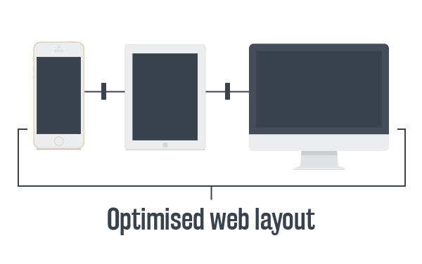
A breakpoint is not the best option if one is using a kindle or such similar gadgets. These break points can be substituted with different layouts that would help in using such devices without any problems. It also makes the website very user friendly, especially in case the user uses some gadgets where break points are not easy to read. Generally the only problem with changing such layouts is that it would require to be tested extensively before making it applicable.
Having a very large file size is a sin in the online world

Not everybody has high speed internet access. Moreover, there are certain areas where there is a limit to the download capacity. In such a case if a person comes to know that the website would take up a lot of internet space or it would take a really long time for the site to be downloaded, then he would certainly try not to use that web site at all. This means that with a large file size there is a risk that a person may not even opt to use the site and hence all the contents would be unseen.
Missing the home screen icon
A home screen icon is a simple thing, but it is very essential. While surfing the site a person would certainly want to use the icon to return to the home page frequently so that he could surf easily.
Forgetting to make the site look elegant

Nobody would like to see a congested site. They would prefer it properly arranged and easy to use.
Conclusion
A simple thing may make immense difference not only to the website but also to the user, as the website is the first image that an outsider would have about an establishment.


")


[…] Responsive Web Design mistakes you better make a note of […]