Flat. Responsive. User scenario. UX. UI. Patterns. Grid. Flow. iA. Mockups. These are only few buzzwords for anyone who builds responsive websites. If you aim to be one of these guys who rock the digital world, than stick to us and find out more.
- There’s no Future for Mobile Websites. The Future is Now.
It’s a fact that people are spending an amount period of time playing with their mobile gadgets: smartphones, iPad or Apple Watch. Starting from here, business owners are becoming aware of the huge impact that mobile devices have into our lives.
That’s why, adapting to these trends is a must and being able to understand them from A to Z is the only gateway to survive, for designers, users and prospective clients as well. So if you want to continue your creative path you should know that Qards is here to guide you. This visual editor for WordPress is one of the best tools available for building mobile friendly websites.
At the end of the journey you will have the full stack of details and insights to make it happen so let the fun begin. Below we explain how you can easily create a mobile friendly website with Qards. You can do it for a wide range of clients, no worries.
Step 1
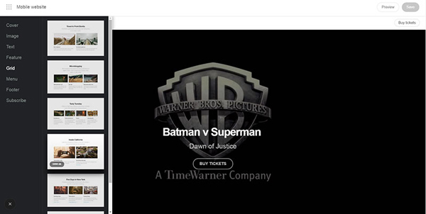
Here we go! Let’s use a video in the big cover section: you can do that in the blink of an eye, thanks to Drag & Drop builder. Afterwards, select Grid from the main menu (click on the + icon) and choose the pre-designed card that matches your needs. You’re done for now!
Step 2
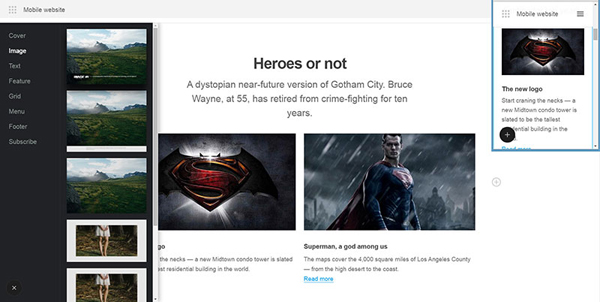
Inserting an image with Qards is simple & fast. Now, you can build more by uploading more pictures and blocks of content as well. You can easily duplicate them in order to save time. Choose from the stack of pre-designed cards everything that fits your creative approach.
Step 3
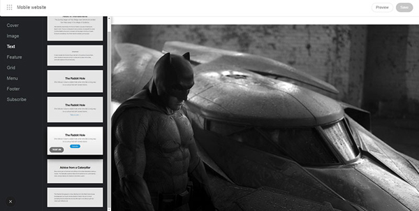
A website without a single call to action is almost useless, right? Let’s change that in minutes. Select Text from the menu and add a relevant and catchy call to action. Don’t forget that people are looking for relevant reasons in order to click on it. Otherwise, they don’t.
Step 4
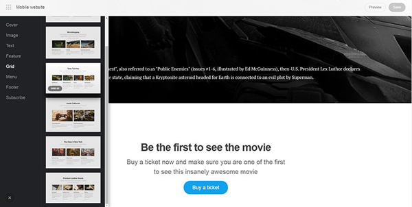
Back to grid! Choose another stunning pre-designed card and continue to build a beautiful mobile friendly website. Keep in mind that you can change a bunch of items so that everything is spotless. If needed, feel free to modify colors, fonts, sizes and everything related.
Step 5
Similar to call to actions, the subscribe forms can bring a lot of value. You can create one by clicking on the Subscribe option front hemenu and make sure you start a productive dialogue with your users, readers, clients, you name it.
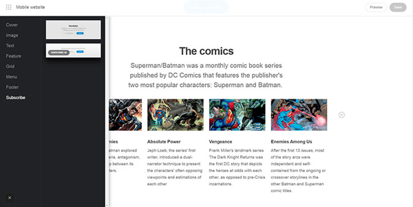
Step 6
Here’s a preview of your mobile friendly websites. As you can see, everything is flawless: from the main navigation to the size of the font, the whole www is a provider of great user experiences. Even the images are adapted to this challenging format. Congrats!
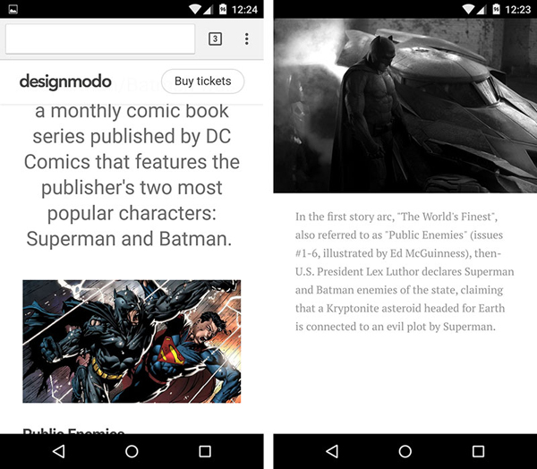
Step 7
It’s time to admire your beautiful and creative work by clicking on the full screen version. You will have to face a great surprise. Thumbs up for building another great mobile website!
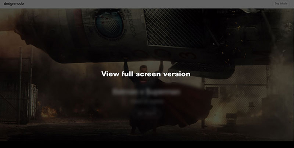
Easy, right? With the following features next to you building mobile friendly websites will be piece of cake. The best part is that Qards comes with 50% of the job done so you don’t need to start from scratch:
- Pre-designed cards for everything you can think of (from uploading an image to adding a call to action button, Qards is there to help);
- Typekit integration for creating beautiful storytelling by providing great fonts to choose from;
- Customizable backgrounds (you can also make them interactive by inserting an eye-candy YouTube – just copy-paste the URL);
- Drag & Drop builder because we simply love to get our job done in minutes;
- SEO friendly for getting a spike in Google ranking;
- Cache ready for the big players, such as: W3 Total Cache, WP Super Cache, Quick Cache;
- Flexible items, ready to be changed in any way you feel like.
Check out some websites built with Qards below:
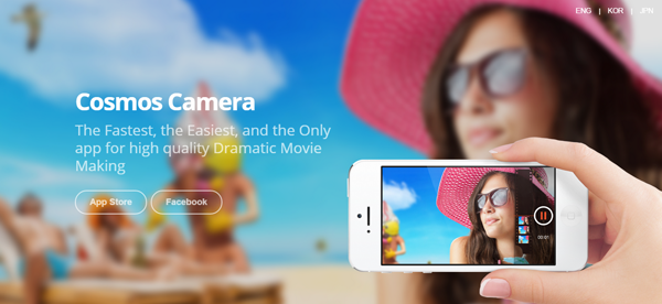
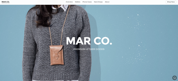
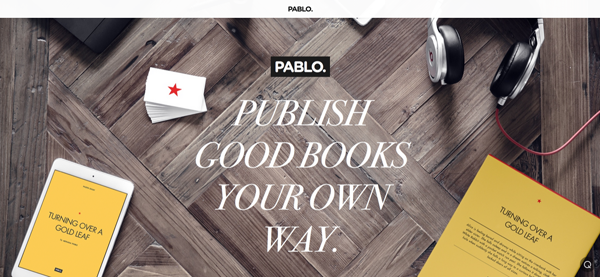
With all this stack of benefits, the only real challenge is to make room for your creativity in order to achieve award-winning results. Start now with Qards!

