Creating a well-designed and effective leaflet is often much more difficult than it initially sounds.
Not only does a leaflet have to look good (in order to stand out from the crowd), but it also has to fulfil the objective(s) of the organisation for which you’re creating the leaflet.
It’s this part that often ends up taking the bulk of your time as a designer, as you not only need to think about the visual design aspects of the leaflet, but also, the layout, aim, target demographic and overall branding, amongst other things.
It starts to get even more difficult when you consider that there are a number of different reasons companies decide to create leaflets these days. For example, one company might simply wish to create leaflets as a branding exercise (i.e. to reinforce their brand position), while another company might be looking to attract direct sales from their leaflets, and another company might simply be aiming to get readers to visit their website.
It’s your job as a graphic designer to ensure that the leaflet fulfils the objective and has the desired impact, which can often be a tall order to say the least.
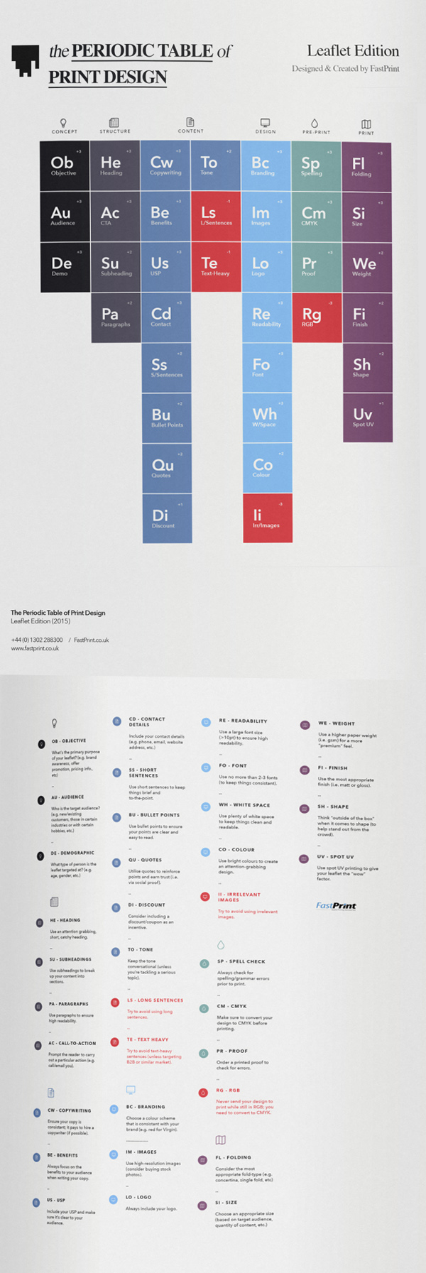
The good news is that there are a handful of elements that most successful leaflets are likely to have, and I recently came across an infographic that does a great job of documenting these elements in a visual format.
A Visual Guide to Leaflet Design (Infographic)
You’ll notice that the infographic has been designed to resemble a periodic table; however, unlike the original periodic table (which lists almost 120 chemical elements), the periodic table of leaflet design lists just 36 elements, all of which are related to leaflet design.
What’s more, all of the various elements have been divided into a handful of different groups, ranging from the conceptual stage of design, right through to the printing stage(s).
For example, the first element you’ll see is “Ob” – which stands for “Objective” – and is listed under the “Concept” category. Under the “Pre-Print” category, you’ll see elements such as “Sp” (i.e. Spelling) and “Pr” (i.e. Proof).
It should also be noted that each element has a “weight” assigned to it. This “weight” ranges from -3 to +3 and documents just how important said element is. “Ob” – for example – has a weight of +3, meaning that it’s an extremely important element to consider, no matter what type of leaflet you’re designing. Similarly, “Uv” has a “weight” of only +1, showing that it may not be so important for most leaflets.
There are also negative elements (i.e. -1 to -3); these are elements that you should take great care to avoid if possible (e.g. “Ls” – using overly long and daunting sentences).
The whole point of arranging the various elements like this is to make the process of leaflet design as simple as possible. No matter whether you’re designing A5, A6 or even DL leaflets (available from FastPrint, by the way), if you follow through the graphic in order, you should end up with a leaflet that will not only look good (assuming you’re a good graphic designer), but also fulfil the initial objectives, appeal to the ideal target audience, and be suitable for print.
If you feel the infographic doesn’t offer enough detail on a particular element, you can also check out the huge written guide (which goes alongside the graphic) here.
