After completing 2 or 3 multi-page websites building a one-pager will take no time at all. Or so you’ve been told. The problem is, whoever told you that never tried putting together a one-pager. Or, at least one that could be bragged about.
You’ll discover that cramming all the important information isn’t all that easy to do on a single page. At least in a way that won’t scare your visitors away. A significant amount of planning is needed to ensure your content is well organized. It should be easily readable, and effectively lead users to a call to action. The latter should fulfill the website’s goal.
![]()
The following guide outlines 5 critical actions that you need to tend to. They can individually or in total make or break a one-page website.
5 Critical Elements that Can Make or Break Your Design
#1 The GOAL: Identify and Understand the Website’s Goal & Work Toward It
You’ll be wasting your time if you start designing your one pager if you don’t have a goal clearly in mind. After all, the structure of your design has to be built around your goal. A map is of little use if you have no idea where you need to go.
What should a goal look like?
- It could be to sell something.
- It could announce an event.
- It could be for presenting a portfolio, or
- It could be for some other reason, as long as you can define what that reason is.
With a goal in mind, you can commence with your design activities. You should focus on what users want to see and also be keenly aware of what to avoid –
Like slow page loads that can result from using certain special effects. Parallax is often a suspect when things start to slow down.
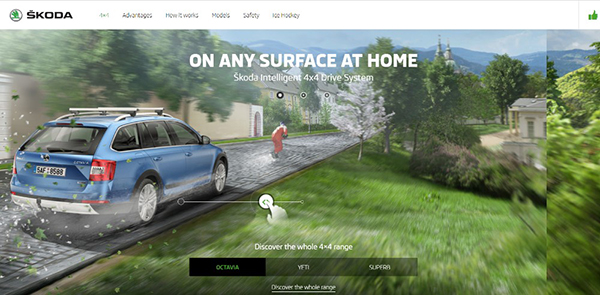
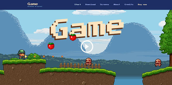
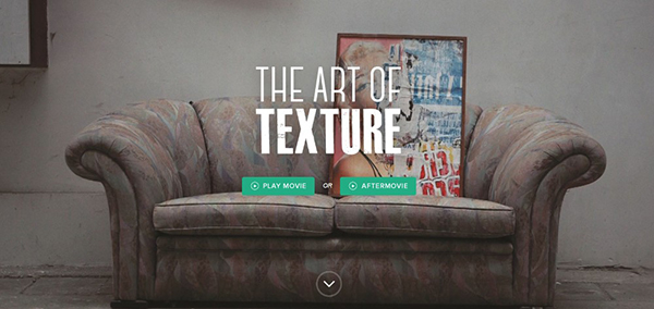
This website’s interactive effects are kept above the fold so “hidden” effects won’t be responsible for being a drag on load speeds.
This BeTheme pre-built one-pager features a cool static image; cool because it appears to be dynamic.
Tiny animated items spruce up this page’s illustration without slowing things down.
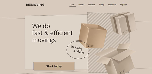
This is a good example of when a page’s fresh look is in itself a key selling point.

Large images and sliding panels can be put in play to engage users instead of “clever” special effects that could slow things down.
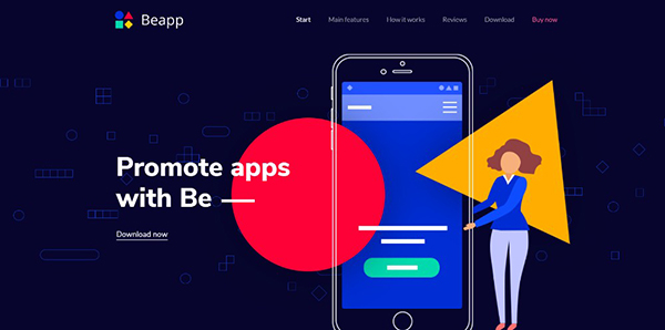
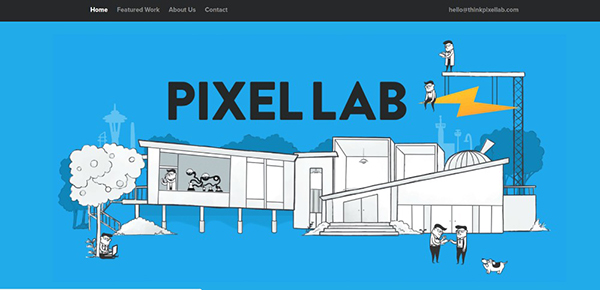
You don’t need a lengthy technical presentation to promote an app when a genuinely cool presentation like the one in this example will do the trick.
#2 TEXT: Keep It to the Minimum & Make It Easy to Read
Avoid clunky blocks of text like the plague. You want to keep the textual content to a minimum. You can do so by using concise paragraphs, bold headlines, and judicious use of bullet lists.
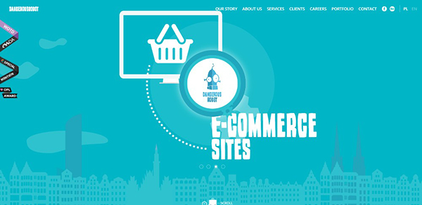
Dangerous Robot relies on entertainment; so much in fact that you’ll want to go through every section at least once and maybe twice.
A prime example of what you can accomplish with neat organization
The core information in this one-pager is kept above the fold. Bullet lists are used to keep the message concise.
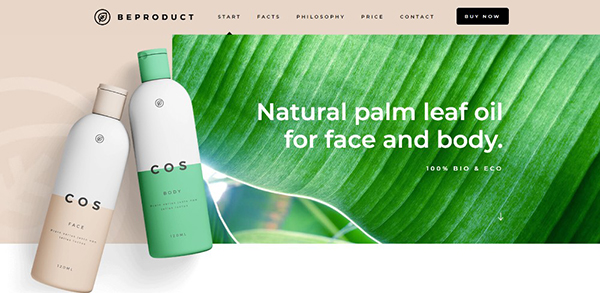
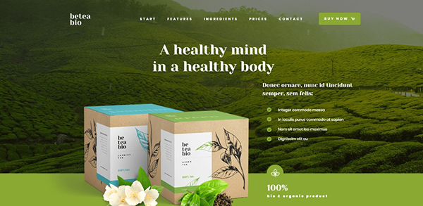
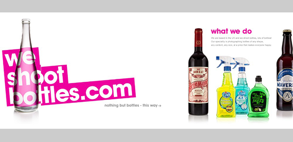
Another example of how large attractive images help to sell when accompanied by nicely formulated paragraphs of text.
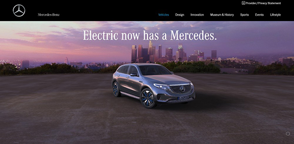
If you’re promoting vehicles like Mercedes-Benz it’s safe to rely more on high quality images and less on text.
#3 VISUALS: Identify the Right Patterns & Use Negative Space Wisely
People read text in an F pattern and scan images in a Z pattern. This is helpful to know when you have to mix design elements. You still need to ensure a smooth flow to direct users toward the site’s goal.
This one-pager illustrates how white space can be used to provide a sense of order.
White space provided the canvas for this wildly creative website.
Here, white space not only ensures a sense of order, but makes the different sections of the website appear to pop out.
Here’s an example of how you mix different design principles to create an amazing visual display.
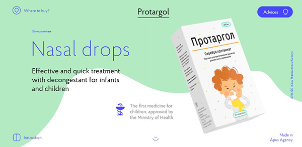
Pages promoting nasal drops rarely if ever excite. This one’s different thanks to the ingenious use of slides, animations, and white space.
#4 NAVIGATION: Make It Easy to Navigate & Entertaining to Scroll
Navigating through a one-pager would seem to be a no-brainer. But for a long-form one-pager keeping visitors engaged can become tricky. Alternate navigation is a good solution. It allows visitors to jump from one section to another with a single click.
Sticky menus, sidebar menus, and auto-scrolling links. All this can all be used to ensure user-friendly navigation.
Some examples:
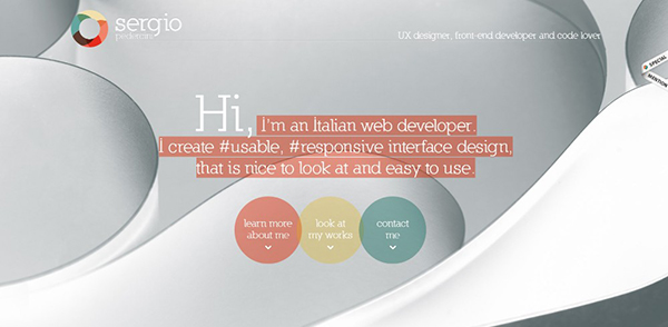
3 different auto-scrolling links are used in this designer’s website.
Be Game offers a highly entertaining navigation experience.
Here’s how to scan a page with 3 mouse scrolls.
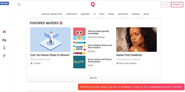
The Brainflop folks really wanted to help you navigate their site quickly. So they provided a menu at the top and one on the left.
#5 CALL TO ACTION: Identify the Correct CTA & Don’t Be Afraid to Use It
We addressed the need to define a website’s goal in critical element #1. We’ll close the loop here by addressing the final step toward meeting the goal –the CTA.
It’s not all that difficult with a one-pager. You’re generally directing people toward a single action. You may only need a “Buy Now” CTA button, or you may wish to follow common practice and add a “Learn More” button. If you’re promoting several products you may need several CTA buttons, but you get the idea.
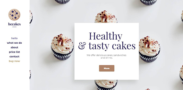
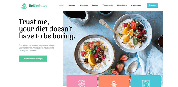
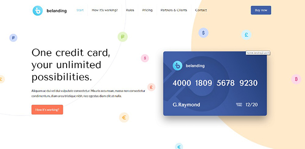
The CTA button in this pre-built website is above the fold. There is also one in the menu.
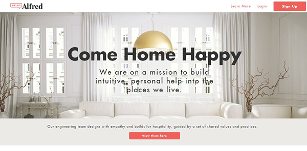
In this example, two CTA buttons placed above the fold give users a choice of what they want to see.

A simple opt-in form with a bold CTA button is used in Pyrismic’s site.
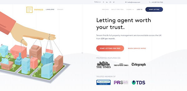
Reneza didn’t mess around with their CTA buttons. They did however use them judiciously, and with a nice choice of colors and text sizes.
Wrapping It Up
Perhaps a 6th critical element is in order. It states that once you’ve read and understood the first five, don’t forget them. Practice them until they become habitual and you’ll do fine.
You can also take a shortcut (you’ll still need to keep the 5 critical elements in mind for every project). The shortcut is to use pre-built websites. They have already incorporated these critical elements.
A good resource for them is Be Theme, with its huge library of over 400 pre-built websites, 60 of which are one-pagers. Simply choose the one you want to work with and customize it to fit your needs.

")


