Data visualization plays an enormous role in placing information in a visual setting. It can be viewed as both an artwork and a science. This is why it can be a challenge to master.
It is a fundamental way to know how to influence through content.
Giving the facts, numbers meaning is a form of art itself – this is why data visualization is essential. There is such a considerable extent for creativity and self-expression while applying these visual components. ![]()
Both graphs and charts are some of the most visually sophisticated and challenging elements for designers to achieve high criteria.
The range of different features and specifications for cohesiveness makes it all the more impressive when a great example is included. Many designers are handed reports that carry tables of monotonous data demanded to shine a little.
Below you will find the best practices for charts in web design.
Show the Data Properly
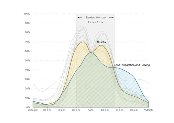
You first need to know that there are many different types of charts. It is a unique form of art to decide which type is the best. If you choose the right model, it will make the data easier to understand and present it accurately.
To figure out which chart type is the best, you first need to think about the kind of data you have. Then figure out to whom you want to present it. This will narrow down your choices and promise to help you make the correct choice.
Choose the chart that tells the story
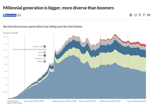
There might be many ways for you to visualize the data. If you are conflicted, then think about what you are trying to succeed. Think about the message you’re trying to send and the people you’re trying to reach.
Types of Charts and best uses
Depending on its components, the data may be rendered in many different ways, such as a line diagram, bar table, or pie chart.
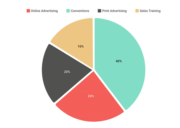
- Pie Chart: This circle graph is a round chart that is divided into sections. They all help illustrate proportions. Therese types of charts can’t visualize variations over time, but they can explain parts of a whole.
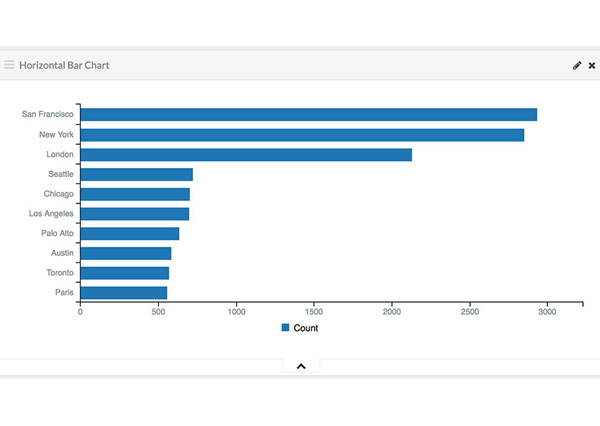
- Bar Chart: a bar chart is a chart constituted of horizontally and vertically rectangular bars. The lengths are proportionate to the values they represent. They can be used to analyze quantitative data, such as tracking changes over a specified interval.
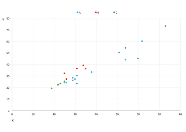
- Scatter Plot: A scatter plot shows information as a bunch of points. Here each point is designed with a couple of variables on the horizontal and vertical axes. Scatter plots should be used to display values for two variables for a set of data. They’re excellent for exploring the relationships between the two groups.
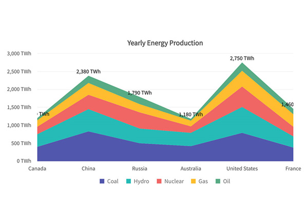
- Line/Area Chart: An area chart is a modification of the line chart. It is a file that executes it of data points that are linked by a line. Line charts are used to analyze conditions over time. They are excellent for displaying both large and small settings. They can also be used to examine differences to more than one group of data. One way of adding an interactive line chart on a WordPress website, for example, is to use one the #1 WordPress table plugin out there. Not only does it create a modern and practical WordPress table, but with the help of its 3 chart frameworks, you can create amazing charts to impress your visitors. And it’s incredibly easy to use it.
Simple headers and charts
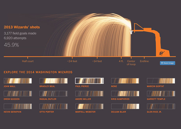
You should always join a short text above the table, describing it. It is necessary to remember that you should focus on how to achieve the best comprehension. It should be legible, but not too big or extremely diverting the attention. In other terms, it should perform its work and not distract any further.
Watch your placement
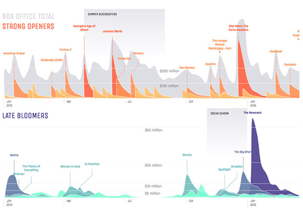
If you want to present two charts for comparison, then you should always focus on the placement. If placed too dense, they can confuse and even confuse texts. But, if also inserted apart, they can fail the focus of the reader.
Think about your chart color
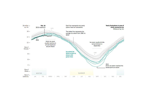
Color should be used widely as a way to express and contrast information. It’s best to come up with your color scheme.
Make sure you have enough colors for all the data series that could potentially be on the chart. If charts with alike colors—and lighter contrast—are troublesome to read for the average person, they are even more challenging for people that don’t have a sharp vision—and they serve as a vital portion of the community.
- Use high-contrasting colors
- Use texture on your color to differentiate information
- Add text or icons to certain label elements.
Using Various Textures
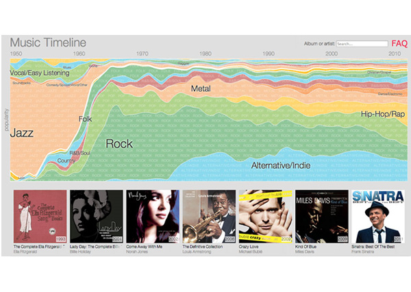
Textures can sometimes add a bit of character to your design. Go for surfaces that align with the message you want to send. Think about the overall look of the chart and decide what’s best for you.
Add no more than five slices to a pie chart
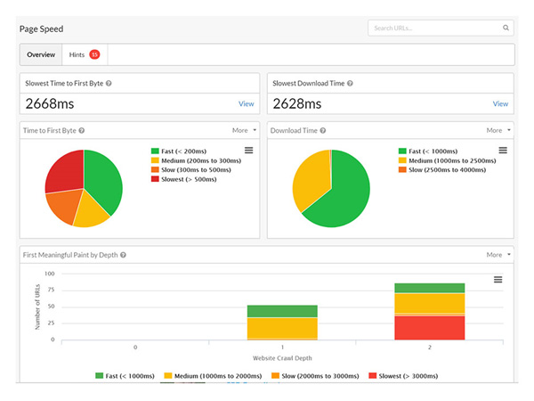
Try simplifying your graph. Use fewer slices to show more information or data. It is best to use less than five parts not to clutter the chart, and it is going to be unreadable.
Chart fonts
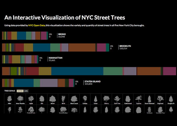
The font choice can affect the legibility of text. It can enhance or detract from the intended meaning. Because of this, it’s better to avoid display fonts and stick to more basic fonts such as serif or sans serif. Make sure the chart has a legible font size for its medium.
Data Complexity
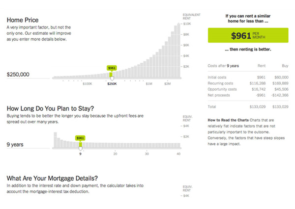
It is essential to keep your chart simple. Adding a lot of information on one chart can be confusing and distracting. If necessary, split data into two charts using highlighting, simplified colors, or change chart type.
Examples of chart design:
Stripe Connect
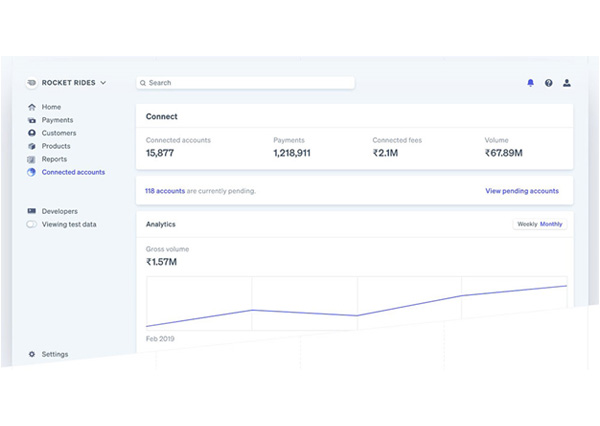
Stripe Connect applies Gantt charts to demonstrate how its platform can advance up numerous aspects of refund processing. The artwork is exact and uses a variety of trademark colors to distinguish each element within the chart.
Okela
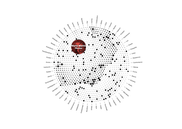
Okela uses a radial chart, giving off an excellent look. It ideally blends in the plain yet classic aesthetics.
Median for Mac
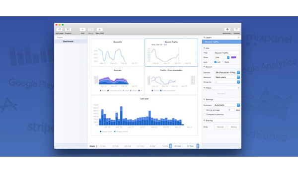
The Median for Mac’s website concentrates on its Mac application with is almost entirely graph and chart-based. The graph and chart layouts are simplistic and use a color-scheme within of the Median brand.
Game of Canada
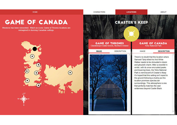
Charts can work in any setting when you put your heart and soul into it. The Game of Canada is a perfect example. The team has chosen almost the same method as in the preceding design. The map is an integral part of the experience; however, it is placed in a flat graphical surrounding.
Tapdaq
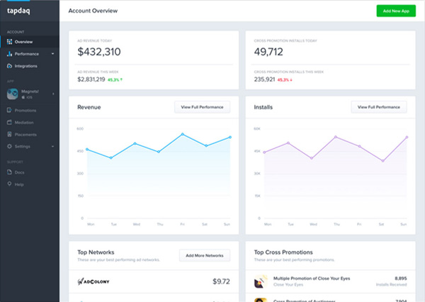
Tapdaq’s homepage also uses line graphs within the dashboard preview. The blue and purple lines harmonize with each other wonderfully, while the fading slope draws notice to the axis and overall quantity of data.
Most designers, especially those who handle a lot of print work for corporate clients, are eventually tasked with finding a creative way to display tabular or charted data, which makes sense since charts are the smart way to display information. Of course, if you want to stay on top of your game, make sure you’re up-to-date on best practices at every stage.


