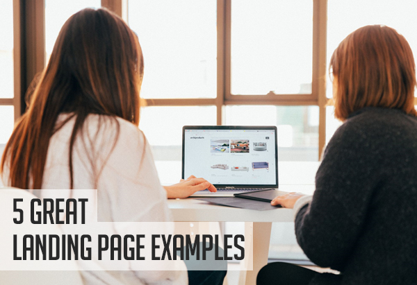
Your landing pages are incredibly important, as they often provide the first experience people will have with your website. They’re typically created with the purpose of converting your website visitors into leads or customers, so they have to be well-designed, attention-grabbing, and compelling enough to convince people to take action.
There are so many types of landing pages and, in this blog post, we are going to dive into 5 great examples to give you inspiration for designing your own. Read on to find out more.
iCASH engages website visitors with interactive elements

iCASH is a company that provides loans for people who need financial assistance at short notice. On the landing page where Canadians can apply for these loans, there is an interactive element that makes it especially engaging.
On the right side of the page, you’ll notice an interactive tool that people can use to input the amount they would like to borrow and how many repayments they plan to make. Users can also add where they’re based before clicking the call-to-action, “get my loan”.
This interactive element will help to engage website users and make them feel more in control of their financial situation. It will also make the loan feel real before they’ve even applied for it, which is sure to make it far more likely that they’ll go ahead with borrowing from iCASH.
Also on their landing page, they’ve highlighted facts about their past clients, the applications they’ve previously approved, and reviews from people they’ve helped. All of these elements will help to earn the trust of their ideal customers and secure them more conversions.
Think about what kinds of services you offer and whether an interactive element would make your landing page more engaging and effective. Perhaps you could add a calculator, a virtual try-on feature, or even a quiz. This will help to ensure people stay on your site for longer and lead to more sales.
Manhattan Tech Support focuses on the benefits of its services

Manhattan Tech Support is a company that provides managed IT services and tech support for small businesses and enterprises. One of the best parts about their landing page is their emphasis on the benefits that clients enjoy when they make use of their services.
They list out the different services they provide and highlight the benefits people get when they hire them. Examples include how their services make employees more productive, simplify team communications, and protect companies against cyber attacks.
While many websites tend to focus on the features and prices of their products and services, Manhattan Tech Support understands that people are more concerned about the benefits they will get, so they have highlighted those front and center on their landing page.
Not only does this help prospective customers to feel understood, but it also allows them to imagine themselves using the company’s services. Plus, it proves that Manhattan Tech Support truly has its customers’ best interests at heart.
This is a really good approach because it tells your customers that they’re your number one priority. So, when you’re looking to design your landing pages, don’t just focus on how much your products are or what they can do — outline the biggest benefits of using them, too. This is sure to convince your target audience that they need what you’re offering.
Slack helps customers imagine themselves using their service

Slack is a channel-based messaging platform that people use as a workplace communication tool. With Slack, team members and individuals can easily connect and communicate with one another.
One of the best things about their landing page is the way it gives prospective customers an insight into what it would be like to use their product. The company uses visuals in their web design to show prospective customers what the platform will look like on their own desktops or phones.
Moving down their landing page, you will also see that they focus on addressing a lot of common customer pain points, like the inability to collaborate with teams from other companies or have all communications in one place. These issues will be a thing of the past with Slack, and they let potential customers know that!
To replicate this for your business, you will need to create high-quality images and visual content that displays the features of your products or services. And you should focus on showing how you can help customers solve the problems they are currently having.
Hootsuite catches your attention with attractive visuals

Hootsuite is a social media management platform for scheduling and managing different social media channels. It allows users to perform several tasks, such as bulk scheduling and tracking the performance of published content.
On their landing page, they use simple but effective visuals to grab and keep visitors’ attention. With illustrations and screenshots, they show off all of the different features and how they can make social media managers’ lives easier.
A good landing page should keep people engaged and that’s what Hootsuite has done well. In every section, they have used an image that shows how people can use their products alongside some copy that tells users about the benefits of their product. These elements provide the right amount of information, so website visitors are informed without being overwhelmed.
For other businesses that want to replicate this style, it is important to create colorful graphics or designs that can attract and retain the attention of your website visitors. These designs could include illustrations of your product’s features, or even infographics that outline its benefits. You can also support these visuals with text that highlights how your products can be used.
Stortford Interiors let examples of their work do the talking

Stortford Interiors is a company that provides interior architectural packages. They offer contractual services for drywall, suspended ceilings, and also provide carpentry and joinery solutions for their clients.
Because their services make for great images, they let their work do the talking on their landing page. They have put the company’s best work front and center, so website visitors get a great idea of what the company is going to be able to do for them before reading a word of copy.
As their work is so visual, including these images on their landing page shows prospective customers the type of service they stand to get and it will also motivate them to take action.
If you are in a similar industry, you can do the same for your business by including high-quality and original images of the work you have done on your landing pages. And make sure these images are attractive and aesthetically pleasing, as it will give you a better chance of keeping visitors engaged up until the point when they decide to convert.
Summary
Building a landing page that converts is a lot of work and it requires you to pay attention to even the smallest details. However, you don’t have to start completely from scratch because you have these examples to inspire and guide you.
Some of the best tactics include using interactive elements to engage your audience, focusing on the benefits of your products or services, and showcasing your past work. Use these techniques and it won’t be long before your landing pages are securing more conversions than ever before.
")


