Any brand needs to stand out from the competition while maintaining its identity. Therefore, design is based on integrity and recognizability as part of branding. Integrity here is the harmonious compatibility of the meanings embedded in the brand and its visual incarnations – logo, colors, composition, and fonts. This article will tell why fonts are so important and how to choose fonts for your brand.
How to choose a brand font
The font is one of the visual tools to convey the brand’s meaning. It is essential to properly build the brand creation process and divide the work into several successive stages to choose a font and create an identity. The first stages are research and positioning. At these stages, the brand picture is formed: there are meanings, mission, features, and rational and emotional manifestations. When the semantic characteristics are thought out, an understanding of what a brand can look like begins to emerge. All visual elements must convey the brand’s internal content, including fonts. It is essential to feel good about the brand and its audience to do this.
The choice of font and other visual manifestations is made at one of the following two stages – design approach or design concept. Sometimes you can easily choose fonts right away, even when looking for references, and sometimes you need to work hard. When choosing a creative fonts design, do not blindly follow the trends. First, there is little uniqueness in trendy fonts, and secondly, the font may not fit into the brand picture. If one of the brand’s features is uniqueness, you do not need to download fonts on free or popular resources. If individuality is not essential, you can choose one of the best fonts to support the overall visual system.
Best five tips on how to improve branding fonts design:
1. Choose your font carefully
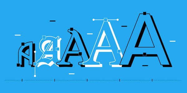
The corporate identity redesign and font change in the Google logo design are great examples.
As part of a significant corporate identity redesign, Google ditched its distinctive serif logo after 16 years in favor of a clean, modern sans-serif.
Combined with minimalism, sans-serif fonts have dominated the design trend in recent years.
In 2015, Google changed the old serif logo to a friendlier, more modern, sans-serif logo. But don’t let trends dictate the rules: sometimes, a serif font can be the right choice. But sometimes, even the most ordinary font can be what you need. For example, many brands use Helvetica as their main font: BMW, American Airlines, Oral-B, The North Face, Toyota, Motorola, etc. You even can find such fonts on google docs!
2. Customize and refine your personality
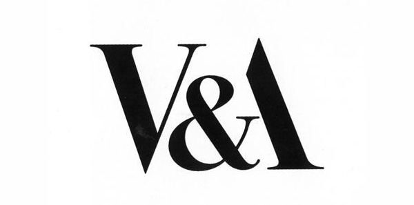
Simplicity in style can lead to longevity. Lightweight and stylish, Alan Fletcher’s V&A logo draws on the interplay of symbols between V and A. Brand awareness is essential for your future company.
Once in a logo, a typeface can connect letterforms or add a unique twist to match the brand’s tone – one example would be shifting characters at appropriate angles to get a sharp and contrasting look.
3. Create a unique logo
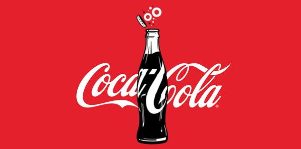
Over a century, Coca-Cola has made minor changes to an almost handwritten logo based on Spencer’s font.
Sometimes, it’s impossible to express a logo idea with an existing font, so a handwritten font seems more appropriate for a brand. The most iconic example that has evolved over more than a century is the Coca-Cola logo. Font uniqueness can be your key ingredient for success!
The bottom line is simple: create a truly unique, custom pictorial typeface, and you’ll build yourself a powerful brand awareness with genuine longevity.
4. Explore combinations of letters in logo design
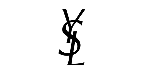
The Yves Saint Laurent monogram logo is a simple yet effective emblem.
Designers place monograms on hotel robes and wedding invitations. With the correct handling of initials, designers can create a truly exemplary example of a simple yet effective logo.
Existing examples of logos in the fashion industry are proof of this – Coco Chanel and Yves St Laurent.
5. Take complete control of your typography
If you can afford to work with a specialized type of design agency such as Dalton Maag or Fontsmith, your work will definitely be successful. Typography can become the center of a brand’s personality and infiltrate all communications.
Restrictions when choosing a font
There may be some limitations when choosing a font. They will serve as a kind of filter for determining the possible outlines of the brand and will help weed out what is not precisely correct.
Financial limitations: Fonts can be very expensive.
Technical limitations: not every font will fit all platforms. If the brand plans to scale and, for example, create an application, the number of available fonts is sharply reduced.
Lack of uniqueness: The font you like may be used too often.
The nature of the fonts
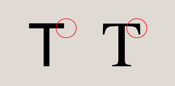
The nature of the font is divided into two stages – superficial and deep. In the first stage, the font’s appearance is evaluated: boldness, thickness, and shape. On the second – the meanings that are embedded in the font. If the superficial nature can be understood simply by looking at the font, then the profound nature is studied more comprehensively and longer. To do this, you need to get acquainted with the brand and other elements of its identity and understand what meanings the author put forth.
Superficial perception of fonts in humans is laid down on a subconscious level. Sharp fonts symbolize strong emotions, soft – smoothness, kindness. The same word has a different emotional color depending on the font in which it is written.
Custom fonts

Despite the significant number of fonts already available, some brands create custom fonts. They provide a unique visual language that fully meets the ideology and requirements of the company. But often, business owners do not understand why they need a custom font if you can choose from those already created.
Whether it is appropriate to create a custom font depends on the company’s goals. If there is a task to emphasize the individuality, status, and level of the brand, then your font is a good solution. In other cases, “choose, not create” is standard practice.
The price of a custom font is ambiguous: sometimes development can be cheaper than a license for some existing fonts, but often it takes much more time and money to develop.
Conclusion
The font is an optical transmission of meanings. So before choosing or creating fonts and identities, you need to understand your brand’s purposes, mission, features, benefits, etc. Only after the positioning stage can you make a visual representation. What it will be like depends on the goals and capabilities of the brand and technical, language, or financial constraints. After reading this article, we hope you understand the importance of using a professional font design.

