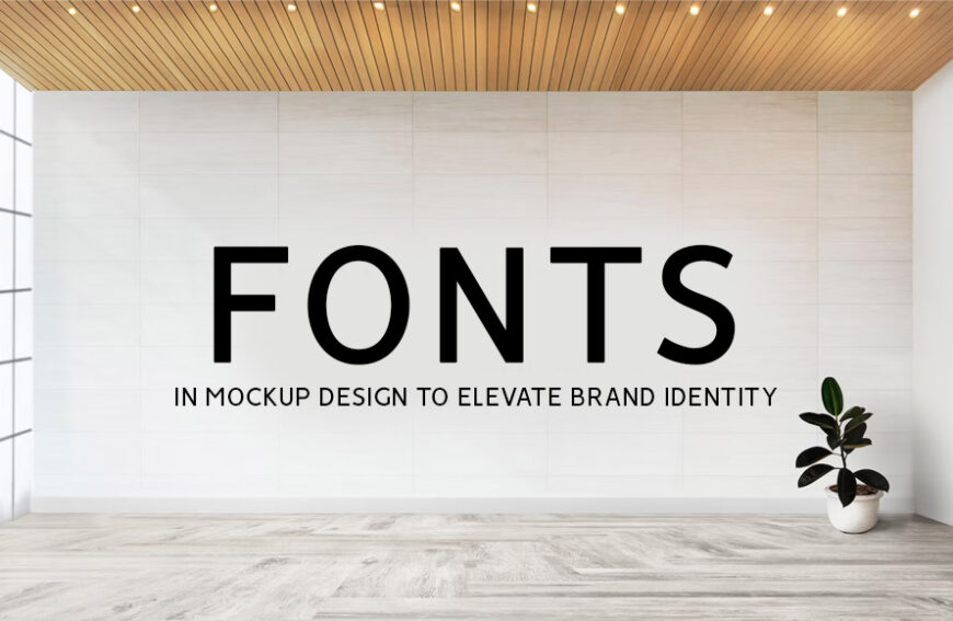
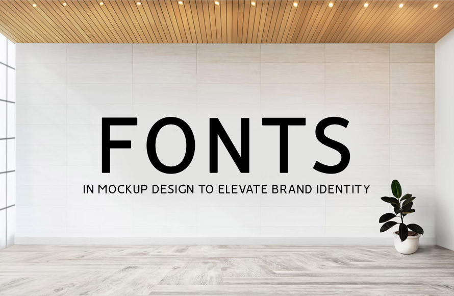
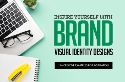
Picture yourself walking down a bustling street: a sea of storefronts blurs past, each competing for your attention. Suddenly, a single window catches your eye. The clean lines, the bold typeface, the inviting color palette—it all speaks to you, inviting you closer. This is what you call the power of a well-designed brand identity.
When it comes to design, your fonts are not just letters on a page. They’re the voice of your brand, whispering personality and purpose to your audience. In fact, once incorporated strategically into your mockups, your fonts can do magic to elevate your brand identity. Read on to know more.
Choosing The Right Font
To effectively leverage fonts in your mockup design, your first step is to select the right one. Think about the kind of feeling you want your brand to evoke. Playful and energetic? A whimsical script font might be a good fit. Sophisticated and timeless? A classic serif font could be the answer. Consider how the typeface aligns with the core message you’re trying to convey.
place
Feeling overwhelmed by all the choices? Don’t worry, here are some factors to remember when picking the most ideal one.
Brand Personality
Is your brand playful and energetic? A whimsical script font might be a good fit. Are you aiming for a sophisticated and timeless feel? A classic serif font could be the answer.
Target Audience
Who are you trying to reach? Your font selection is much easier if you you’re your audience’s demographics and preferences. For instance, a younger audience might respond well to a trendy, modern font. On the contrary, a professional audience might connect better with a traditional one.
Readability
The most beautiful font in the world won’t do you any good if it’s difficult to read. Prioritize fonts with clear letterforms and appropriate spacing for both digital and print applications.
Don’t just pick a pretty font! The one you choose should be a strategic decision that strengthens your design, communicates your message clearly, and resonates with your target audience.
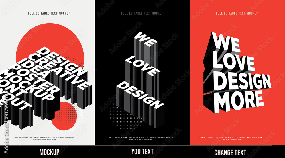
Crafting a Cohesive Font Hierarchy
If you really want to elevate your brand identity, a single font may not be enough, no matter how well-chosen. Mockups usually require a hierarchy of fonts, each serving a specific purpose and leveraging the power of font psychology. Here’s where you can showcase your design finesse:
Headings
Bold, eye-catching fonts are ideal for grabbing attention. Opt for fonts that complement your primary font but stand out enough to create a clear visual distinction.
Body Copy
This is where the bulk of your message resides. Choose a font that’s easy to read on screens and in print. Consider using a sans-serif font for its clean lines and readability, especially for large blocks of text.
Accents
Sprinkle in a touch of personality with accent fonts for elements like call-to-actions or product names. Play with contrasting styles, but ensure they remain harmonious with your overall font palette.
Don’t be afraid to get creative with your font hierarchy. With a thoughtful typographic system in place, you can give your mockups an extra touch of personality. Doing so helps you elevate your ordinary designs to extraordinary ones.
Putting Font Power into Practice
Now comes the exciting part: applying your font selections to your mockups. Here are some practical tips to elevate your brand identity:
Consistency is Key
Consistency is crucial for brand recognition. Establish a core set of fonts and stick to them across all your mockups, from website design to social media graphics. This creates a cohesive visual language that people will come to associate with your brand.
Color Coordination
Fonts and colors work hand-in-hand. Play with contrasting colors for headlines against a neutral background to make them pop and grab attention. You may also want to use similar color tones for body copy and background to craft a sense of visual unity and calmness.
Whitespace Matters
Don’t underestimate the power of empty space. Whitespace between letters, lines, and design elements allows your fonts to breathe. Aside from improving readability, it reduces clutter and produces a clean, professional aesthetic that makes your message stand out.
With these tips, you can harness the power of fonts to build a brand identity that sticks in people’s minds.
Testing and Feedback
Before finalizing your design, testing different fonts and getting feedback is vital. Here are a few strategies to consider:
User Testing
Have some user testing sessions wherein participants can view your mockups and provide insights on font readability and aesthetic appeal. This direct feedback can reveal how different demographics respond to your font choices.
A/B Testing
Implement A/B testing by creating two versions of your design with different fonts. Analyze which version performs better in terms of user engagement and conversion rates. This data-driven approach helps refine your font selection to truly elevate your brand.
Surveys and Questionnaires
Distribute surveys or questionnaires that specifically ask about the fonts used in your mockups. This may enable you gain diverse opinions and highlight any recurring themes or preferences from your target audience.
These testing phases are crucial to ensure your fonts effectively communicate your brand message. Additionally, gathering feedback can provide insights into how your font choices are perceived and whether they are a smash hit or leave your brand feeling flat.
Conclusion
In a highly competitive world of branding, your fonts play a big role. Once you use them right in your mockups, it’s never impossible to create a brand identity that packs a punch. Remember, fonts can build trust, make people remember you, and basically win them over.


")


