In the digital modern world, first impressions matter. For brands and businesses, a well-designed logo and website are often the first point of contact with potential customers. Beyond aesthetics, these elements play a crucial role in conveying brand identity, personality, and values. This is where the psychology of fonts comes into play. Fonts, or typefaces, are more than just visual representations of letters; they are powerful tools that shape user experience and communication.
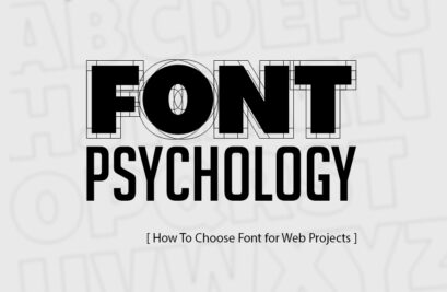
The Psychology of Fonts
In our digital world, information bombards us from all sides. Yet, amidst the cacophony, a silent language persists – the language of fonts. Fonts, or typefaces, are more than just visual representations of letters. They are meticulously crafted tools that shape how we perceive and interact with information. This is the essence of the psychology of fonts: understanding the impact of typeface on communication and experience.
Typography as a Craft:
Fonts have a rich history, evolving alongside human communication. From the first carved symbols to meticulously designed digital typefaces, font creation has always been a deliberate process. Each typeface reflects a design psychology, embodying specific proportions, spacing, and stylistic elements. These choices influence readability, evoke emotions, and ultimately guide how we interpret the message.
A Journey of Discovery:
Understanding the psychology of fonts empowers us to become more conscious communicators. We can analyze existing design choices, appreciating the thought behind font selections in logos and websites. When creating content, we can utilize fonts strategically, enhancing the message we aim to convey. Exploring the vast collection of fonts available, from the playful to the formal, becomes a journey of discovery, allowing us to find the perfect voice for our unique communication needs.
Fonts carry a silent language, influencing how users perceive information and interact with a brand. Understanding this psychological impact is key to selecting the right typeface for your logo and web design. Here’s a closer look:
- Serif fonts: With their decorative flourishes, serifs like Times New Roman or Garamond exude a sense of tradition, formality, and elegance. They are often associated with established institutions and publications, making them ideal for brands seeking to convey trust and authority.
- Sans-serif fonts: Clean and modern, fonts like Helvetica or Open Sans prioritize legibility. Their minimalist approach creates a sense of simplicity, clarity, and efficiency. These fonts are popular choices for modern brands and websites that want to project a tech-savvy and approachable image.
- Script fonts: Flowing and decorative, fonts like Pacifico or Lobster evoke a sense of playfulness, creativity, and personality. They are well-suited for brands targeting a younger audience or those associated with artistic endeavors.
(Citation: “Psychology of Fonts in Web Design“)
- Choosing the Right Font: There’s no single “perfect” font for every brand. The best choice depends on several factors:
- Target audience: Who are you trying to reach? Consider the demographics, values, and interests of your ideal customer.
- Brand personality: What are the core values of your brand? Is it playful or serious? Formal or casual? The font should reflect these qualities.
- Readability: Prioritize fonts that are easy to read across all screen sizes, especially for body text in web design.
The Art of Font Pairing: Harmony and Contrast
A well-designed logo or website isn’t just about visuals; it’s a carefully orchestrated symphony of elements. One crucial aspect of this symphony is the art of font pairing. It’s the dance between harmony and contrast, where fonts work together to create a visually appealing and impactful message. Here’s where the art of font pairing comes in:
- Harmony: Use fonts with similar characteristics. For example, pair a serif headline with a serif body text font like Playfair Display and Merriweather. Imagine a pair of dancers moving in perfect sync. In font pairing, harmony involves selecting fonts that share similar characteristics. This can be through similar styles, like two serif fonts (think Playfair Display and Merriweather), or a consistent weight, such as a bold and regular version of the same font family.
- Contrast: Use fonts with contrasting styles to create visual interest. For instance, combine a bold sans-serif headline font like Montserrat with a lighter serif body text for emphasis.
(Citation: “A Guide to Effective Font Pairing“)
Beyond Aesthetics: Functionality in Web Design
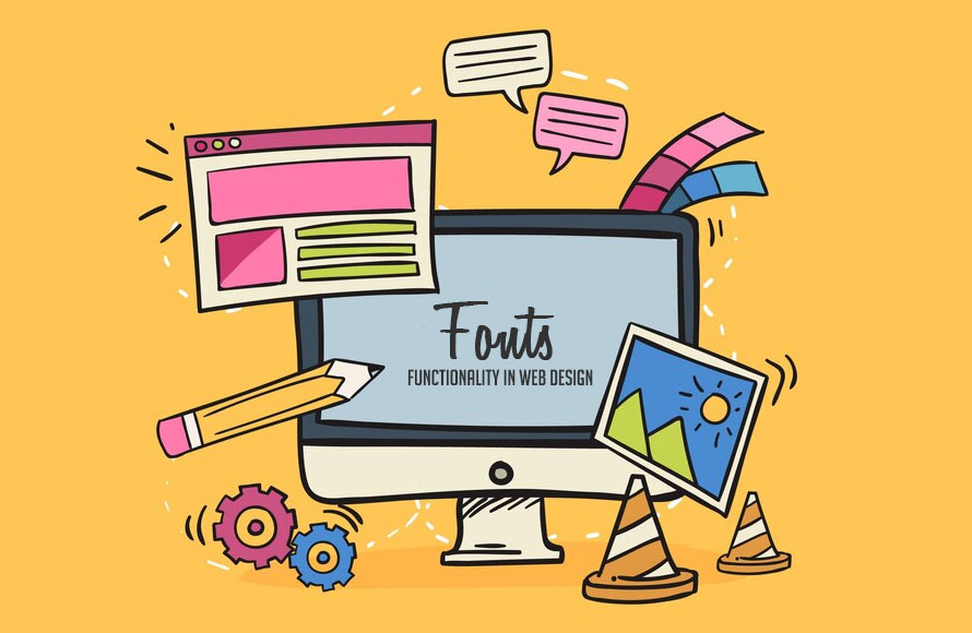
While fonts undeniably play a crucial role in shaping aesthetics,their impact in web design extends far beyond visual appeal. Functionality becomes a critical factor, ensuring a smooth and positive user experience. Here’s how font selection goes beyond decoration:
- Readability: In the digital realm, content is king, but only if it’s readily consumed. Fonts with clear letterforms, sufficient contrast with the background, and appropriate sizing are essential for optimal readability. Imagine struggling to decipher a website’s text due to a poorly chosen font; frustration sets in, and engagement plummets.
- Web-safe fonts: Select fonts that are widely supported by most browsers to avoid display inconsistencies. Many free fonts from Google Fonts are a good starting point.
- Performance Matters: Large or complex fonts can be beautiful, but they can also slow down page loading times. In today’s fast-paced world, users expect instant gratification. Optimizing font usage is key. Consider using web-safe fonts like those readily available on Google Fonts or exploring font subsets that only load the specific characters needed for a website. Every millisecond saved in loading time translates to a more satisfied user.
- Accessibility for All: The web should be inclusive, catering to a diverse range of users. Selecting fonts that are compatible with assistive technologies ensures everyone can access and understand your website’s content. Consider dyslexia-friendly fonts with clear letter differentiation and avoid overly decorative styles that might hinder readability for users with visual impairments.
By prioritizing functionality alongside aesthetics, font selection becomes a powerful tool for creating user-friendly and accessible web experiences. Remember, a beautiful website is only effective if users can navigate it with ease and find the information they seek.
(Citation: “Web Font Optimization: A Guide to Faster Loading Times“)
Case Studies: Fonts in Action
Let’s explore how some well-known brands leverage fonts to enhance their identity:
- Apple: The brand uses San Francisco, a clean and minimalist sans-serif font, reflecting their focus on innovation and user-friendliness.
- Lego: The playful and chunky font used for the Lego logo aligns perfectly with their brand image of creativity and fun for children.
- Netflix: The streaming giant utilizes a custom typeface called Netflix Sans. This bold, geometric sans-serif font projects a sense of confidence and authority, reflecting Netflix’s position as a leader in the entertainment industry. The clean lines and strong letterforms contribute to a modern and sophisticated feel, aligning with Netflix’s focus on premium content.
- Barclays Bank: Barclays, a global financial institution, utilizes a serif font called Aktiv Grotesk. This classic and professional typeface evokes a sense of trust and stability, critical qualities for a financial institution. The subtle serifs add a touch of elegance, conveying a sense of heritage and reliability.
These examples showcase how font selection plays a crucial role in shaping brand perception. These diverse case studies showcase the power of font selection. Each brand meticulously chooses a typeface that resonates with their core values and target audience, ultimately shaping brand perception and fostering connection. By understanding the psychology of fonts and observing how successful brands leverage them, we can make informed choices for our own communication needs, ensuring our message is delivered clearly and with impact.
Conclusion: The Power of the Right Font
In the grand scheme of communication,fonts may seem like a minor detail. However, the psychology of fonts reveals their profound impact. The right typeface can elevate your message, fostering trust, sparking creativity, or ensuring clarity. By understanding the psychology of fonts, practicing smart pairing, and prioritizing functionality, you can harness this power. So, choose your fonts wisely; after all, they speak volumes before a single word is uttered.


")


