

Beautiful packaging design does more than protect a product. It gives the product a visual identity and helps people recognize it before they even read the name. A package sitting on a store shelf has only a short time to catch someone’s attention, so the design needs to be clear, interesting, and easy to remember.
For graphic designers, packaging is a mix of branding, typography, color, layout, photography, illustration, materials, and practical information. Every part has to work together. A beautiful package can still fail if the product name is difficult to read, the information is confusing, or the design looks too similar to competing products.
“The best packaging design gets attention first and gives people a reason to look again.”
Memorable packaging does not always mean using complicated graphics or bright colors. Sometimes a simple shape, unusual typography, strong color combination, or recognizable illustration is enough to make a product stand out.
In This Article
- Introduction
- 7 Ways to Make Product Packaging More Memorable
- 1. Start With a Strong Brand Idea
- 2. Use Color to Create Recognition
- 3. Make Typography Part of the Identity
- 4. Create One Visual Element People Can Remember
- 5. Use Simple Design With a Clear Hierarchy
- 6. Make the Packaging Design Work as a System
- 7. Think About the Physical Experience
- Test the Packaging Design Before Final Production
- Avoid Making Packaging Design Too Trendy
- Final Thoughts
7 Ways to Make Product Packaging More Memorable
Here are seven practical ways designers can make product packaging design more memorable.
1. Start With a Strong Brand Idea

Before choosing colors or creating graphics, understand what the product and brand are trying to communicate.
A package for an organic skincare product should not necessarily look the same as packaging for an energy drink. The audience, product category, price, personality, and brand position should influence the design direction.
Start by asking a few basic questions:
- Who is going to buy this product?
- What problem does the product solve?
- What makes it different?
- What should customers feel when they see it?
- Where will they see the packaging design?
- Who are the main competitors?
- What should people remember about the brand?
This information gives the designer a better starting point.
A memorable package usually has a clear idea behind it. The design might communicate simplicity, luxury, energy, natural ingredients, youth, tradition, or something else that makes sense for the product.
The design should also connect with the wider visual identity. The logo, colors, typography, imagery, and graphic elements should feel like part of the same brand system. For more ideas, see our guide to professional brand identity with AI. Graphic Design Junction’s guide to visual identity explains how consistent use of logos, colors, typography, and imagery helps create recognition across different brand touchpoints.
2. Use Color to Create Recognition

Color is one of the fastest things people notice about packaging design.
A strong color choice can help a product stand out on a crowded shelf, but using color simply to make something bright is not enough. The color needs to have a reason behind it.
For example, a natural food brand might use earthy greens and warm neutrals. A children’s product might use brighter colors, while a premium cosmetic product may use a restrained palette with black, white, metallic, or soft neutral tones.
The important thing is to create a color system rather than randomly choosing colors for every package.
A product line can use one main color for the brand and different supporting colors for product variations. This allows customers to recognize the brand while quickly identifying individual products.
Designers should also test the colors in actual packaging conditions. A color that looks perfect on a monitor may look different when printed on cardboard, plastic, glass, or a matte material.
Graphic Design Junction’s branding resources also emphasize the importance of defining color palettes and using them consistently across brand materials.
Don’t Use Too Many Colors
Adding more colors does not automatically make packaging more memorable.
Too many colors can make the design difficult to understand. Start with a main color, one or two supporting colors, and a neutral color when needed.
A limited palette often gives designers more control over hierarchy and recognition.
3. Make Typography Part of the Identity

Typography can make packaging recognizable even when there are very few graphic elements.
The product name is often one of the most important elements on the front of the package, so its typeface, size, weight, spacing, and placement need careful attention.
A bold custom wordmark can become a recognizable feature of the product. A refined serif can give a premium product a different personality, while a clean sans serif may work better for a modern technology or lifestyle brand.
Do not choose a font simply because it looks attractive on a font website.
Test it with the actual product name.
Look at:
- Letter spacing
- Font weight
- Word length
- Readability
- Capitalization
- Contrast
- Small-size performance
- Printing limitations
Typography should also work across the complete product range.
Graphic Design Junction’s recent logo design guide makes a similar point: type choices need to be tested across different sizes and formats, while spacing, proportions, and readability can have a major effect on recognition.
A memorable package can sometimes be created with typography alone.
4. Create One Visual Element People Can Remember

A package does not need ten interesting elements. Sometimes it only needs one.
This could be:
- A distinctive illustration
- A custom pattern
- An unusual symbol
- A unique product shape
- A bold typographic treatment
- A recognizable character
- A specific border style
- A repeated graphic element
The important part is that the element should belong to the brand.
For example, a small illustrated character appearing across an entire product line can become strongly associated with the brand. A unique pattern can perform the same job.
The element should also work at different sizes. It might appear on the main package, website, social media graphics, advertisements, and promotional materials.
This creates a connection between packaging and the rest of the brand.
Graphic Design Junction’s packaging design examples show how simple illustrations, colors, and repeated typography can create recognizable packaging systems without filling the package with unnecessary details.
5. Use Simple Design With a Clear Hierarchy

Packaging design contains a lot of information.
There may be a logo, product name, product description, ingredients, instructions, size, certification marks, barcode, manufacturer information, and other required details.
The challenge is making all of this information fit without making the package look crowded.
This is where visual hierarchy becomes important.
The designer should decide what people need to see first, second, and third.
A typical hierarchy might look like:
1. Brand name
2. Product name
3. Main benefit or description
4. Important supporting information
5. Legal and technical information
Not every piece of information needs to be the same size.
A common mistake is trying to make everything stand out. If every element is bold, large, and colorful, nothing has real priority.
Simple packaging can be more memorable because it gives the viewer fewer things to process.
It also makes the product easier to recognize when people see it quickly in a store or online product listing.
6. Make the Packaging Design Work as a System
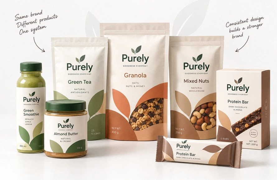
If a company sells one product, the packaging still needs to represent the brand. But when there are multiple products, the challenge becomes larger.
A collection of packages should look related without becoming identical.
For example, a skincare brand might use the same logo position, typography, layout, and graphic style across all products while changing the accent color for different product types.
This creates a visual family.
The customer can recognize the brand from a distance and then use the color or product name to identify the individual product.
A packaging system can define:
- Logo placement
- Product-name position
- Typography
- Color structure
- Photography style
- Illustration style
- Icon style
- Pattern usage
- Information hierarchy
- Packaging materials
This is also useful when new products are introduced later. The designer does not need to start from zero.
Graphic Design Junction’s article on memorable product packaging notes that packaging design involves more than decoration; it needs to work with brand identity, production, materials, budget, and the wider product experience.
7. Think About the Physical Experience

Packaging design is not only a flat graphic design.
People touch it, open it, hold it, carry it, store it, and sometimes keep it after the product is finished.
This gives designers more opportunities to create a memorable experience.
Think about:
- The shape of the package
- Paper or material choice
- Matte or glossy finish
- Embossing
- Foil details
- Cut-out areas
- Labels
- Opening mechanism
- Inside printing
- Product inserts
- Reusable packaging
These details should support the brand rather than exist only for decoration.
A premium product might use a tactile material or subtle embossing. A playful brand might use an unexpected message inside the box.
Even a simple package can become memorable when the physical experience matches the visual identity.
This is especially important for ecommerce brands because customers may experience the packaging only after ordering the product. The package then becomes part of the unboxing experience.
Designers can test these ideas with product packaging mockups before moving to final production.
Test the Packaging Design Before Final Production

A design that looks good on a computer screen is not automatically ready for production.
Before approving the final artwork, create realistic packaging mockups and, when possible, physical samples.
Check the design from different distances.
At a normal viewing distance, can people recognize the brand?
Can they read the product name?
Does the package look different from competitors?
Does the color still work?
Does the design look balanced from every side?
Also check how the packaging looks as part of a product range.
One package may look excellent on its own but fail when placed next to five other products from the same brand.
Testing gives designers an opportunity to fix these problems before production.
Avoid Making Packaging Design Too Trendy
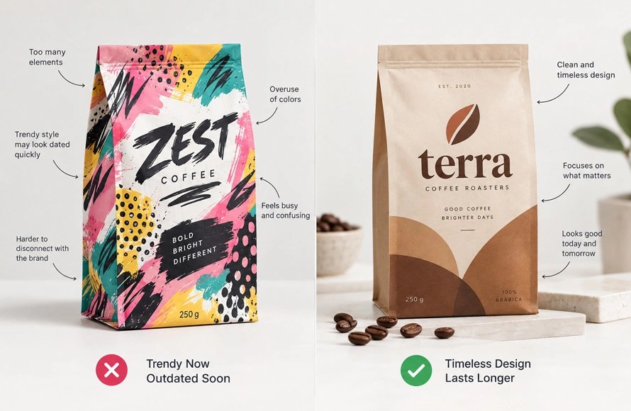
Trends can be useful for inspiration, but following every current packaging trend can make a product look temporary.
A design may use a fashionable typeface, popular color combination, or visual effect that feels fresh today but becomes dated later.
This does not mean packaging should be boring.
The better approach is to understand the trend and decide whether it actually fits the brand.
A memorable package should have something that belongs specifically to the product and brand.
Graphic Design Junction’s branding work also points toward simplicity, consistency, and recognition as important parts of a strong visual identity rather than relying only on short-term visual trends.
Final Thoughts
Memorable packaging design is not about adding more graphics. It is about making the right decisions and giving people something they can recognize.
Start with a clear brand idea. Choose colors with purpose. Make typography part of the identity. Create one visual element people can remember. Keep the information hierarchy simple and make the entire product range feel connected.
Then think beyond the screen.
The material, shape, finish, opening experience, and small physical details can all contribute to how customers remember the product.
The strongest packaging designs usually have a simple idea that is repeated consistently. When the logo, colors, typography, graphics, and physical experience work together, the package becomes more than a container. It becomes part of the brand people recognize and remember.


