If you’re looking at your website and wondering why people aren’t visiting it or clicking on your ads, it might be time to take a step back and assess the information architecture of your website.
One of the most important aspects of a website is its architecture. The focus of this article is on eight easy ways to improve how your website looks and feels to visitors.
Create an Easy Top-Level Navigation Menu

When you first land on a website, one of the things you might be most interested in is navigation. You want to know how to get around. Your website must have a top-level navigation menu.
People need to see this immediately when they land on your website, and ideally, it should be above the fold. Designers often make the mistake of designing for themselves and their creative processes and not for their clients.
Add a Call to Action Button

A call to action is a button that encourages people to click on something. Buttons can be used for any number of things, from purchasing products to sharing information.
Your website should have one of each.
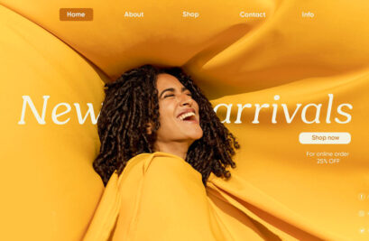
Introduce Your Homepage without Words

If you are building a new website, it’s best not to use text on the homepage if you can help it.
Instead of text, use images and/or videos that support and enhance your message.
Use Icons to Help Users Understand Your Website
Icons are some of the most iconic elements of design. If you want people to be able to understand your website, use icons in your designs quickly.
Emotion is one of the best ways to communicate a message. Use the elements of emotion so that you can start a conversation with your visitor with one element of content and continue it with another element.
Ensure That the Colors of Your Website Complement Your Brand

The color scheme of your website information architecture should match the colors of your brand. While it is great to try different things to see what looks best, you should resist the temptation.
The color scheme of your website should also be consistent with all marketing materials so that people can quickly build an emotional connection between the messaging and the mediums used to communicate it.
Be Consistent with Fonts

A site’s font is another important element that can make a huge difference in user experience.
A designer might spend hours choosing a typeface that is perfect for their client, but if the typeface is not used consistently throughout the design, it will undermine the efforts of both the designer and client.
Don’t Rely on Interactive Elements to Communicate Your Message

While interactive elements can make websites more appealing, they can also distract users from what they originally looked for.
Stick to communicating your message using text and other non-interactive means.
Be Consistent with Color Combinations

Using two different colors on the same page can instantly create quite a dissonance, which will often confuse users.
Use only two colors on your website at a time, and make sure they are related to each other in some way.
Conclusion
After reading this article, you should now know how to make your website more appealing to users. But remember, you are not just making people come to your website – you are making them stick around.
You may also like:
- 50 Resume Templates – Best Of 2020
- 50 Best Logos Of 2020
- 26 Creative Logo Design Templates for Inspiration
- 45 Free T-Shirt Mockup Templates PSD
- 50+ Best Brochure Templates For 2021
- 23 Best Vintage Fonts
- Professional Business Card Templates (30 Print Design)
- 35 Best Procreate Brushes For Procreate App
- Best Lightroom Presets Of 2020
- 50+ Best CV Resume Templates 2020
- 20 Best High Quality Photoshop Brushes


")


