The psychology of color studies the impact that color has on thought and behavior. In fact, it has been proven that looking at colors has a physiological impact that results in the releasing of hormones and subsequent mood changes. There is some skepticism about color psychology. After all, some people form emotional connections with a color due to personal experience or simple taste, while others may have a more organic reaction to color. This makes it difficult to thoroughly, scientifically prove various theories related to color psychology. In spite of this, there are definite patterns that have emerged in the study of color, and there is certainly a lot of anecdotal evidence.
One discipline where color psychology can be especially useful is web design. Certain colors and groups of colors have been shown to influence use behavior. Keep reading to learn more about the importance of color when it comes to web design that makes an impact.
Knowing How to Use Color
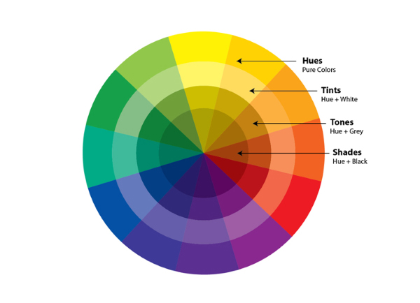
Knowing that a color has a certain psychological impact is not enough. You have to know when, how, and where to use that color. To do this, you have to know your audience, be mindful of your branding, and understand why you might use color in a given situation.
Knowing Your Audience

There is more to color psychology than simply developing a list of colors and a corresponding list of behaviors and emotions. You have to consider your audience as well. For example, kids respond well to bright colors and lots of contrast. Their parents, on the other hand, might find subtler colors more expensive. So, if you are selling children’s products what do you do? Do you use the subtler colors to appeal to the parents who will be making the purchases? No, because the parent is likely to associate the bright colors with fun and childhood, even if they don’t find them aesthetically pleasing. The visual content that you use should make sense to your audience, and this includes color.
If you know the gender of your target customer persona, you should also know that color preferences are often split on gender lines. For example, women largely dislike gray, while men largely dislike purple. As an experiment, pay attention to advertising geared towards men and advertising geared towards women. You will likely notice that these disliked colors are largely missing from those advertisements.
Being Mindful of Your Brand
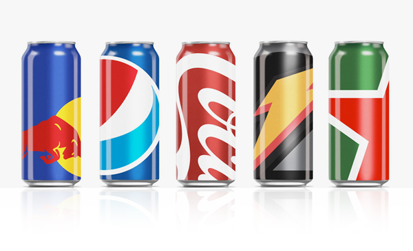
The purpose of color psychology is to improve the user experience, and to influence behavior, e.g. increase conversions. Color psychology is a helpful tool for a web designer, but it should never replace branding. When it comes down to it, web design decisions should prioritize branding, even if that runs counter to the things the designer has learned about the impact of color on customer behavior.
Understanding Why You Are Using Color in Any Given Situation
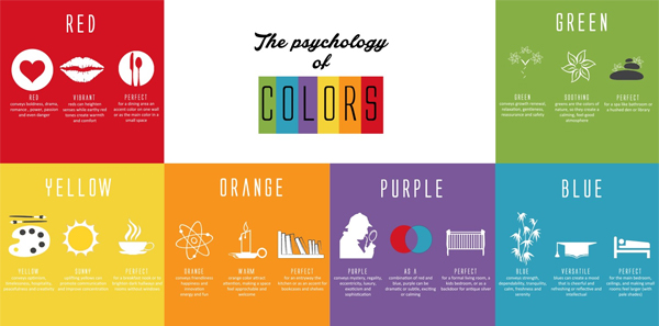
At the end of the article, we will list a few colors, and the psychological impact that they have. However, before that, it’s important to understand why you are making a choice based on color psychology before you actually change the design of a web page. For example, the color black creates a feeling of luxury and exclusivity. Does this mean that you should use lots of black on all of your product pages to make your wares seem more valuable? Maybe not. If you have thirty pages of products, the color black might lose its impact after a while. Instead, might opt to use black only for the pages that showcase your top tier products. This way, top shelf items that you share seem even more valuable.
Remember That Absence of Color is Part of Color Psychology
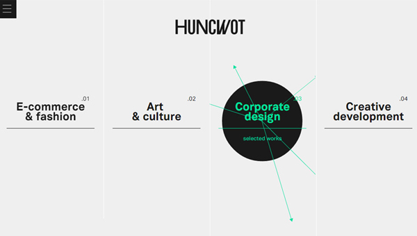
The absence of color, also known as white, can be used to influence user behavior. For example, if you want a particular piece of content on a web page to stand out and get a lot of attention, you might choose to use a lot of white space around that content to ensure that it sticks out.
Colors And Their Psychological Impact
Yellow
People associate the color yellow with caution and slowing down. It essentially communicates “warning”.
Potential Uses of Yellow
- To warn people of what they will miss if they click away from a landing page
- To caution visitors not to trust the word of your competitor
- To let visitors know that a sale or special offer is about to expire
Blue
Blue establishes trust and gives off an aura of professionalism and responsibility. Many fortune 500 companies and companies that are associated with the financial industry use a lot of blue in their web design.
Potential Uses of Blue
- On pages where customers are asked to provide personal or financial information
- On your about us page to improve trust while customers learn more about your brand
- On any page that contains thought leadership content
Green
This color has a strong association with nature. It is also seen as an affirmative color and can represent money.
Potential Uses of Green
- To highlight outdoor products and services
- To promote that products are environmentally friendly
- To emphasize savings or earnings
- To make CTA buttons more appealing
Orange
This color is seen as being fun, playful, competitive and impulsive. There is a reason that you see the color orange used on sports team uniforms.
Potential Uses of Orange
- When asking users to indulge themselves and have fun
- When promoting products that are more enjoyable than practical
- In contests and competitions
- To highlight sports teams and sports competitions
A Final Note: The Importance of Testing
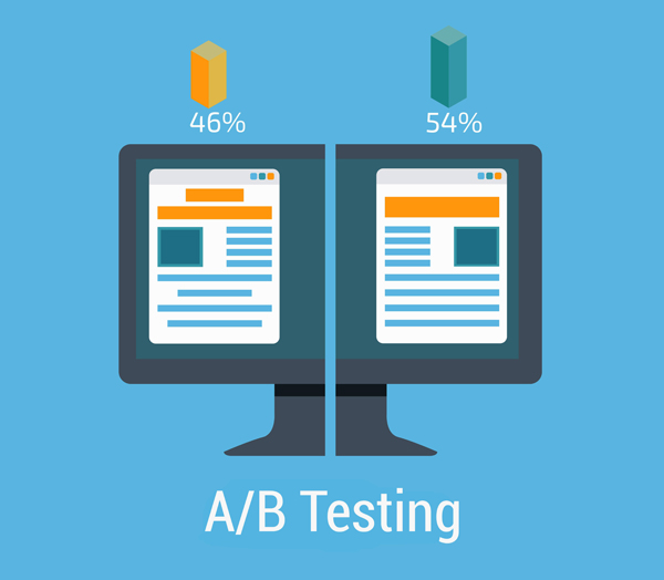
Color psychology can absolutely be used to create web pages that have high impact, and that influence consumer behavior. Just keep in mind that this is not an exact science. What might work on one web page for one company, might not work on yours. This is why A/B testing is so important when it comes to implementing these changes. Remember that this isn’t an exact science. Instead, it is based on an observed pattern of behaviors in different groups over a period of time. Test and use analytics to determine whether or not each change is worthwhile.






improvements. Moreover, these entities track changes in by Google