
A strong brand visual identity system doesn’t just rely on individual elements; it’s the synergy of these elements that creates a lasting and meaningful brand image. In the world of business, creating a strong brand is essential for standing out in a competitive landscape and forging a lasting connection with customers.
While a well-designed logo serves as the face of a brand, a comprehensive visual identity system goes beyond the logo, encompassing a range of visual elements that collectively convey a brand’s personality, values, and promise. In this article, we delve into the concept of a visual identity system and explore the crucial components that contribute to building a cohesive and impactful brand image.
You may be interested in the following related articles as well.
- 15+ Professional Brand Stationery Templates
- 30 Modern Script Fonts For Branding
- 35+ Best Brand Stationery Templates Design
- 23 Modern Creative Brochure Templates For Branding
Unlimited Downloads
Over 1,500,000+ Fonts, Mockups, Freebies & Design Assets

Understanding Visual Identity System
A visual identity system is a strategic approach to visually representing a brand across various platforms, both online and offline. It’s a set of guidelines that dictate how a brand should appear visually in order to maintain consistency and coherence. While the logo is a fundamental part of this system, other elements such as color palettes, typography, imagery, and design principles are equally important. Together, they create a holistic brand experience that resonates with the target audience and reinforces the brand’s narrative.
Components of a Cohesive Visual Identity System

1. Logo and Wordmark:
The logo serves as the cornerstone of a visual identity system. It’s the primary visual element that captures the essence of the brand. A well-designed logo is memorable, scalable, and versatile. Alongside the logo, the wordmark (the textual representation of the brand name) should be carefully chosen to align with the brand’s personality and values.
2. Color Palette:
Colors evoke emotions and have a psychological impact on consumers. A thoughtfully curated color palette helps establish the brand’s mood and tone. The palette should include primary and secondary colors, as well as guidelines on how these colors should be used in various contexts. Consistency in color application across all brand materials fosters recognition and strengthens the brand’s identity.
3. Typography:
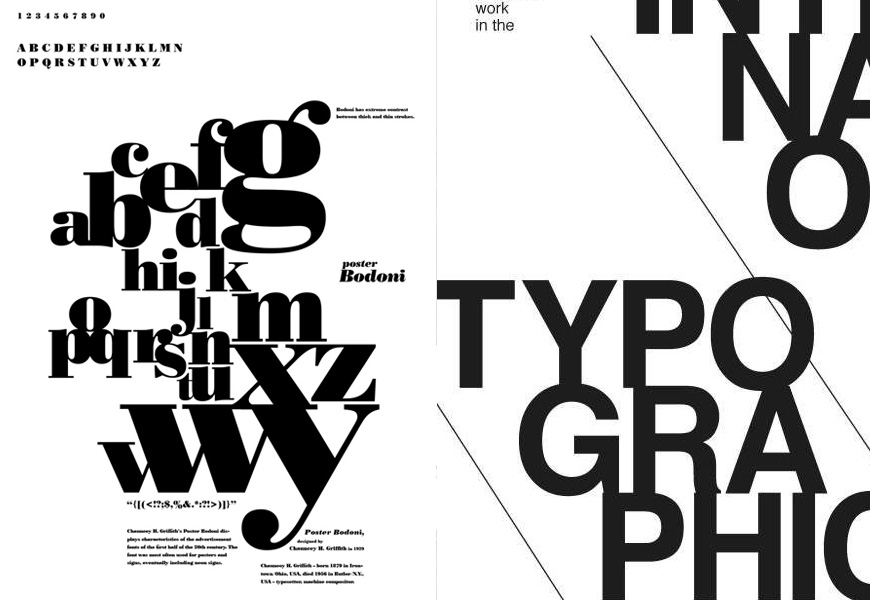
Typography plays a significant role in shaping a brand’s visual identity. The choice of fonts conveys a brand’s personality – whether it’s modern, elegant, playful, or professional. A visual identity system should outline the fonts to be used for headlines, body text, and other design elements. Maintaining consistency in typography ensures that brand communications remain coherent and recognizable.
4. Imagery and Photography Style:
Visual imagery, including photography and illustrations, contributes to the overall brand perception. Establishing guidelines for the type of imagery to be used, the photography style, and the mood it should evoke is crucial. Whether it’s high-contrast black-and-white photos or vibrant, colorful images, maintaining a consistent visual style reinforces the brand’s narrative.
5. Design Elements and Patterns:

Design elements such as icons, patterns, and graphics can become distinctive identifiers of a brand. These elements can add visual interest to various materials while reinforcing the brand’s personality. Incorporating unique design patterns and icons into the visual identity system can enhance brand recognition and differentiate it from competitors.
6. Layout and Composition:
Consistency in layout and composition is essential for creating a unified brand experience. Guidelines on how to structure various design materials, such as brochures, advertisements, and digital content, ensure that the brand’s visual identity remains intact across different formats. Well-defined layout principles maintain coherence while accommodating creativity.
7. Voice and Tone:

While not strictly visual, the voice and tone used in written content are integral to a brand’s identity. Whether it’s formal, casual, friendly, or authoritative, the chosen voice and tone should align with the brand’s values and target audience. A consistent writing style reinforces the brand’s identity in both written and visual communications.
8. Digital Presence:
In the digital age, a brand’s online presence is paramount. Guidelines for the design of websites, social media profiles, email templates, and digital ads should be outlined. Consistency in digital design ensures a seamless brand experience for online audiences.
Building a Cohesive Visual Identity System

1. Brand Strategy and Research:
Before creating a visual identity system, a brand should have a well-defined strategy in place. This includes understanding the target audience, competitive landscape, and the unique value proposition the brand offers. Research helps identify design trends, consumer preferences, and areas of differentiation.
2. Collaboration with Design Professionals:
Creating a visual identity system requires a collaborative effort involving design professionals. Graphic designers, branding experts, and marketers work together to translate the brand’s essence into visual elements. Their expertise ensures that the design choices align with the brand’s strategy and resonate with the intended audience.
3. Logo Design:
![]()
As mentioned earlier, the logo is the keystone of the visual identity system. The design process involves conceptualizing, sketching, digital rendering, and refining. A well-designed logo encapsulates the brand’s core values and personality in a visually appealing manner.
4. Color Palette and Typography Selection:
The color palette and typography should be chosen based on the brand’s personality and target audience. Warm colors might evoke feelings of energy and excitement, while cool colors may convey calmness and professionalism. Similarly, typography should be easily readable and aligned with the brand’s tone.
5. Guideline Documentation:

Once the various components of the visual identity system are established, they need to be documented in a comprehensive brand style guide. This guide serves as a reference for anyone involved in creating brand materials, ensuring that the visual elements remain consistent across all touchpoints.
6. Testing and Feedback:
Before fully implementing the visual identity system, it’s advisable to test it across different platforms and mediums. Gather feedback from stakeholders, employees, and potential customers to identify any areas of improvement or inconsistencies.
7. Implementation and Training:

Rolling out the visual identity system involves applying the guidelines to all brand materials – from business cards and stationery to digital platforms and marketing collateral. Additionally, training employees and partners on the proper usage of the visual elements is crucial to maintaining consistency.
8. Continual Evaluation and Adaptation:
A visual identity system should not be static. As the brand evolves and consumer preferences change, periodic evaluations of the system are necessary. This allows for necessary adjustments while ensuring that the core essence of the brand remains intact.
Case Studies: Successful Visual Identity Systems

1. Coca-Cola:
Coca-Cola’s visual identity system is a testament to consistency and timelessness. Its signature red color, iconic logo, and unique script typography have remained largely unchanged for decades. This continuity has contributed to the brand’s global recognition and cultural impact.
2. Airbnb:
Airbnb’s visual identity system reflects its commitment to inclusivity and diversity. The brand’s logo, called the “Bélo,” represents people, places, love, and Airbnb itself. The use of vibrant colors and inclusive imagery in their branding materials reinforces their brand promise of creating a sense of belonging.
3. Google:
Google’s visual identity system showcases a playful and dynamic approach. While the primary logo remains consistent, the brand’s use of vibrant colors and ever-changing doodles reflects its innovative spirit. Google’s logo is recognizable, adaptable, and aligns with its tech-forward identity.
Conclusion
A cohesive visual identity system goes beyond the logo, encompassing a range of visual elements that collectively convey a brand’s personality, values, and promise. By carefully curating components such as logo design, color palette, typography, imagery, and design principles, brands can create a unified and impactful brand image that resonates with their target audience. A well-executed visual identity system fosters recognition, trust, and emotional connection, setting the stage for a successful and enduring brand presence in the ever-evolving business landscape.


")


Well, “Branding Beyond the Logo” has the potential to be an enlightening and informative piece that challenges conventional notions of branding and inspires readers to consider the myriad dimensions that contribute to a brand’s success.
In my opinion, By unifying visual elements, it establishes a strong brand presence, enabling effective communication and fostering a lasting connection with the audience. thx