
We’re visual beings – we’re sure this is not the first time you’re reading this, but it’s a fact of life we need to be aware of. A study by the Seoul International Color Expo showed that 92.6% of consumers consider visual factors as their top priority when purchasing products.
This is also true for the food industry – we eat with our eyes first. As a designer, you must be aware that customer engagement is highly dependent on the colors and design elements you choose to use.
The difference between attracting a casual browser and converting a sale hinges on your understanding of color psychology and its power to stir viewers’ appetites.
Additionally, well-chosen design elements guide users through an experience, setting the mood before they’ve even glanced over the menu options.
Table Of Content
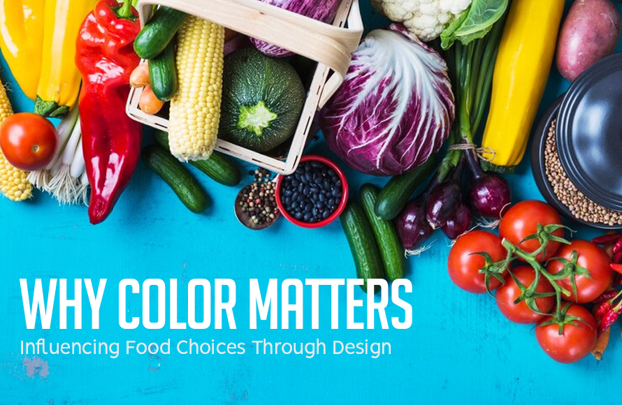
Color Psychology in Food Web Design
Think of your favorite vegetarian restaurant and visit their online page or website. It won’t take long to notice that the dominant color is green in its different shades, from mint to olive. This is because green is synonymous with health and freshness.
Green signals nourishment and natural goodness – this connection is hardwired into our brains. Health-focused brands capitalize on this by integrating greens into their design, especially those catering to vegetarians or the health-conscious crowd.
For instance, a vegetarian meal delivery service that promises to deliver veggie goodness to your doorstep will use a palette of greens alongside images of vibrant, crunchy vegetables to evoke feelings of wellness and vitality. You can almost feel yourself biting into a veggie burger or tasting that gorgeous tomato because the images are designed this way.
Now, compare this imagery with websites that promote mostly meat-based products, such as stakes or BBQs. They’ll often feature rich reds and warm earth tones, colors that resonate with richness, warmth, and savory satisfaction.
Darker reds suggest indulgence and sophistication, subconsciously aligning with the expectations of meat lovers who are looking for a fulfilling meal. Of course, the images used will make your mouth water as you can almost taste the meat melting on your tongue.
As a designer, it’s important to understand that the right color choice doesn’t just attract attention – it engages the mind, aligning product offerings with consumer desires through visual cues rooted in psychological triggers.
How to Use Color & Design to Encourage Engagement
Color has a sneaky way of playing with our impulses – when used right, it can influence our actions without being too pushy.
Think about the color orange – it evokes enthusiasm and can motivate action, which is why it’s perfect for ‘Order Now’ buttons or special deal highlights. When customers encounter this energetic color paired with mouthwatering food photos, they’re more likely to feel compelled to interact or make a purchase.
But it’s not just about choosing the right color. You also have to consider images, typography, and other design elements to create an interface that tempts and persuades. For instance, imagine scrolling through the website of a bakery where warm beige tones provide a backdrop for the vibrant reds and yellows of pastries.
Also, the buttons and other design elements are soft and rounded, suggesting the fluffiness of the products.
This strategic blend creates a rich visual narrative that taps into consumers’ subconscious, making them imagine themselves enjoying these culinary delights.
How to Create a Pleasant User Experience
As a web designer, you first have to consider the user experience on the page you are building.
For instance, the secret to creating a tempting food-oriented online page (or menu) is to keep things simple. If the page is crowded with images of delicious meals, the viewer may feel confused by the multitude of options.
Also, you want to make it easy for viewers to find culinary products that fit their dietary and taste preferences. For instance, a green leaf icon next to an item can mean vegan or vegetarian, while a chili pepper suggests spicy. These small visual cues help customers quickly navigate the menu without wading through text-heavy descriptions.
Additionally, to turn visitors into customers, you have to create a clear, inviting path from menu browsing to order confirmation. The design should funnel viewers effortlessly through selections, with enticing ‘add to cart’ buttons in bold, appetizing colors that stand out.
For every step on the site, whether choosing sides or making payments, seamless transitions, and readability are key – no distractions, just clean graphics and straightforward instructions. By minimizing friction throughout this journey, you’re not only serving up top-notch user experience but also optimizing the website for increased sales.
Wrap Up
The world of graphic design is exciting and dynamic, so you must stay up to date with the trends. However, you first need to learn the basics, and color psychology is one of the most important pillars of good design.
Once you understand how the right color combination can transform a casual visitor into a loyal customer, you’ll be able to have a lot of fun with your creations!


")


