In today’s hyper-connected world, first impressions reign supreme. When it comes to professional branding, a cohesive visual identity and a thoughtfully crafted logo are no longer mere afterthoughts; they’re the cornerstones of establishing a distinct and memorable presence.
This article delves beyond the realm of “examples” and conventional approaches. We’ll explore the strategic nuances of professional branding, unpacking the intricate relationship between visual identity and logo design.
You may be interested in the following articles as well.
- 20+ Best Photoshop Brushes: Elevating Your Painting and Blending Skills
- Exploring the Psychology of Fonts: Enhancing Logos and Modern Web Design
- 20 Top WordPress Themes for Building a Successful Website
- Design Like a Pro: Download 50 Best Free Mockup Templates
Unveiling the Power of Brand Identity: Beyond Aesthetics
Visual identity transcends mere aesthetics. It’s the meticulously orchestrated symphony of visual elements that encapsulates the essence of your brand. From color palettes and typography to imagery and layout, every facet meticulously communicates your core values, personality, and target audience.
Think of it as a meticulously crafted narrative woven with visual threads. A successful visual identity fosters instant recognition, cultivates trust, and evokes the desired emotional response within your target audience. It’s the silent ambassador that speaks volumes about your brand, even before a single word is uttered.
List of Innovative Branding: Visual Identity and Logo Design:
The Logo: The Hero of Recognition
The logo sits at the heart of a powerful visual identity. It’s the iconic symbol that instantly sparks recognition and reinforces brand recall. Imagine the iconic swoosh of Nike or the bitten apple of Apple – these logos transcend mere visuals, evolving into cultural touchstones.
However, creating an effective logo is an exercise in strategic minimalism. Gone are the days of overly complex or overly literal designs. A modern logo prioritizes simplicity, memorability, and versatility. It should function seamlessly across various platforms, from digital avatars to printed materials, retaining its impact at every touchpoint.
The Strategic Marriage: Aligning Brand Identity with Logo Design
Here’s where the magic truly unfolds. A successful professional brand is built upon the harmonious marriage between a well-defined visual identity and a compelling logo. Imagine a brand that champions sustainability. Its visual identity might feature earthy tones and organic textures, while the logo itself could be a stylized leaf or tree. This synergy creates a cohesive narrative, reinforcing the brand’s message and resonating with the target audience.
Here’s a breakdown of the key considerations for a strategic alignment:
-
Brand Values: The visual identity and logo should embody the core values of the brand. A brand focused on innovation might leverage bold colors and sharp lines, while a brand prioritizing comfort might utilize softer tones and rounded shapes.
-
Target Audience: Understanding your ideal customer is paramount. The visual identity and logo should resonate with their preferences and evoke the desired emotional response.
-
Versatility: In today’s digital age, a logo needs to adapt seamlessly across platforms. Ensure the logo maintains its impact and legibility when shrunk for a social media profile picture or blown up for a billboard.
By strategically considering these factors, you pave the way for a powerful visual identity and a logo that works in tandem to propel your professional brand forward.
Innovative Branding: Visual Identity and Logo Design Showcase
In a digital era characterized by rapid change and relentless competition, crafting a distinctive visual identity is a journey of continuous evolution and innovation. By embracing minimalist design principles, harnessing the power of symbolism, prioritizing authenticity, and leveraging data-driven insights, brands can create visual identities that captivate hearts, inspire minds, and stand the test of time. In the pursuit of visual identity excellence, remember that it’s not just about creating a logo; it’s about crafting an enduring symbol that embodies the essence of your brand and resonates with your audience on a profound level.
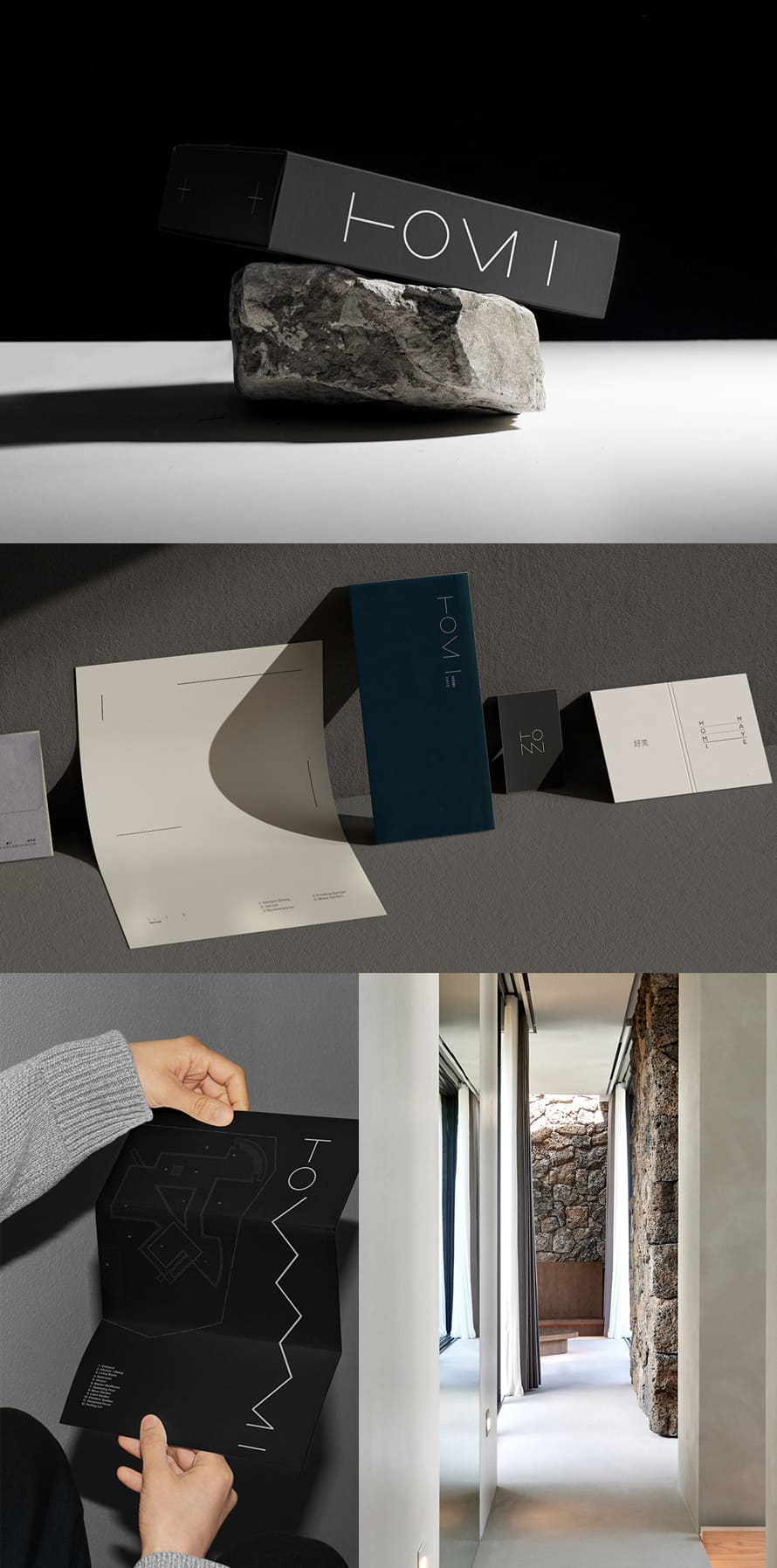
1. Homi Brand Identity Design by studio le_m
Homi Brand Identity Design epitomizes the fusion of strategic vision and creative flair, offering bespoke solutions tailored to each client’s unique identity and objectives. Through meticulous research and collaboration, Homi crafts compelling visual identities that resonate with audiences and differentiate brands in competitive markets.
With a focus on consistency and versatility, Homi ensures that every element, from logos to color palettes, embodies the essence of the brand across various touchpoints. Homi’s approach blends innovation with timeless design principles, delivering identities that captivate, inspire, and endure.
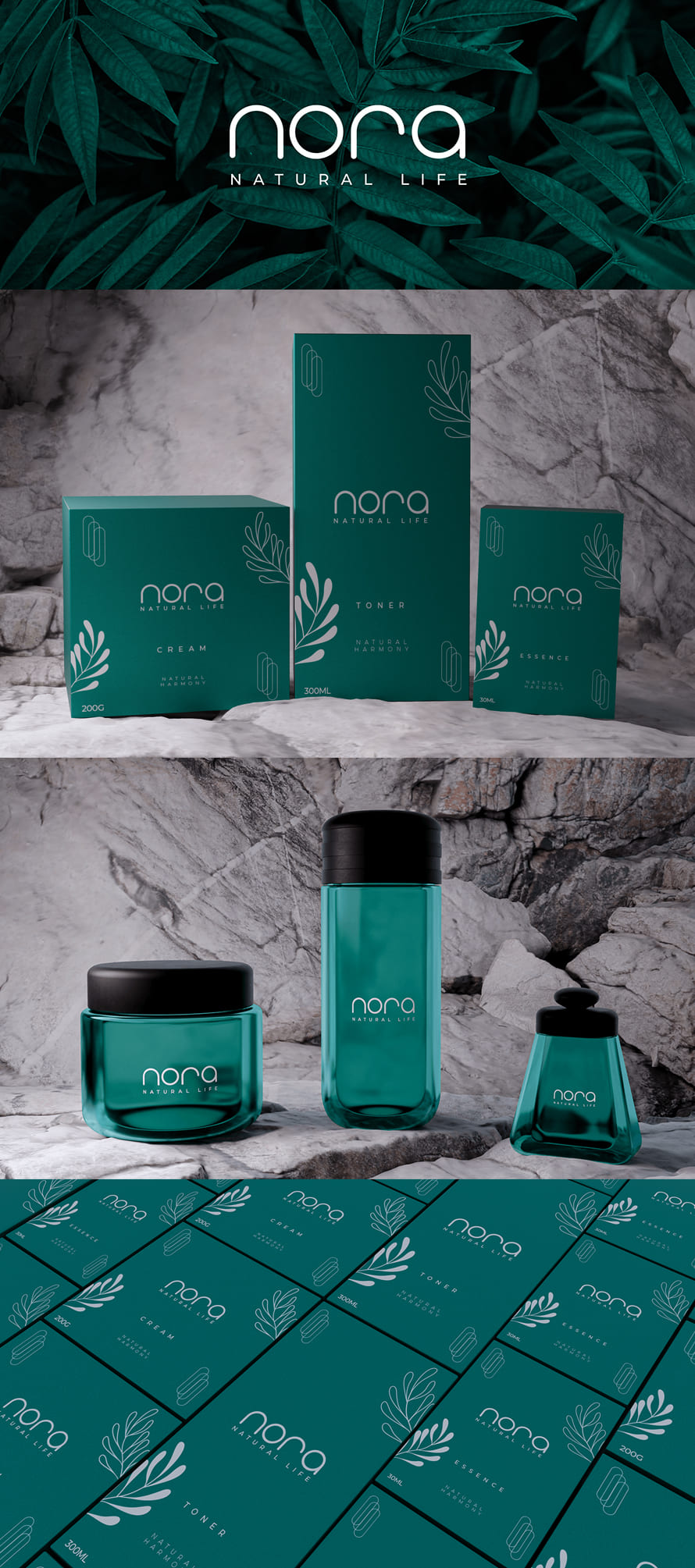
2. Nora Branding Packagin Design by Felipe Viana
Nora Branding Packaging Design epitomizes the intersection of creativity and strategic branding, delivering comprehensive solutions that elevate products and captivate consumers. With a keen understanding of market trends and consumer psychology, Nora crafts packaging designs that not only showcase the product but also convey the brand’s identity and values effectively.
From innovative structural designs to captivating visual elements, Nora ensures that every packaging solution stands out on the shelf and resonates with the target audience. With a commitment to excellence and attention to detail, Nora’s packaging designs enhance brand recognition, drive sales, and foster brand loyalty.
- Innovative structural designs that enhance product visibility and appeal
- Strategic use of visual elements to convey brand identity and values
- Comprehensive understanding of market trends and consumer behavior
- Attention to detail and commitment to excellence in every design
- Packaging solutions that drive brand recognition, sales, and loyalty
3. Raumfüller Branding by VISEE Design
Raumfüller Branding embodies the essence of strategic design and creative ingenuity, crafting captivating brand identities that resonate with audiences and leave a lasting impression. With a meticulous approach to understanding client needs and market dynamics, Raumfüller develops comprehensive branding strategies that elevate brands to new heights. From logo design to brand guidelines, Raumfüller ensures consistency and coherence across all touchpoints, fostering brand recognition and loyalty.
Through innovative storytelling and visually striking designs, Raumfüller creates immersive brand experiences that engage and inspire audiences.
- Strategic branding solutions tailored to client objectives
- Meticulous research and analysis to inform design decisions
- Consistency and coherence across all brand touchpoints
- Immersive brand experiences that engage and inspire audiences
- Innovative storytelling through visually striking designs
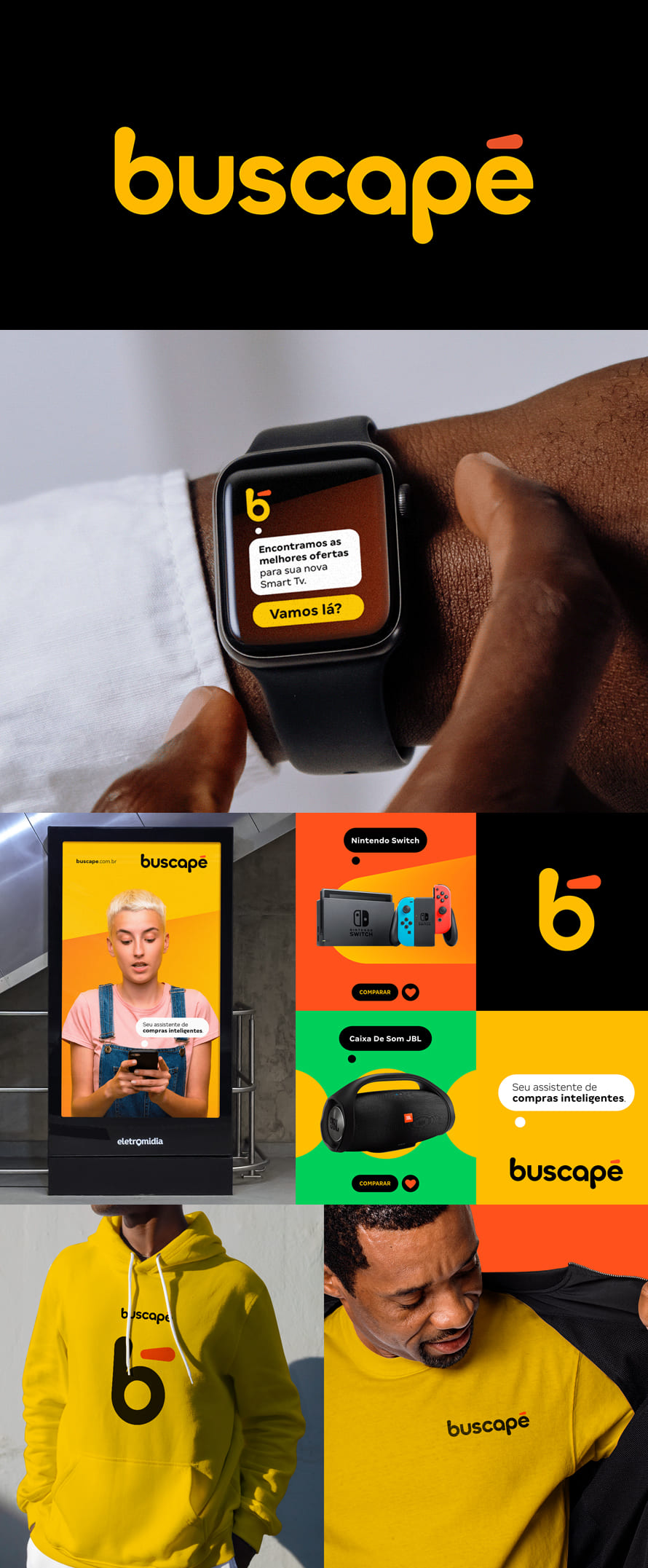
4. Buscapé Rebranding by My Name Is Will Nunes
Buscapé’s rebranding initiative represents a strategic evolution in its visual identity, encapsulating its commitment to innovation and customer-centricity. Through a meticulous design process, Buscapé has modernized its brand elements while preserving its core values, signaling a forward-thinking approach to the market. The refreshed logo, typography, and color palette reflect Buscapé’s dynamic nature and dedication to providing intuitive, user-friendly experiences.
This rebranding effort reaffirms Buscapé’s position as a leader in the industry, poised to adapt and thrive in an ever-changing landscape.
5. Aod® Logo And Branding by Hasib Hemal
The Aod® logo and branding embody a harmonious fusion of sophistication and innovation, reflecting the brand’s ethos of excellence and forward-thinking. Crafted with precision and creativity, the Aod® logo serves as a visual anchor, encapsulating the brand’s identity and values with elegant simplicity. Complemented by a cohesive branding strategy, including typography, color schemes, and visual elements, Aod® establishes a strong brand presence across diverse platforms and touchpoints.
This strategic approach ensures consistency and resonance, fostering brand recognition and loyalty among its audience while setting Aod® apart as a symbol of quality and innovation in its industry.
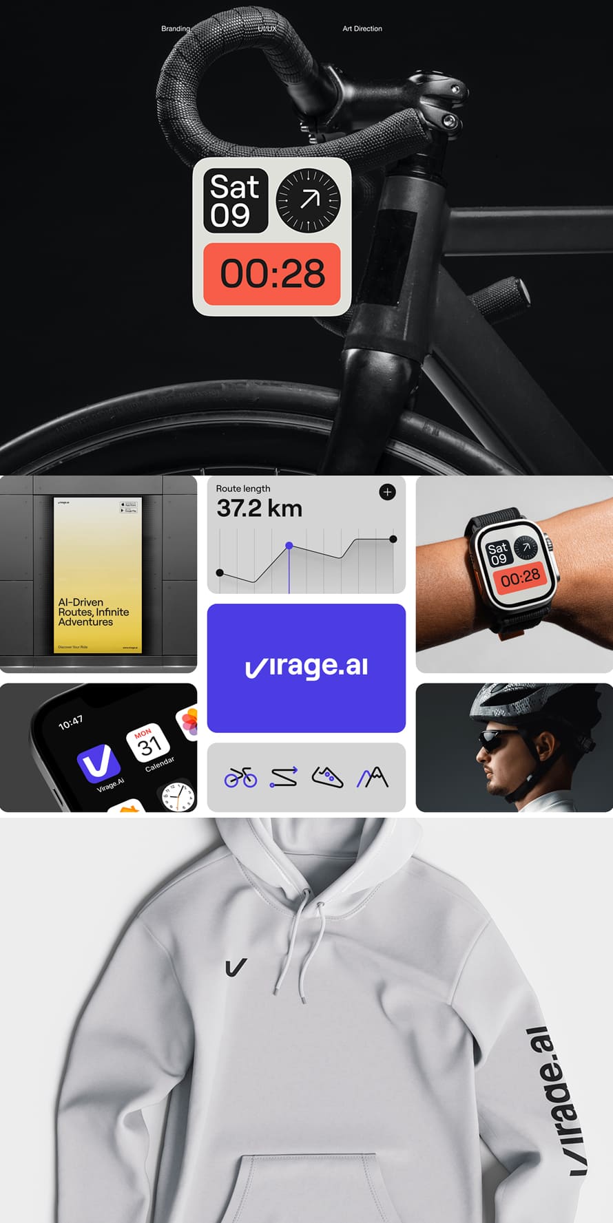
6. Virage Ai Brand Identity by HALO LAB
Virage Ai’s brand identity epitomizes innovation and expertise in the realm of artificial intelligence. Through meticulous design, Virage Ai’s visual elements, including its logo and color palette, reflect the brand’s cutting-edge technology and commitment to excellence. The strategic use of typography and imagery reinforces Virage Ai’s position as a leader in the industry. Additionally, Virage Ai’s brand guidelines ensure consistency across all communications, enhancing brand recognition and trust among its audience.
This cohesive brand identity reinforces Virage Ai’s reputation as a trusted partner for businesses seeking advanced AI solutions.
7. Clarysse Rebranding by skinn branding agency
Clarysse’s rebranding initiative signifies a strategic evolution aimed at revitalizing its brand identity and market presence. Through careful design considerations, Clarysse’s new visual elements, including the revamped logo and color palette, convey a sense of modernity and sophistication.
The rebranding effort also encompasses updated typography and imagery, reflecting Clarysse’s commitment to innovation and quality. With a focus on consistency and coherence, Clarysse’s brand guidelines serve as a roadmap for maintaining a unified brand image across various channels and touchpoints. This comprehensive rebranding strategy reinforces Clarysse’s position as a forward-thinking leader in its industry.
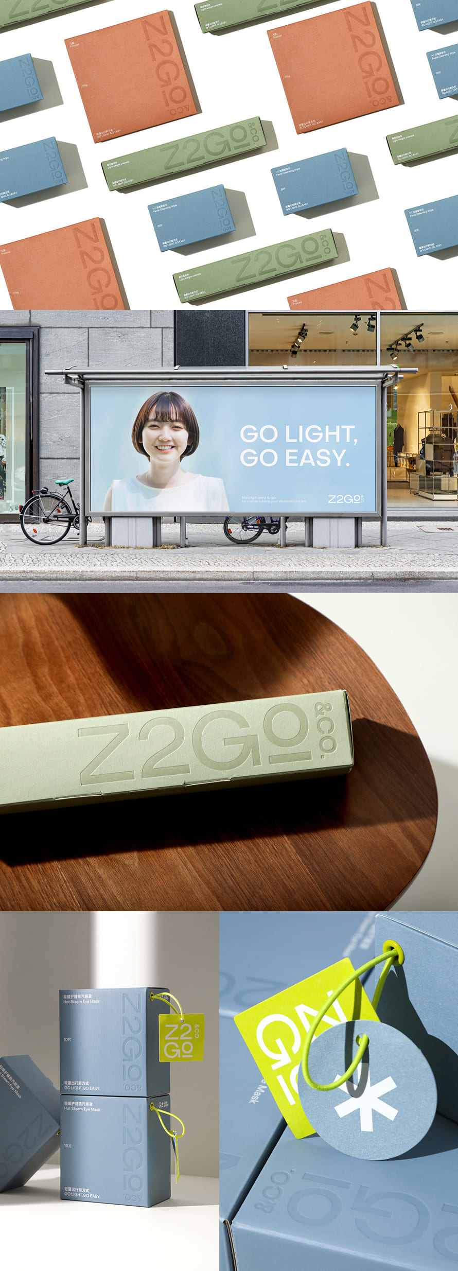
8. Z2GO&CO. Visual Identity And Packaging by lowkey design
functional elegance, reflecting its dedication to high-quality products and user-centric design. Through thoughtful design choices, such as a clean logo and subdued color palette, Z2GO&CO. communicates sophistication and simplicity.
The lowkey design approach extends to its packaging, where minimalist typography and subtle branding create a sense of understated luxury. This cohesive visual identity and packaging strategy position Z2GO&CO. as a brand that values both style and substance, catering to discerning consumers seeking refined experiences.
9. Aywa Branding by Amr Araby
Aywa’s branding embodies a strategic blend of cultural resonance and contemporary flair, reflecting its commitment to innovation and authenticity. Through meticulous design, Aywa’s visual elements, such as its logo and color scheme, evoke a sense of cultural heritage while remaining relevant in today’s market. The incorporation of traditional motifs and modern typography creates a compelling juxtaposition that captivates audiences.
Additionally, Aywa’s brand guidelines ensure consistency across all communications, enhancing brand recognition and loyalty. This holistic branding approach positions Aywa as a trusted purveyor of heritage-inspired products with a contemporary twist.
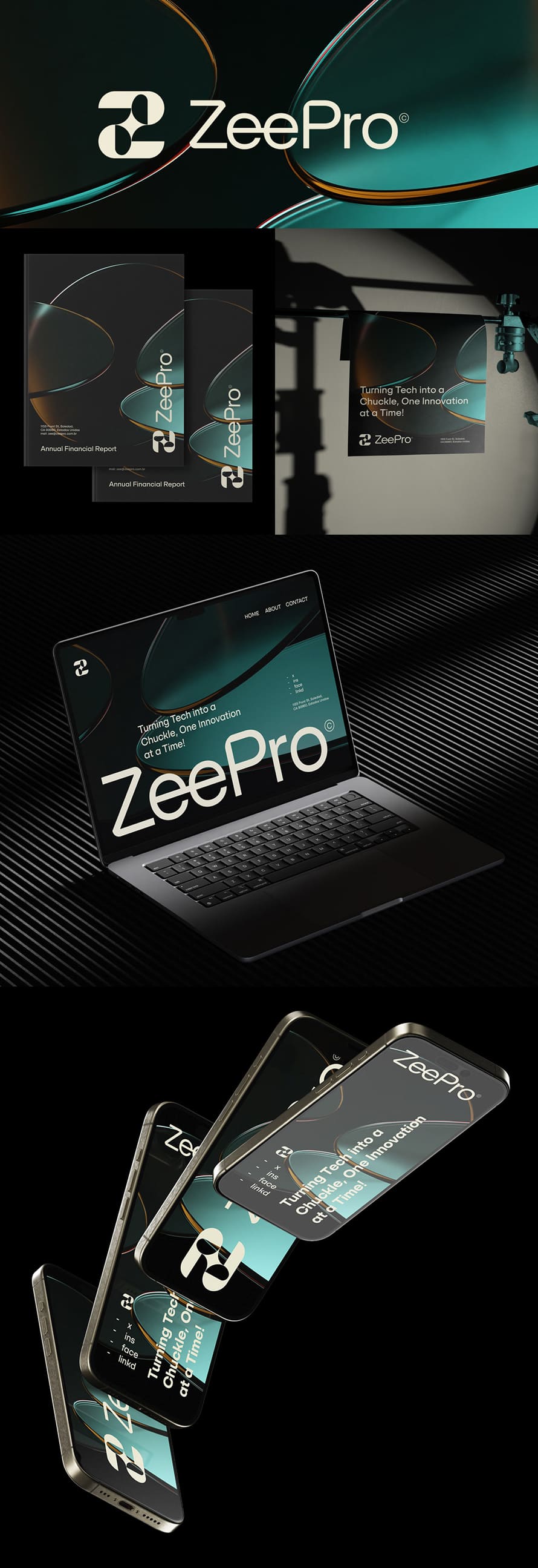
10. Zeepro Branding by Pedro Messias
Zeepro’s branding exemplifies a seamless fusion of innovation and simplicity, reflecting its dedication to cutting-edge technology and user-centric design. Through strategic visual elements like its sleek logo and vibrant color palette, Zeepro communicates a sense of modernity and dynamism. The minimalist typography and clean imagery further reinforce the brand’s commitment to clarity and efficiency. With comprehensive brand guidelines, Zeepro ensures consistency across all touchpoints, enhancing brand recognition and trust. This cohesive branding strategy positions Zeepro as a leading innovator in its industry, driving engagement and loyalty among its audience.
- Sleek logo and vibrant color palette for a modern aesthetic
- Minimalist typography and clean imagery for clarity and efficiency
- Comprehensive brand guidelines maintain consistency across touchpoints
- Fusion of innovation and simplicity enhances brand recognition and trust
11. Aerotech Branding Design by Obrazur Brands
Aerotech’s branding design reflects a strategic convergence of precision engineering and forward-thinking innovation. Through meticulous design, Aerotech’s visual elements, including its logo and color scheme, convey a sense of reliability and technological prowess. The incorporation of dynamic typography and futuristic imagery creates an engaging visual identity that resonates with its audience. Additionally, Aerotech’s brand guidelines ensure consistency across all communications, enhancing brand recognition and loyalty. This comprehensive branding strategy positions Aerotech as a trusted leader in its field, driving engagement and fostering long-term relationships with its customers.
- Logo and color scheme convey reliability and technological expertise
- Dynamic typography and futuristic imagery create an engaging visual identity
- Brand guidelines maintain consistency across communications
- Precision engineering and forward-thinking innovation enhance brand recognition and loyalty
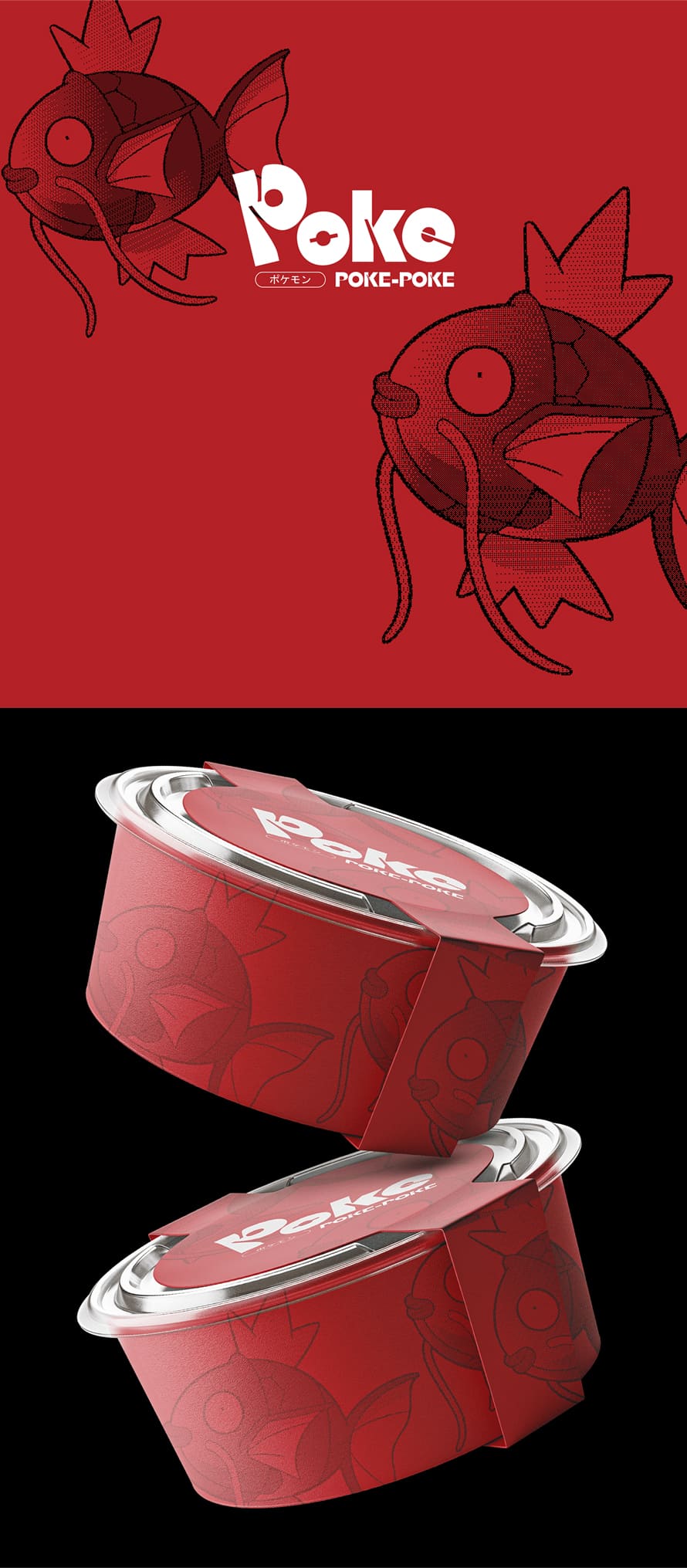
12. Poke Poke Brand Identity by Miguel Bandoch
Poke Poke’s brand identity embodies a vibrant fusion of Hawaiian culture and culinary innovation. Through meticulous design, Poke Poke’s visual elements, such as its logo and color palette, evoke the spirit of the islands while maintaining a contemporary appeal. The playful typography and fresh imagery reflect the brand’s commitment to creativity and freshness. Additionally, Poke Poke’s brand guidelines ensure consistency across all touchpoints, enhancing brand recognition and customer trust. This cohesive branding approach positions Poke Poke as a distinctive and beloved destination for authentic Hawaiian cuisine.
- Vibrant visual elements evoke the spirit of Hawaiian culture
- Playful typography and fresh imagery reflect creativity and freshness
- Brand guidelines maintain consistency across touchpoints
- Fusion of Hawaiian tradition and culinary innovation enhances brand recognition and customer trust
13. Venue Brand Identity by Marwan Hassan
Venue’s brand identity embodies sophistication and versatility, reflecting its commitment to providing exceptional event experiences. Through strategic design, Venue’s visual elements, such as its logo and color palette, convey elegance and modernity. The refined typography and polished imagery exude professionalism and attention to detail. Additionally, Venue’s brand guidelines ensure consistency across all communications, enhancing brand recognition and trust. This comprehensive branding strategy positions Venue as a premier destination for memorable and stylish events.
- Sophisticated visual elements convey elegance and modernity
- Refined typography and polished imagery exude professionalism
- Brand guidelines maintain consistency across all communications
- Versatility in design reflects Venue’s commitment to exceptional event experiences
14. GAMAX Creative Brand Identity by Kamrul Hasan
Kamrul Hasan’s expert touch shines through in the GAMAX logo and brand identity, showcasing a blend of creativity and strategic thinking. With meticulous attention to detail, Hasan crafts a logo design that encapsulates the essence of GAMAX, instilling recognition and memorability. Through cohesive branding elements, Hasan establishes a visual language that communicates GAMAX’s values effectively, ensuring a lasting impact on its audience. Hasan’s expertise in branding elevates GAMAX, setting it apart in its industry with a distinctive and memorable identity.
Beyond the Basics: Embracing a Dynamic Visual Identity
The modern professional brand isn’t static – it’s a living, breathing entity that evolves alongside your business. Your visual identity should possess an inherent dynamism, allowing it to adapt to changing trends while retaining its core essence.
Here are some approaches to embrace dynamism:
- Color Palettes: Consider incorporating a secondary or even tertiary color palette alongside your primary one. This allows for greater flexibility in creating visually engaging content without compromising brand recognition.
- Imagery: Explore the use of dynamic imagery that reflects your brand’s evolution and resonates with current trends. This could involve incorporating seasonal elements or experimenting with different photographic styles.
- Typography: While maintaining a consistent core font, consider utilizing complementary typefaces for emphasis or specific applications. This injects a sense of dynamism without compromising overall brand coherence.
By embracing these methods, you ensure your visual identity remains fresh and engaging, reflecting the constant growth and development of your professional brand.
Conclusion: The Symphony of Success
Professional branding is an orchestra, with the visual identity acting as the conductor and the logo serving as the lead instrument. Together, they orchestrate a symphony of recognition, trust, and emotional connection with your target audience. By prioritizing strategic alignment, embracing dynamism, and crafting a narrative through visuals, you’ll set your professional brand on a path to enduring success.
Remember, a powerful brand doesn’t emerge overnight. It’s a continuous journey of refinement and strategic evolution. By dedicating yourself to building a cohesive visual identity and logo design, you’ll establish a recognizable presence that resonates deeply with your audience.

