In the world of web design, the minimalist approach adheres to the axiom “less is more.” This philosophy can be particularly effective for student portfolios, where the focus should be on showcasing your skills and achievements without unnecessary distractions. Minimalist design not only boosts your portfolio’s usability but also ensures that your creations take the spotlight.
During busy college days, the last thing you need is a complex project to manage. That’s where minimalist design comes in, along with services that simplify other aspects of student life. For example, you can use the writing service DoMyEssay help write your essay. Such resources free up your time and energy, allowing you to focus on what truly matters: your learning and career development.
Unlimited Downloads
Over 1,500,000+ Fonts, Mockups, Freebies & Design Assets

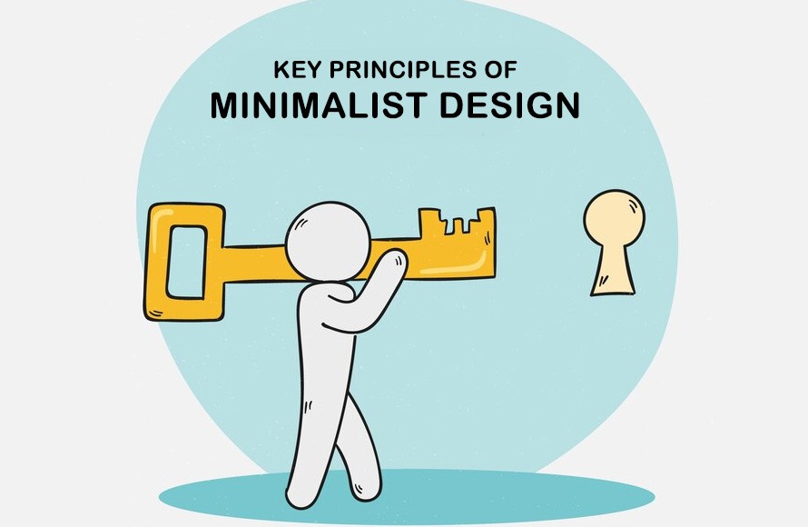
Key Principles of Minimalist Design
1. Embrace White Space
The Power of Breathing Room
White space, or negative space, is a fundamental element of minimalist design. It doesn’t just reduce visual clutter. It also guides the viewer’s focus. Use ample white space around important elements like your key projects or achievements to highlight them effectively, ensuring they stand out and capture attention.
Visual Balance and Composition
Balancing text and images with white space can create a visually appealing layout. It makes your content easier to digest, encouraging viewers to spend more time exploring your portfolio. Thoughtfully placed white space can significantly enhance the user’s visual journey through your work, making each element more impactful.
2. Limit Color Usage
Choose a Limited Palette
Select a small palette of two to three colors that complement each other and support the overall aesthetic of your portfolio. Consistent use of these colors throughout your site will create a cohesive look. This uniformity helps establish a strong visual identity that is easy to recognize and remember.
Accent Colors for Focus
Highlight essential elements such as your contact information or key projects by using an accent color. This strategy can guide visitors through your portfolio to the most important information, subtly emphasizing parts you want to highlight without overwhelming the viewer.
3. Simplify Typography
Clean and Readable Fonts
Choose up to two readable fonts: one for headers and another for body text. This consistency keeps your portfolio easy to read and visually consistent. Choosing the right fonts improves readability and makes your content accessible to everyone.
Consistent Hierarchy
Establish a clear text hierarchy to organize information and navigate the reader effectively, using varying sizes and weights to distinguish sections and highlight important points. This organization aids comprehension and allows viewers to easily navigate through your narrative.
4. Streamline Navigation
Intuitive Layout
Your portfolio’s navigation should be intuitive and minimal. Restrict your menu to essential items to prevent overwhelming your visitors. This simplification makes it easier for potential employers or professors to find the information they need quickly and without hassle.
Clear Labels
Opt for clear, descriptive terms for your navigation links to help users understand their destinations, thereby improving the navigation experience. Precise navigation improves usability and ensures a smooth interaction with your portfolio.
5. Focus on Content Quality
High-Quality Visuals
Only include high-quality images and videos that directly relate to the text or showcase your work. This selectiveness ensures that every piece of content adds value to your portfolio, maintaining a high standard throughout your presentation.
Concise and Compelling Text
Write concise, impactful text that communicates your achievements and skills without excess verbiage. Every word should have a clear purpose, clearly showcasing your skills and abilities. Effective communication is key to keeping the viewer engaged and informed.
6. Minimalist Interaction Design
Subtle Effects
Use subtle interactions, like hover effects, to enhance the user experience without adding visual clutter. These interactions should feel seamless and natural, not distracting, providing a pleasant user interaction without detracting from the main content.
Performance Optimization
Ensure that your minimalist design translates to fast loading times by optimizing images and scripts. A swift, responsive site keeps users engaged and reflects your technical skills, making your portfolio not only aesthetically pleasing but also functionally superior.
7. Consistency Is Key
Uniform Styling
Ensure uniform styling throughout your portfolio to maintain a coherent and professional appearance. This consistency creates a professional and polished appearance that reinforces your brand, building trust and recognition among your audience.
Cohesive Visual Language
Develop a cohesive visual language that ties together all elements of your portfolio, from the layout to the type of content displayed. This unity shows thoughtful design consideration, demonstrating your ability to create a harmonious visual experience.
8. Regular Updates
Current Content
Continually update your portfolio with your most recent work and remove any that are no longer relevant. This relevance shows that you are active and evolving in your field, which is critical in maintaining a current and engaging portfolio.
Reflect Current Trends
While maintaining a minimalist approach, periodically refresh your design to reflect current trends and best practices in web design. This adaptability demonstrates your awareness of the industry standards and your commitment to staying relevant in a rapidly changing field.
Conclusion: Less Is More for Your Portfolio
Adopting these minimalist design principles can transform your student portfolio into a powerful tool for your career. By focusing on simplicity and functionality, you ensure that your work speaks for itself. Remember, a neat and clear presentation significantly impacts how your skills and projects are viewed. Implement these principles today and see your portfolio distinguish itself for all the right reasons.


")


