Apple’s new iOS mobile operating system “iOS 7”, features a new user interface, colors, a new font and new icons. The operating system has been given the biggest change to iOS since the introduction of the iPhone.
Apple has changed some of the icons on its official iOS 7 mobile OS, making notable changes to the Weather, Passbook, and Reminders apps. iOS 7?s icons, which have been subject to much scrutiny and disapproval from various designers, have been one of the largest complaints about iOS 7 so far.
The icons, which can currently only be viewed on Apple’s site using a mobile device, most notably show a completely redesigned weather app icon, ditching the clouds and sun found in the current iOS 7 beta, in favor of the live temperature, something users have been waiting for for years. (9to5mac.com)
You may be interested in the following modern trends related articles as well.
- Beautiful Flat Icons (90 items)
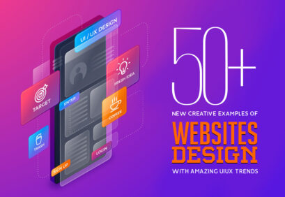
- Mobile Design Trends 2013 Flat And Minimal
- 30 Best UI/UX Pinterest boards You Must Follow
- Modern trends: HTML5, CSS3, Responsive and Flat design
Unlimited Downloads
Over 1,500,000+ Fonts, Mockups, Freebies & Design Assets

iOS 7 Redesign Concepts and iOS7 Icons (PSD)
The most beautiful, modern and inspiring iOS 7 redesign concepts are right here. Today we’re picked up 26 Beautiful iOS 7 Mobile OS Redesign Concepts from behance and dribbble for your inspiration. All the design concepts are created by professional graphic designers who can join web’s biggest platforms from all over the web.
Here is the big list of beautiful examples of iOS 7 redesign concepts. Enjoy!
iOS 7 Redesign by by Leo Drapeau


iOS 7 by JustD

iOS 7 Icons by Jackie Tran Anh
iOS 7 icons by Alexandr Nohrin
iOS7 AirDrop/Share Redesign by Zane David

Mochila Mail iOS7 by Victor Erixon

Ios7 Concept by Ariel Verber


iOS 7 – Redesign (UIUX) by Dmitry Kovalenko

New iOS7 Concept MCASE by Alexis Jossart

Consistent iOS7 Icons by Todor Russanov
IOS 7 Lockscreen Concept by Alexis Jossart

iOS 7 Full Home Screen Icon Redesign by Ida Swarczewskaja
iOS 7 Icon Redesign by Suhaila Baheyeldin
iOS 7 Vector Icon Redesign by Ida Swarczewskaja
iOS 7 Lock Screen Concept by Peyman Eskandari

FaceTime iOS 7 Concept by Thomas Koch

ios7 design practice by Muhammad Farhan

iOS7: Mobile OS Redesign Concept by Nicole Calace

Apple iOS 7 Redesign by Venkatesh Aiyulu

iOS7 Lock screen – Redesign Concept by Mariusz


iOS7 Redesign by Michael Boswell

FREE PSDs – iGravertical Screen Layers + iOS 7 Screen Converter by Balraj Chana

iOS 7 PSD Download by by Teehan+Lax

iOS 7 UI Kit (.sketch) by Sketch Gems
")
iOS 7 style icons of social media FREE PSD by despoth
iOS 7 Home ScreenWith 100% Shape Layers Mockup Free PSD by despoth


")


I vote for Michael Boswell’s redesign (2nd place, Alexis Jossart)!
[…] Apple's new iOS mobile operating system iOS 7, features a new user interface, colors, a new font and new icons. The operating system has been given the […]
[…] Beautiful iOS 7 Mobile OS Redesign Concepts from behance and dribbble for your inspiration. Continue Reading Advertisements Author: Team Member Being a member of team, I really enjoying my […]
HI,
It is your article. I also realized my version. You can visit her here:
http://dribbble.com/shots/1117284-iOS-7-Redesign-Free-PSD
The PSD file is free
Michael Boswell designs are wonderful – both professional, artistic and interesting. My vote is for him!
[…] 26 Beautiful iOS 7 Redesign Concepts […]
[…] 26 Beautiful iOS 7 Redesign Concepts […]
[…] Long shadow design has been mostly used in icons and logos. Shadows live within the element canvas and often extend outside an object to the surrounding frame. Many of the long shadow concepts we are seeing come from projects where designers are looking for creative ways to build icons for Apple iOS 7. […]
[…] Long shadow design has been mostly used in icons and logos. Shadows live within the element canvas and often extend outside an object to the surrounding frame. Many of the long shadow concepts we are seeing come from projects where designers are looking for creative ways to build icons for Apple iOS 7. […]
[…] releasing the Apple’s new iOS mobile operating system “iOS 7“, some of my designer friends really dis-heart with new iOS user interface icons. The new […]
[…] Long shadow design has been mostly used for smaller objects and elements such as icons and logos. Shadows live within the element canvas and often extend outside an object to the surrounding frame. Many of the long shadow concepts we are seeing come from projects where designers are looking for creative ways to build icons for Apple iOS 7. […]
[…] are perfect for web designers, developers and design agencies. The following modern and new mobile iOS7 UI kit contains various design elements such as menu bar with drop down, product widget, shopping cart […]
[…] and concepts with modern user experience. The most beautiful, modern and inspiring Sign Up Screen iOS 7 concepts are right here. All the design concepts are created by professional graphic designers who can […]