Mobile-friendliness is the trend that every web designer has to follow while designing websites for the future. The main theme of any mobile-friendly web design is to bring great convenience for the end users. Mobile-friendly websites should look perfectly not just on Smartphones, but also on laptops, tablets, and even on desktops. Not just mobile web designing is a trend, but there are several sub-trends related to mobile web designing. What are those sub-trends? Reading the lines below will give you a clear picture, so keep reading.
1. Responsiveness Would Be On High Demand

As you know responsive web designing means creating websites that cater to the needs of the users from whatever device they are accessing internet. A responsive web design looks the same on any device. With responsive web design, provided by web design companies, many news and sports websites are attracting more and more followers. Such a design doesn’t support immense scrolling to read the whole page text.
With almost 67% shopaholics preferring Smartphones to place their orders online, RWD serves the best to help them in making easy purchases regardless of the device they are using.
2. Less Cluttered-Websites
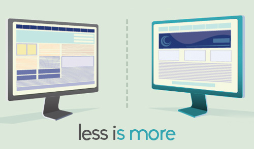
The best lesson web designers have learnt over the time is less is more. Websites need to be more action-packed. Slim navigation and hidden landing pages are there to reduce the website clutter. Even navigation is altogether absent at many websites to make them mobile friendly. The hidden landing pages are helping users to reach the desired page, rather than the home page. These pages are SEO-optimized, so help in keeping the home pages slim. Left-right scrolling gives the website a fresh look.
3. Websites Resembling Apps

No more need to build separate apps for mobile devices, as websites are now looking more like apps. According to the stats of Wall Street Journal, almost 650,000 Apple apps were downloaded in June, last year, and Google Play Store experienced 500,000 downloads. iPhone users downloaded 30 billion apps and Android users downloaded 15 billion apps.
With websites looking like mobile apps, web designers can reach a wider audience and it’s also a great convenience for the users as well due to the familiarity they already have with a certain website.
4. Moving Navigation
This could be done with CSS programming. This isn’t something new, as it supports quick moving to any part of the website. Such kind of navigation supports easy search and narrowing down the desired content to facilitate the users.
5. Larger Images
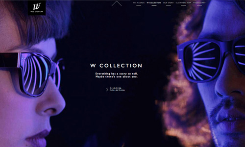
The time to use small images is gone, web designers are going for images with high-resolution. These larger images aren’t just catchy, but also provide more space to the other important elements. The most popular websites having larger images belong to the lobbies, healthcare, and restaurants. These larger images let the viewers have some inside feeling of the business.
6. QR Codes

QR codes are being used abundantly over World Wide Web, serving as call to action. The interesting thing is mobile users are inclined towards scanning these codes to know what’s hidden over there and get advantages. These codes are meant to carry information, special promotions, discounts, or coupons.
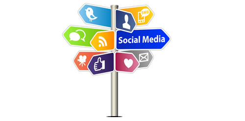
7. Social Media Is Everywhere
Facebook and twitter badges are there on almost every website. Web designers have their own social media presence and guide the users to join them on those pages. Social media badges are also there on blog posts to help readers in easy sharing.
8. Video Integration
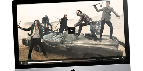
Google prefers listing YouTube videos in its search results. One reason is YouTube is Google’s property and the other reason is videos help the users a lot in understanding about the products, services, or the software offered. They can have a 360-degree learning of the software being offered at a website. These videos are becoming major part of web design.
9. Bigger Typography

At present, larger typography isn’t just a trend, but need of the hour. Larger typography is being made mobile screen-fit with the help of CSS and HTML. Larger text along with simple fonts is attracting the viewers using desktops, laptops, or tablets.
10. DIY Designing

The great sources of DIY designing are WordPress and GitHub. There are available free templates to help the DIY designers creating their very own designs. There are available hundreds of plugins, supporting the relevant features. All these are meant to give your web design a pleasant look and feel.
11. Less Flash And More HTML5 And JS

Flash is losing its popularity with growing usability of HTML5 and JavaScript. Rich internet Application (RIA) is the main advantage that web designers take from HTML5 and JavaScript. All this is helping the web designers to make the websites more interactive and affluent.
12. Rich Story Timelines
It’s a trend that companies are sharing more about them, their history, their success, and their vision. These story timelines inform the visitors about the companies and need more images as well as text to give the website a cinematic feel. Fashion, food, and automotive industries are more into this kind of story timeline.
These are just few glimpses of the trends prevailing and going to exist in near future, particularly to hit the mobile audience. Web designs built with these considerations in mind are more interactive, search engine-friendly, and user friendly. There is more to come in the designing world, the result of more innovation and imagination. So, tighten your seatbelts web designers!


")


[…] Mobile-friendliness is the trend that every web designer has to follow while designing websites for the future. The main theme of any mobile-friendly web design […]
Interesting article, but I am unclear as to what you meant by “hidden landing pages”
[…] Continue Reading Advertisements […]
Wonderful list of top trends – I agree that responsive design is a ling now and will hold its positions in nearest future! I’ll add that design elements convenient for touch-screen are a hit now too – it’s more used even in normal websites as they are often viewed form the tablets
Mark Feliciano, Thank you showing the interest. You can get best answer from here . I think you will understand.
[…] Mobile-friendliness is the trend that every web designer has to follow while designing websites for the future. The main theme of any mobile-friendly web design is to bring great convenience for the end users. Mobile-friendly websites should look perfectly not just on Smartphones, but also on laptops, tablets, and even on desktops. Not just mobile web designing is a trend, but there are several sub-trends related to mobile web designing. What are those sub-trends? Reading the lines below will give you a clear picture, so keep reading… Read more: […]
[…] Web Designing For Mobile Devices: 12 Ruling Trends Of Present And Near Future […]