With the advent of online and mobile working culture, UX/UI trends have experienced a significant transformation over the years. Yet 2021 is just no exception. As a UX/UI professional, it is vital to keep updated about these continuously shifting trends and follow and recreate good UX design examples.
The COVID-19 issue has transformed how consumers engage with products and services and intensified towards a digital-first strategy. This fast move towards digital platforms implies that businesses need to handle adjustments and demands more efficiently. This has increased the value for brand positioning and that is why the demand for logo, clipping path, photo retouching is increasing at the highest rate.
Throughout the face of the pandemic, many companies were compelled to pursue digitalization, whereas others utilized this moment in their favour and reinvented them by adopting design trends. Most significant businesses changed their logos to make them more current and innovative for this new period, while others extended creative limits to distinguish themselves from the competition.
In this blog, we’ll look at the top UX/UI logo trends for 2021, as well as what’s driving the shift and why you should pay attention to them.
What is UI & UX?
UX design relates to “user experience design,” whereas UI refers to “user interface design.” Both components are essential to a brand and function effectively combined. However, despite their professional relationship, the jobs are incredibly distinct, relating to very particular aspects of the design process and the design discipline.
User Experience (UX) Design
Essentially, UX applies to anything that can be experienced—whether it is a website, a coffee machine, or a visit to the grocery. The “user experience” component refers to interactions between both the user and a good or service. User experience design, then, considers all the many features that influence this experience.
A UX designer focuses on how the encounter makes the user feel and how easy it is to achieve their intended objectives. They also watch and do task studies to discover how users accomplish tasks in a user flow.
User interface design, unlike UX, is a digital term. A user interface is the point of interaction between a user and a digital device or product, such as the touchscreen on your smartphone or the touchpad on the coffee machine where you select the type of coffee you want.
The ultimate aim of UX design is to provide accessible, efficient, relevant, and all-around enjoyable experiences for the user.
User Interface (UI) Design
UI design investigates the product’s appearance, feel, and interaction for websites and apps. It’s all about ensuring that a product’s user interface is as intuitive as possible, necessitating thoroughly evaluating every visual, interactive component the user may encounter.
Icons and buttons, font and colour schemes, space, pictures, and responsive design are all things that a UI designer considers.
User interface design, like user experience design, is a multifaceted and challenging field. It is in charge of transforming a product’s creation, research, content, and layout into a user-friendly, guided, and responsive experience.
Logo Trends
Here we describe 10 logo trends that may spark your creativity today.
1. Minimalism
Logos are getting simpler as the years go by and this long-standing tendency shows no signs of stopping down in 2021. This is excellent since we’re not yet ready to let it go! Companies are increasingly utilizing digital technologies to connect with their consumers. This paradigm shift demands clean and succinct visuals. Designers are abandoning elaborate patterns and excessively sophisticated typefaces. Instead, they’re aiming for simple designs that duplicate across several sizes and media.
As we are bombarded with information and pictures all day, clarity and extreme simplicity become more and more essential. Tech companies are moving away from their unique logo ideas and embracing dull, predictable, and nearly similar designs. This is an organic process emerging from these companies operating across different markets, audiences, and platforms.
A simple and flat typeface such as sans-serif ensures that logos may be scaled faster and better. Due to its neutrality, sans-serif logo designs are also much more appealing to broad audiences since they can be easily incorporated into a cohesive experience and business identity. Considering all this, it’s not a surprise that most businesses are choosing generic logotypes because they send a very clear message to consumers: “We’re clean, flexible, and convenient.”
2. Gradients
Gradients seem to have an inexhaustible potential, which we are thrilled about! A gradient is created when several tones of the same hue blend into one another seamlessly. This is how you make a 3D picture that “breathes” and stands out due to its dynamism and vitality. Design tip: Double-check that all of your logo’s color tones print properly.
Overall, the usage of gradients in logos is expected to grow in 2021. However, there are a few things to think about before opting for a multicolor mix in your logo. As previously said, it is a divisive topic, therefore it is important to examine the target demographic that will be exposed to the logo.
The platform is another important consideration when choosing whether or not to utilize a multicolor mix for your logo. Is it going to be utilized online or off? After all, we must consider the number of printing materials as well as the time and work required to produce them.
3. Animated Logo
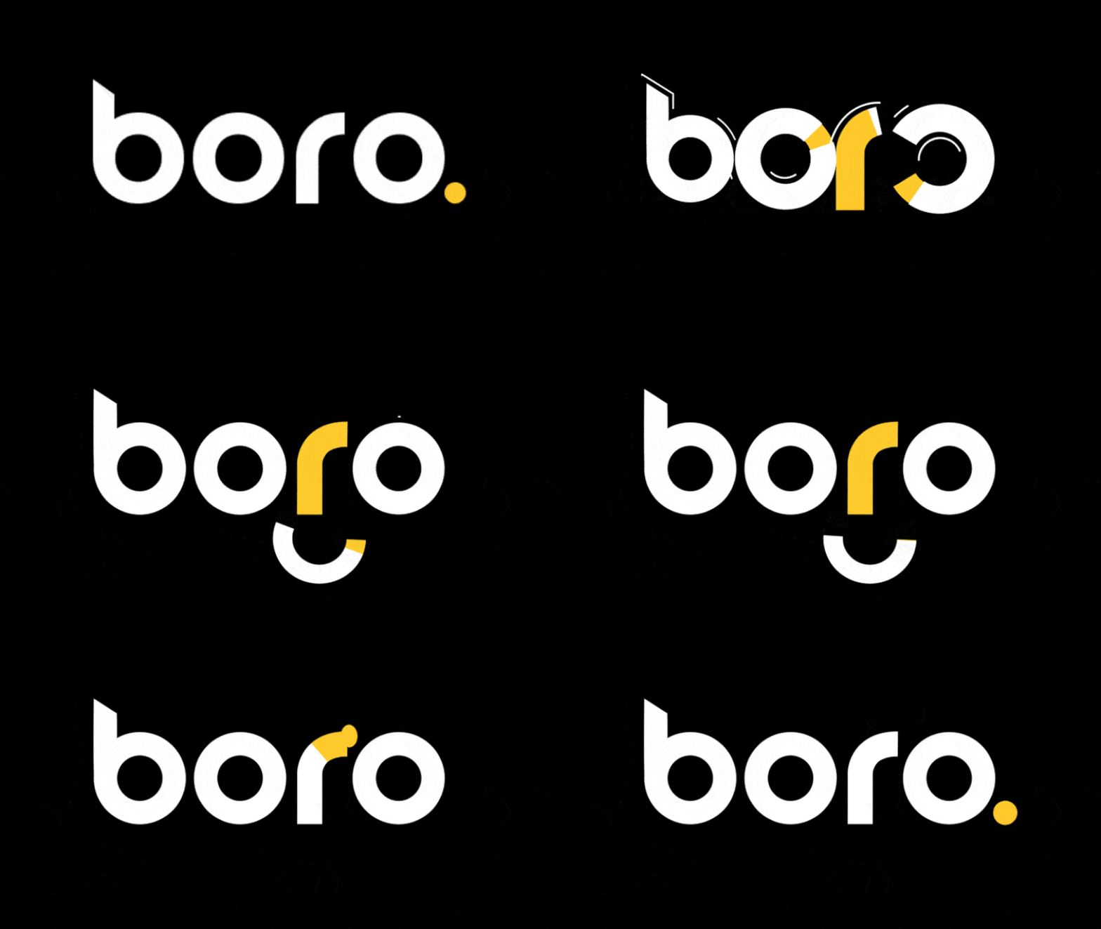
Animated logos are one of the logo trends for 2021 and continue in 2022. Simple animations, typographic animations, and animated cartoons are some of the options.
Basic or typographic animations are logo animations that include the movement of a specific item. They typically use the morphing method (in which the original element is changed into something new), although they may be animated in a variety of ways.
Cartoon logos may be found among the animated logo design trends for 2021. These logos are arranged and irreverent, and they’re linked with good times.
This kind of logo is unsuitable for any brand. They may, however, be extremely helpful for businesses that want to be perceived as lighthearted and fun. Potential consumers will fall in love with a cartoon logo at first sight.
Cartoon logos will not only be at the forefront of logo trends this year but they will also be animated. The humorous illustration impact is enhanced with animation, which serves to establish a feeling of intimacy between the business and the consumer.
4. Typography
Typography-based logos indicate a conceptual change in the portrayal of words as visual representations, moving from a purely textual level to one that is more engaging and significant. With strong typography-based logos, the text takes on the position of the image. This type of communication is related to Mcluhan’s: the medium is the message, but the words are the message.
Strange and unusual fonts will be used to highlight the brand’s uniqueness and distinguish it from its competitors. In most instances, typography-based logos also include beautiful shapes and textures.
This is one of those design trends that has come and gone since the beginning of graphic design history. And, for some strange reason or coincidence, the development of these patterns usually coincides with the end or beginning of decades. Except for the decade that started in 2010, it was a trend in 1960, 1970, 1980, 1990, 2000, and 2020. A statistical conundrum.
5. Retro Logos
Since the epidemic, we’ve been reaching for nostalgia to reflect on what now seems to be simpler times. Strong red tones combined with muted, natural color palettes and characterful typefaces inspired by the 1960s and 1970s are being adopted by brands.
They give a feeling of nostalgia while minimizing the cacophony created by overwhelming visual patterns and textures via simple and basic visual design. The most recent example is Burger King’s redesign, which harkens back to the company’s original 1969 look while conveying a more natural and joyful tone.
The visual language of Meatable, a newly formed cruelty-free food production company, is another example. Meatable’s design is simple and flat, yet it’s visually appealing. Overall, if nostalgia appeals to your target audience’s tastes, including this design trend may be a wise strategic decision.
6. Text Destruction
Offering a puzzle to your target audience is a certain method to capture their attention. Remove a portion of the text, use fading colours, or leave a line half-finished to give your artwork a mysterious vibe. This is an eye-catching yet difficult method. If you go too far, you may wind up with a totally unreadable logo. It’s essential to know when to stop designing logos, just as it’s necessary to know when to stop designing anything else.
7. Overlapping Elements
The sophistication of fine lines, as well as the overlaying of such lines or multi-layered shapes, are the main features of these logos. In today’s logo trends, these characteristics provide new design options.
Shapes combined with advanced multi-layered overlay methods give the designs a deeper sense of depth. This depth has a semi-three-dimensional feel to it. These logos, unlike the 3D logo trends, do not use real 3D, but instead, use optical principles to suggest a false three-dimensionality.
It’s a great method to attract attention to a company by combining the superposition of layers with bright colors for a unique effect.
8. Symbolic
The traditional logo design comprises a sign and a wordmark which function together as a complete. However, after a brand has been recognized well enough, it usually renounces the logotype because everyone already knows the corporation name.
In other instances — particularly in the digital world — businesses have numerous variations of their logos. Quite often the sign serves, sometimes you need the entire thing. They can use the symbol independently as a symbol in any size or they can write out the business name.
By now, plenty of good three-dimensionality businesses have grown to a point where they don’t have to promote themselves by showing their entire logo. People have seen it so many times that it has been imprinted in their minds.
9. Raw Logos
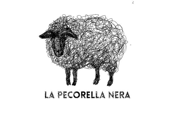
Raw logos disregard the elegant and exact look made available by design tools, bringing us back to the days of sketchbooks. The use of controlled and studied ideas such as asymmetry, uneven lines, and various shading techniques are essential to this logo design.
Some designers are daring to explore the similar roots of hand-drawn logos using digital tools in this digital age. Make no mistake: these are vectorized and digital logos. However, they begin with paper drawings and then end with digital vector tools, like with every good logo design.
This design may be used by both daring, edgy companies and classic, well-established businesses to demonstrate authenticity. This is one of the design concepts that will dominate brand design in the next few years.
10. 3D Logos
3D, which was one of the major UI design trends last year, is likely to continue in 2021. Icons with 3D-like effects have also been introduced to many platforms, which may inspire designers to begin experimenting with 3D concepts. Naturally, this raises the question of whether 3D logos will follow suit.
Creating 3D images is getting less and less time-consuming due to more advanced technology and new tools. Nonetheless, integrating 3D graphics into mobile and web interfaces is a tough job that needs a significant lot of expertise and a particular skill set. To put it another way, 3D is eye-catching and visually appealing, but it also takes a longer time.
As a consequence, creating a modern 3D logo is only beneficial if it compliments your company identity and enhances the overall user experience.
11. Chaotic Art
In 2021, you’re free to do whatever you want. Turn letters upside down or spread geometric motifs throughout your design. There are no recommendations to follow. The phrase “creative anarchy” has reappeared in the media. This trend is a great method to show off your company’s creative side. And, as always, utilize chaos sparingly while ensuring that your brand is legible.
One of the stunning logo styles that defy conventional norms is the chaotic arrangement of logo graphics. These logos are intended to convey a sense of creative uniqueness, orderly chaos, and rebellion. They might be vivacious and dangerous, or just unique. As a result, it is not recommended for any kind of client. However, it may be a great idea for any business that is involved with art (or has an artistic component), fashion, media, or, in certain cases, technology.
The controlled disorder or imbalanced layout is like a neon sign that attracts potential consumers’ attention. However, as previously mentioned, this is not for everyone, and you should not go too far into disorder or your design will become illegible.
12. Monograms
A monogram logo is a decorative design that consists of a single symbol made up of one to three letters (traditionally three). Monogram logos are often used to symbolize a person’s or company’s initials. The letters in this logo design may potentially be used with pictures to better communicate the brand’s message.
Monograms are one of the earliest kinds of identification, having been originally used on coinage to distinguish different cities by the Ancient Greeks. Monograms have been used by artists in their work throughout history, as well as royal families who relied on them for distinction (often to declare property) and wedding invitations.
13. Emblem Logo
In the next few years, simplification and simplicity will become more popular. Many companies, on the other hand, will continue to employ more traditional designs without needing to simplify them.
The symbols have a timeless quality to them, as well as an attention to detail and beauty. In the form of a logo, the aspirations of a vanished civilization.
A complicated design may elevate a brand’s sophistication, making it more attractive to certain sectors. A symbol, on the other hand, does not have to be complex; it may be very basic and minimalistic and yet be powerful!
14. Responsive Logo
With decreasing screen sizes and new advertising platforms, one thing is becoming more clear to company owners regarding branding: logos are no longer “one size fits all.”
As a result, responsive logos appeared. You may be wondering what it is. Responsive logos are shape-shifting logos that adjust in size, complexity, and even color to fit and adapt to their surroundings.
Responsive logos, which were formerly considered a design trend, now seem to be more of a need than a fad. There are more locations to put your brand now than there have ever been, and they all vary in size. That ancient adage about “never changing your logo” that has been passed down through the generations? Nowadays, it will stifle your progress.
15. Black & White
When utilized wisely, flashy logo colors are wonderful, but sometimes the most successful, memorable logos are the ones that keep it extremely basic with only black and white. Black and white logos are the definition of “less is more,” and they are frequently the most memorable and effective due to their deliberate simplicity. They’re also the most affordable and adaptable.
Printing anything in black and white is less expensive than printing in color. A black and white logo is likely the most cost-effective choice for a company that is just getting started or wants to completely revamp its branding.
When it comes to flexibility, it’s critical to think about all of the possible uses for your logo. It may be hung on a wall, exhibited on a banner, or displayed in a vehicle window. Perhaps it will appear on a t-shirt, a sticker, or an Instagram profile. There is no better choice than black and white when it comes to creating a logo that will look excellent almost everywhere. It is, after all, always flattering.
16. Custom Fonts
Many well-known logos use Helvetica, Poppins, Arial, and other classic fonts. Creating a typeface is a great way to stand out and show off your creative abilities. If you’re designing a text-based logo, make sure you choose a bespoke font. Simultaneously, when pursuing innovative ideas, keep legibility in mind. Otherwise, all of your creative efforts will be for nothing.
Conclusion
Successful companies strive for freshness, timelessness, and uniqueness at the same time. The logo trends for 2021 indicate a clear change in brand development, with origins in old-school style yet firmly planted in the present. Technology and software have made it feasible to build things that were before impossible.
Simultaneously, new technology advancements and UX design needs provide designers with new difficulties. For major companies, simplicity, clean lines, and easily recognized designs will acquire traction. Smaller businesses, on the other hand, are more likely to experiment with more complicated logos. Hand-drawn, impossible geometries, and dreamy environments… 2022 is going to be a fantastic year for logo design! You should not be scared to embrace change since the world is always changing.
FAQ
Q1. What makes a good logo in 2021?
Ans. A good contemporary logo design should represent your business and be distinctive, original, and timeless when it comes to branding and inventive logo design. You should avoid fashionable logos that stand in the way of your design goals.
Q2. What is a good logo?
Ans. A good logo is distinguishing, suitable, practical, visual, and straightforward in design, and it expresses the owner’s intended message. A logo should be printable at any size and, in most circumstances, effective without color. A great logo is generally comprised of two components: a great concept and a great execution.
Q3. Can a logo be just words?
Ans. While there are several methods to design a logo, a logo might just be text. A “wordmark” logotype is a logo that simply consists of words and uses typography and typeface to establish a brand’s visual identity through text.
Q4. What is a creative logo?
Ans. The concept behind innovative logos is that they stand out because of their distinctive twist. Take, for example, the Drop Media logo. The name isn’t particularly unique, and if their logo was simply a plain wordmark (just the name without anything fancy), you’d probably forget who they were after a time.
Did you find this article useful? Let us know in the comments below.





I am a logo designer. I trying to looking for this type of article. your article can be helpful for me. Thank you!
As a professional graphic designer, I am searching for articles of this nature. Your article may be of assistance to me. Appreciate your consideration.