We all know that the exemplary planet Earth exists only because it supports life. But the main thing to think about is that our planet is now dominated by an assortment of lifeless gadgets. Can you even imagine a day in your life when you won’t need a laptop or a mobile phone? Everything looks upside down! Isn’t it? In actual, this is the kind of revolution which these gadgets have brought and installed in our lives.
You may be interested in the following modern trends related articles as well.
- CSS3 Tutorials Best Of 2012
- jQuery Plugins Best Of 2012
- Modern Business Cards Design
- 42 Remarkable Examples Of Typography Design
Please feel free to join us and you are always welcome to share your thoughts even if you have more reference links related to other tips and tricks that our readers may like.
Don’t forget to
subscribe to our RSS-feed,
follow us on Twitter — for recent updates and follow us on Google+
.
Responsive Web Designs v/s Ordinary Web Layouts
In this modern era, the main function of the web designers is to augment the technological improvements. Websites are imperative to prove the potential of your business; however your website should be such that it is accessible from almost any device.
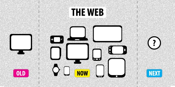
Responsive web designs are ones that provide the businessman to create a striking user experience. They optimize the web pages for number of devices. If you are wondering what these responsive web designs are and how they are better than ordinary web layouts, then here is the answer. Responsive web design is an advanced technique that uses fluid layouts. With responsive web designs you can access your website virtually on any gadget or device including –
- iPad
- Tablet
- Smart phones
- Laptops
- Television
- And many more
No matter your Galaxy Tab’s resolution is dissimilar to your Nexus S phone, your website will appear attractive as long as you implement responsive web designs rather than ordinary web layouts.
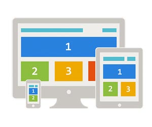
Responsive web designs have fluid grid structure. This structure combines with the media and queries in your CSS. Here are some factors listed which will prove that responsive web designs are much better than ordinary web layouts:
- With responsive web designs your clients will be constantly on the move, browsing your website on their tablets or smart phones while taking ride in metro or sipping a cup of coffee.
- These days everyone uses smart phones and tablets to access websites. Using responsive web designs, you can create a robust web design which is easily compatible to all modern gadgets and devices.
- Responsive web designs speed the rendering process by rendering compatible versions of graphics and images on the browser.
- By using such web designs you reduce the overhead expenses of developing number of versions of the same website.
It is because of number of benefits offered by response web designs that such web designs are becoming frequently used options by website designers as well as online marketers. New websites are developed using this new fluid structure while the already existing websites are now getting re-dressed with responsive web designs.


")


I like ur words regarding responsive web design. As a designer I know responsive website designing is going to make big and better impact in web layouts.
[…] http://graphicdesignjunction.com/2012/12/responsive-web-designs-are-better-than-ordinary-web-layouts… […]
responsive website designing is moreover value now a day because of smart phones
[…] result into customer experiences with elevated engagement which will add to the overall success. Responsive Web Design appears to be the most current and all the rage […]
[…] this modern era, Lot of designers talk about “Responsive design”. Designing a responsive website its really stunning. As a designer, I love to design responsive layout, the main function of the […]
[…] this modern era, Lot of designers talk about “Responsive design”. Designing a responsive website its really stunning. As a designer, I love to design responsive layout, the main function of the […]
[…] this modern era, Lot of designers talk about “Responsive design”. Designing a responsive website its really stunning. As a designer, I love to design responsive layout, the main function of the […]
[…] is used by the developers to add flexibility to the presentation of a website’s content. CSS enhance the look of a site and is easy to implement than other […]
[…] this modern era, Lot of designers talk about “Responsive design”. Designing a responsive website with big background it’s really stunning. As a designer, I love full size background photo […]
[…] this modern era, Lot of designers talk about “Responsive design”. Designing a responsive photogaphy website with large photo background it’s really stunning. As a designer, I love full size background […]
[…] this modern era, Lot of designers talk about “Responsive design”. Designing a responsive photogaphy website with large photo background it’s really stunning. As a designer, I love full size background […]