Just like any other discipline or profession, designing comes with rules. While not following the rules of graphic design layout is allowed and even encouraged in certain circumstances, it is still important to be aware of these rules that you break so you know how to break them in the right way. From graphic design layout to typography, down to special effects and color, we are listing 10 web design rules that talk about some basic rules, tricks, guides and tips to common mistakes and how to dismiss them. ![]()
Here are 10 essential rules to make creative website designs:
Remember to Kern
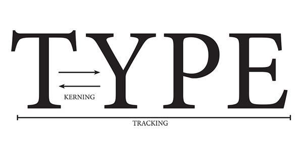
A bad kerning job is among the biggest sins in the world of graphic design. Thus, it is a skill you need to learn in the very early stages of your education. The space arrangement between characters is called kerning. It may sound too much, but when the kerning is executed well, the result can be so much better and different. Your text needs to look orderly and neat, and kerning ensures that.
Don’t Sacrifice Legibility for the Sake of Aesthetics

The ultimate purpose of graphic design is communication. Thus, the legibility and readability of your design text is a major priority. Many things hinder legibility and readability, and a typical example is a shallow contrast between the background and text. Always maintain a high contrast to circumvent this issue.
Capital letters are overused, and this is a common mistake. To the reader, a text in all caps may feel like the message is yelling at them, and they also prevent the eye’s capacity to differentiate letterforms. When you design text in caps, it looks like a block. But when you design in lowercase, the shapes are unique, which lets the reader identify words and letters easily.
Another mistake some do is making the type too small. Consider the fact that your audience may have a hard time reading it. If you are still not sure, perform test prints and request feedback. You may be able to read it, but others might not. In conclusion, just because the type looks good, does not mean it communicated well. Treat the type with caution.
Make Sure to Keep Your Lines Short

As readers and users, you may struggle to get through an interesting article in a magazine, or you may lose your place each time you try to go to the next line. Why does this happen? Most of the time, such things occur due to line lengths that are poorly structured.
The perfect number for line length in the copy’s body is six words maximum per line and 30 to 40 characters on an average, including spaces on every line. Any less, your sentences become too disjointed; any more, you jeopardize the sentences becoming difficult and tedious to read.
Additional Helpful Resources:
- 7 Best Web Design Strategies to Implement to Build Audience’s Trust
- Useful Tips to Design a Website Homepage That Draws Visitors
- 8 Web Designing Practices Every Designer Must Avoid
- The Benefits of User Experience in Web Design
Have a Deliberate Hierarchy

A powerful and robust hierarchy, like within plenty other natural orders, is a pretty useful tool. In graphic design, authority implies the organization of the elements in ways that tell the reader their level of importance. Thus, the more critical elements are created to garner the most attention through type, color, scale, etc., and the elements that aren’t so important are created to attract less attention.
Practice Correct Word Spacing
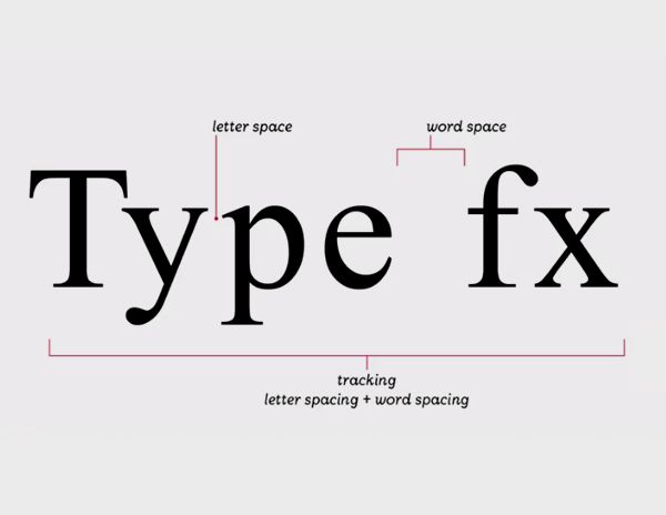
Body type is a specific event when you are working as a graphic designer, and it is almost always the hardest things to do. There are plenty of design elements and rules to consider, and among the most important are a letter and word spacing. There are two main factors about spacing: leading and tracking.
The adjusting of space between vertical type lines is called leading. There are plenty of factors that guide what leading you can apply, such as the typeface to the volume of text. But an excellent graphic design rule is that longer the line length, the often is will require leading.
Kerning is done manually, so when you have a lot of text and very little time, you may not have the peace of mind to modify each space. This is where tracking is useful. Sometimes, tracking tools work better than kerning in space modification. Monitoring is the right way of reducing awkward lengths of line or rivers. For the text body (the heading, for example), a good design rule is to adhere to keeping longer lengths tracked loosely and smaller lengths of line tracked more tightly for maximum readability.
Use the Appropriate Alignment
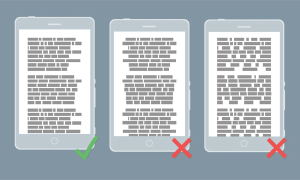
Whether you are a newcomer or an experienced designer, you will encounter essential tools for alignment reasonably early in your life. There are four kinds of alignment: centred, justified, right aligned and left aligned.
Centered
Centered text unmistakably has a broad type of uses, for things such as branding, posters, invitations, etc. Centered alignment makes balancing type easier and it makes type look more aesthetically pleasing. However, centered alignment is difficult to read when the size of the text is more significant.
Justified
Justified text is deceptive. It seems to be the ideal alignment tool. Sometimes, the legitimate type is excellent; books are a simple example. Justified text has its problems though, chiefly in spacing terms. At the paragraph’s edge, wherever there are fewer words on the line, the justify tool will usually increase the type from left to right, creating awkward spacing’s.
Right Aligned
Right alignment aligns the letter to the right. This is often used for ornamental purposes within small type pieces or branding in particular publications. The proper arrangement isn’t right for higher volumes of text as the broken edges on the left can make it difficult to read.
Left Aligned
Left alignment is the most popular form, and this is for a valid reason. It is readable and provides a pleasant, clean left edge to texts. Whenever you are feeling uncertain, just left align.
Prevent Color Discord
Color discord occurs when two colors clash. This happens when you choose colors that are not paired on the color wheel. Breaking the rules of color theory causes this. Discordant colors form a vibrating or muddy effect that it hard for the eye to differentiate between each line or color.
You can easily rectify color discord by using colors with a higher grade of contrast. Some designers, especially advertisers, like the outcomes of color discord, as they consider color discords leads to attractive designs. So, while sidestepping color discord for your aesthetically-pleasing designs is usually advised, you can still bend color distortion in your favour.
Keep Your Audience in Mind When You Design

Most designers start with a brief, and one of the most questions, in summary, is: who are you designing for? Every design has an audience, the people who will see the design and receive the message, so, you need to keep them in mind when designing.
For instance, a black and white, and sophisticated design will never attract the audience if they are children. It will not appeal to the right people and send the right message. However, the colorful and bright design with fun graphics will be more attractive and be in sync with the event and demographics.
Therefore, always remember that even if your design is good, it may not be the best communication for the audience.
Avoid Orphans and Widows
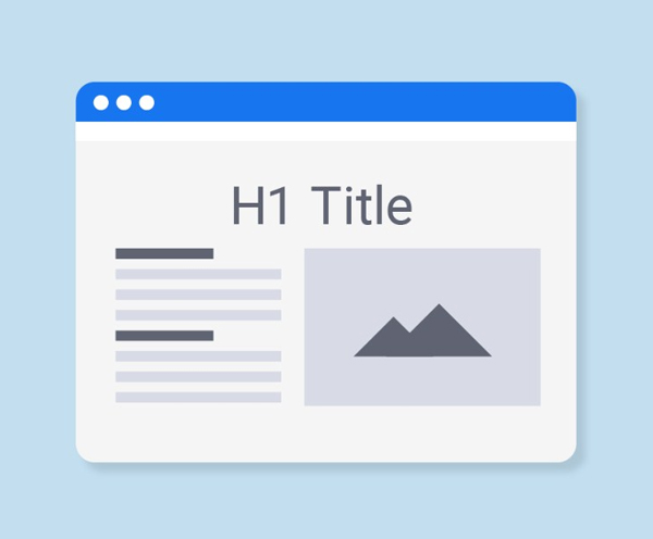
The best way to make your design more professional and polished is to check for orphans and widows and remove them. In any layout you try, a few odd orphans and widows will pop up, it’s unavoidable. However, identifying and dealing with them is critical. Drew de Soto explains it best in his book, Know Your Onions: Graphic Design by saying: “A widow is a term for a line of text that belongs to a paragraph and has moved over to the next column. An orphan is similar, but a single word on its own on a line, poor little thing.” You can fix it manually or adjust your column or textbox sizes.
Have a Consistent Color Palette
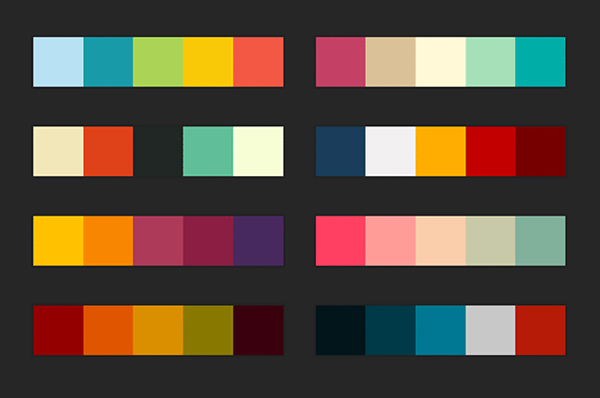
Color is significant in designing. Thus, it makes sense that a consistent palette and careful arrangement would be a critical step in all projects.
Educate yourself on color theory before you select your color palette. Color theory decrees that specific colors have certain effects on audiences, i.e. orange is believed to incite an appetite, which is why orange is usually utilized in fast food designs.
There are some principles and conventions when it comes to color, and while exploring and preventing expectations can execute an impressive design, be convinced that your application of color isn’t too distracting that your message gets confusing.
Conclusion
There are many things to analyse when establishing your design’s theme. It takes some work, and plenty of time wasted pushing things around, resizing details and then pushing them around again, but graphic design rules will keep you grounded.
