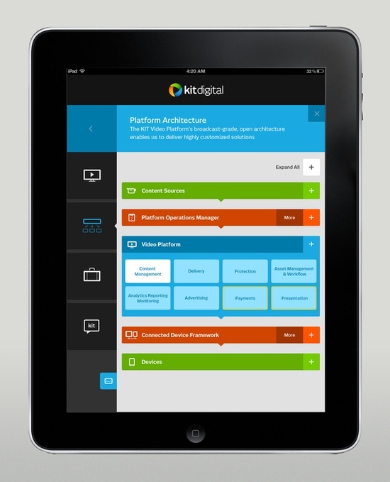
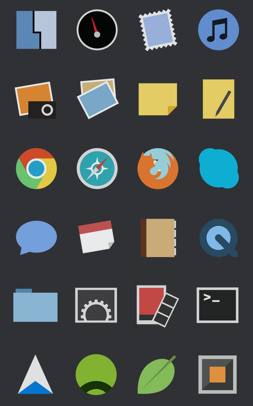
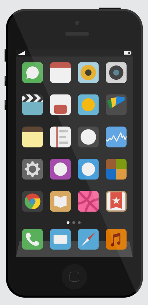
From the latest app to the most clutter-free websites, this design has had resurgence of late. It has brought along with it, amazing color schemata’s and new styles. This is easy to read and comprehend for the user. Bold tiles when used; make for an easy selection of options. This design school has become more entrenched into the technology space with the Windows 8 and Google design patterns. These patterns ensure a completely flat aesthetic. Other popular sites have also jumped into this bandwagon. Icons are very crisp without any feathered shadows and edges. This simple design school does not employ any three dimensional effects. This means no embossing, bevels, drop shadows, gradients or such tools that create a sense of depth. It is straight to the point and fresh.
You may be interested in the following modern trends related articles as well.
- Importance of User Interface (UI) & User Experience (UX)
- How to Have a Better Understanding of Responsive Web Design
- How to Utilize Web UI/UX Design to Improve Your Businesses
- Some Tips to Freelancing Web Designers
Flat Design
But flat design is not completely devoid of any effects. It adds some extras to create a sense of artificial dimension and depth. Many more designs are part of this category of almost flat in which the concept and overall look has very few effects.
This type of a design can be charming and beautiful without the use of any added embellishments. This is a very simple and clean method of communicating a message or promoting an idea or product. It is better to cash in on this trend right away before the next one comes up on the horizon.
There is a lot of focus on color that is very vivid. Color is a vital component making it tick from color blocking and shapes and bars to tints. A good tip is to use colors from your logo that would make the site to stand out visually. Flat schemes can work with black and white imagery also, but by using color you are assured of a greater impact.
Exact usage of words to get across the message
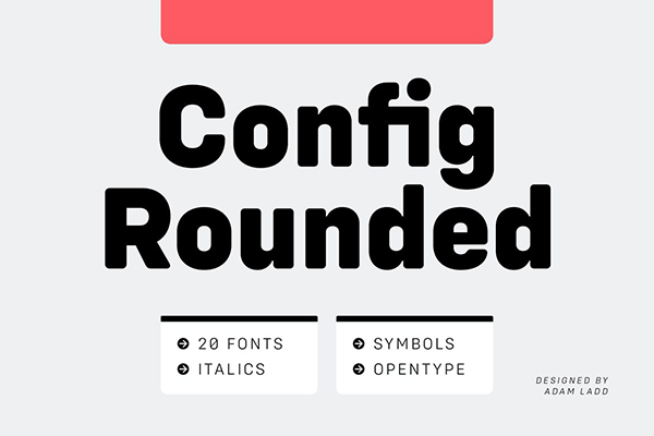
Typography is another aspect to focus on. Words are a necessity, they get across the message, provide navigational tools and guides users on what to do on the site. Add spice to the words with interesting and differing typography. Do not use fonts like Arial. Go in for typefaces that are in sync with your messages. Flat scheme is more often minimalist and simple, so go for typography that matches with that. Simple sans serif typefaces have a number of variations and weights that would stay in with the theme. You can tread the unexpected path by combining the flat design scheme with a novelty font accented by simple typefaces to provide for an art element. Put emphasis on the words as such designs have minimal usage of words to maintain a simple feel and flow. Ensure that every word counts.
Simple and Effective Designs
Go in for simple UI elements and user interface. Clickable buttons need not be complicated and over designed. As far as the elements have a clear use and are definable, they will be effective. These elements can be in the form of outlining, color, boxing, or a different shape or typeface. Create a hierarchy as you would do with any website. In such a design philosophy, some might argue that important places to click are not obvious unlike others where they are signified by gradients, shadows, belevels and other such effects. Ensure that the users know how to navigate and use the site in a simple fashion. Links ought to be crystal clear and clickable. They can be contained in a box or of a different color.
Since, it is simple in nature, flat design schemes work well with products or messages that echo the same thought. The very defining characteristics of this design school are clean, simple and minimalist and lean, small and honest. This design works well for small screens especially mobile or apps design. But now increasingly many are finding it to fit in to larger screens also. Windows phone and Android platform both use such a design thought for their operating platforms. Some find it difficult to work with flat design as you have to focus on each and every small detail. No effects or shadows are there to hide imperfections.
Flat design works well with a variety of color schemes. It pops up with a lot of bright colors among shades of black, gray and white. The downside is, it can appear as quite bland when used in an entirely black and white setting. If you are slightly intimidated by the thought of going completely flat, then you can mull on an almost flat scheme, having effects to a minimum.
Some have argued that although this design style simplifies the visual richness, it can compromise on the clarity of some design elements like buttons. It also has been pointed out that this design school does not rely on metaphors like buttons that ordinary people are very familiar with.


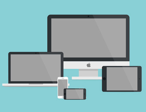
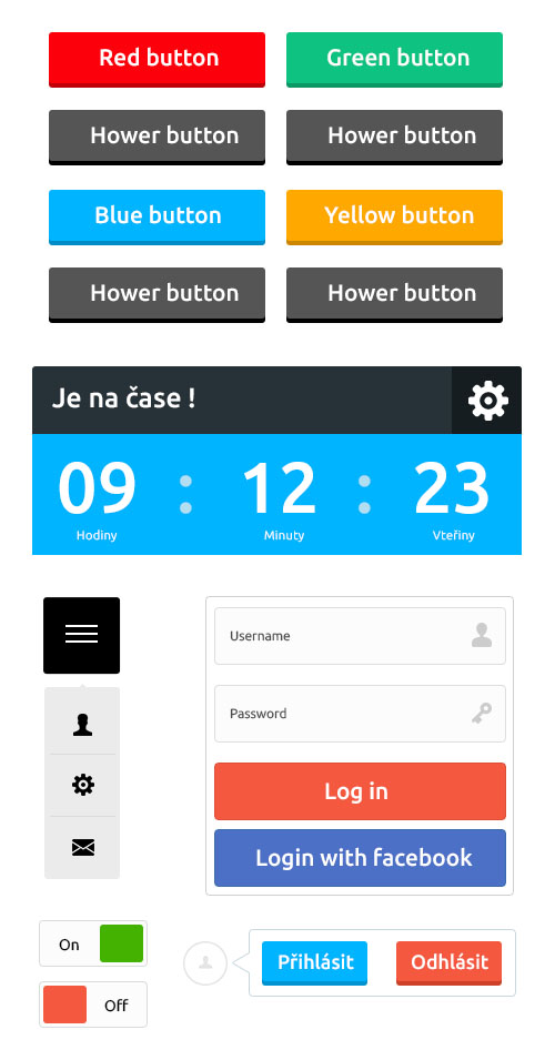








[…] Flat UI Design – Rejuvenating the Look of Electronic Devices […]
In 2014, the most essential thing which brings traffic to your website is design. Use of typography has been increased and it brings creative designing activities in recent time.
[…] Flat UI Design – Rejuvenating the Look of Electronic Devices […]